
objective
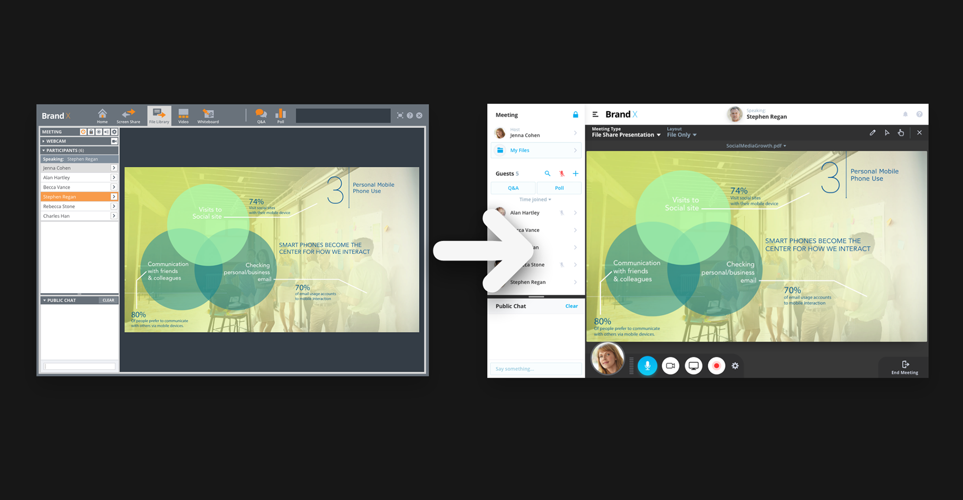
PGi aimed to modernize the GlobalMeet meeting room’s UX and UI, making it more intuitive and user-friendly. However, longtime stakeholders were hesitant to change an established product, fearing it might alienate existing users.
To address these concerns, I set out to establish objective, data-driven insights that would guide the redesign and demonstrate its impact.
primary objective
Establish baseline usability metrics for the current meeting room to measure improvements against after the redesign.
secondary objective
Benchmark these results against competing applications to assess how GlobalMeet compares in terms of usability and ease of use.
By grounding the redesign in measurable improvements, I aimed to provide stakeholders with clear evidence of its benefits, ensuring buy-in and alignment across teams.
methodology
To ensure the GlobalMeet meeting room redesign was both user-friendly and effective, I implemented a research-driven approach that combined prototype testing and A/B testing.
prototype testing
I conducted design prototype testing by sharing static image prototypes with participants to evaluate the viability of the redesign early in the process. This allowed us to identify potential usability issues before committing to full development.
A/B testing
I ran A/B tests where participants were presented with either the existing interface (A) or the redesigned version (B). By analyzing user responses and interactions, I was able to determine which design performed better in terms of usability and efficiency.
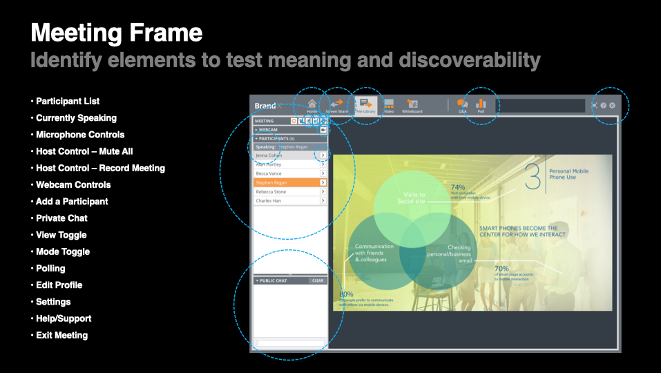
I focused testing on key meeting room features, including microphone and webcam controls, adding participants, muting others, chatting, polling, and content sharing. By gathering objective data on these core interactions, I was able to make informed design decisions that improved usability while addressing stakeholder concerns.
definition of success
To measure the impact of the GlobalMeet meeting room redesign, I established clear success metrics based on user performance and confidence levels.
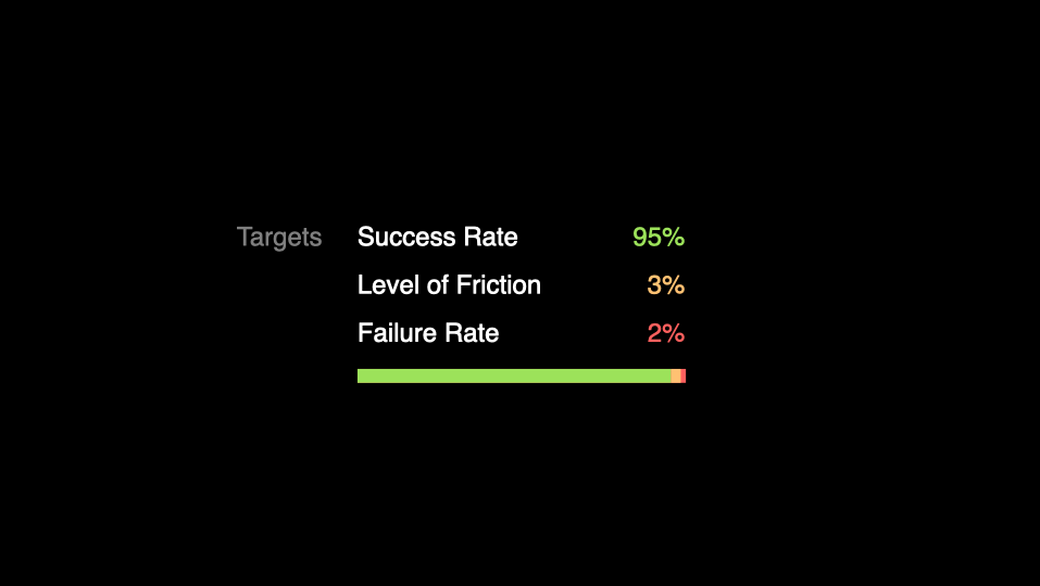
success rate: 95%
A task was considered successful if users completed it quickly and confidently, without hesitation or uncertainty.
level of friction: 3%
Friction was measured when users completed a task but experienced uncertainty or took longer than expected due to hesitation or confusion.
failure rate: 2%
A failure was recorded when users were unable to complete a task, either by performing it incorrectly or abandoning it altogether.
By setting these benchmarks, I was able to evaluate how well the redesign improved usability while ensuring that changes did not introduce unnecessary complexity or frustration for users.
recruiting test subjects
To ensure our usability tests reflected real-world scenarios, I used usertesting.com ↗︎ to recruit participants who matched our product’s target demographic.
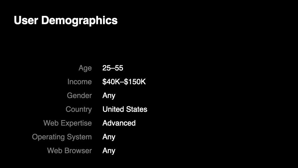
Each test subject was given a predefined user persona to guide their mindset during the test:
“Imagine you’re Jenna Cohen, a manager in a mid-sized company. In this test, you will be hosting an online meeting for several of your colleagues. This prototype is a static image, and we will only be asking questions based on what you can see on your screen.”
Participants were then asked to complete tasks related to key meeting room features, such as microphone and webcam controls, adding participants, muting others, chatting, polling, and sharing content. After each test, I reviewed the recorded session and logged the results in a spreadsheet to analyze patterns and identify areas for improvement.
setting a usability baseline
Before making any design changes, I conducted usability tests on the existing meeting room interface to establish a baseline for comparison. These tests provided concrete data on how well users could navigate key features, helping us measure the impact of future redesigns.
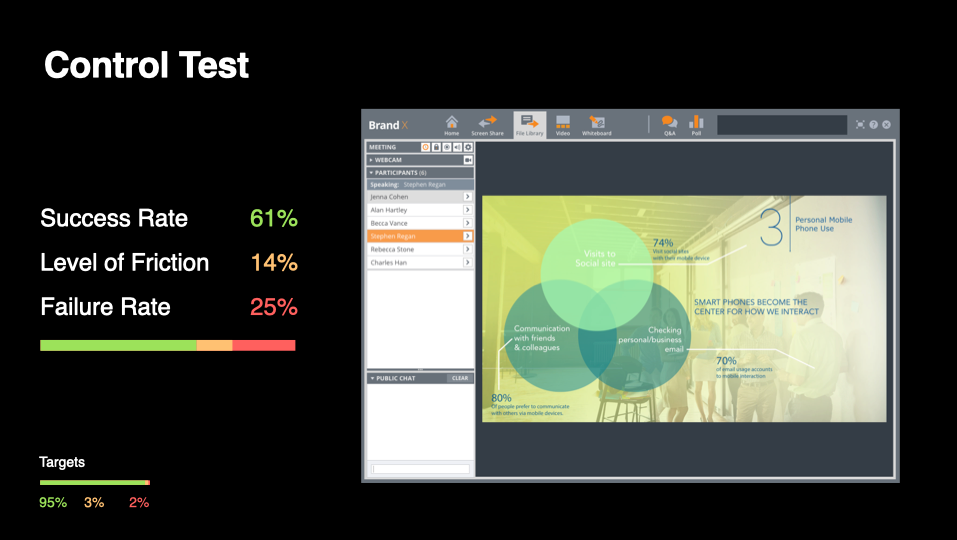
The results revealed significant usability challenges:
success rate: 61%
level of friction: 14%
failure rate: 25%
level of friction: 14%
failure rate: 25%
With a 25% failure rate and noticeable friction, it was clear that the existing design was causing confusion and inefficiencies. These insights reinforced the need for a redesign and provided objective data to help overcome stakeholder resistance to change.
competitor analysis
To better understand how PGi’s meeting room compared to the competition, I conducted usability tests on Zoom, WebEx, GoToMeeting, and UberConference, following the same testing methodology. This allowed us to benchmark our product against industry standards and identify areas for improvement.
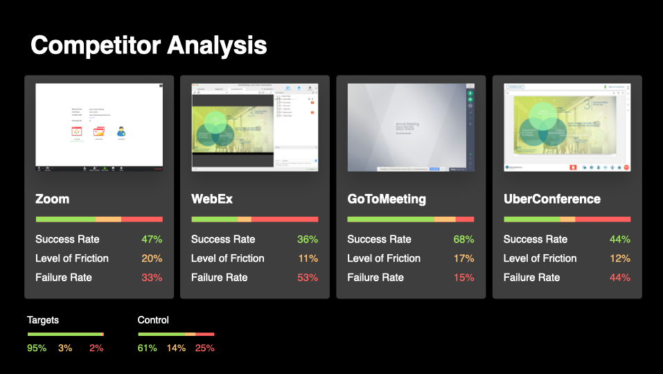
Among the competitors, GoToMeeting performed the best, with the following results:
success rate: 68%
level of friction: 17%
failure rate: 15%
level of friction: 17%
failure rate: 15%
The key takeaway from this analysis was that none of the competitors had an exceptionally usable meeting room. This insight presented a major opportunity—if we could achieve our usability targets, PGi’s meeting room could stand out as a market leader in both usability and user experience.
user tests: round 1
In the first round of usability testing, I evaluated 12 redesign concepts through 135 user tests, generating a total of 2,025 data points. The goal was to identify which design iteration performed best and how it compared to both our existing meeting room and our competitors.
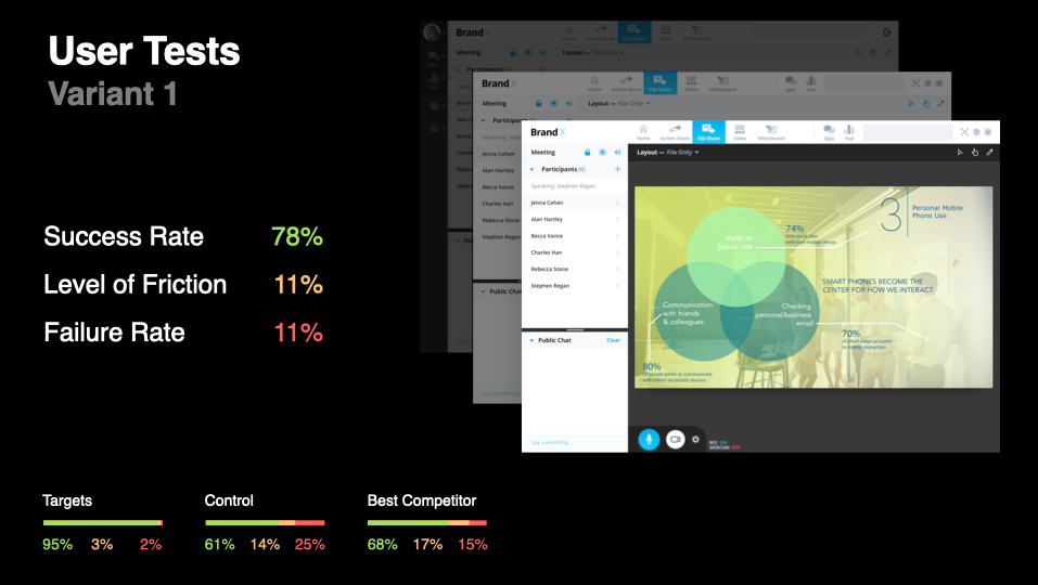
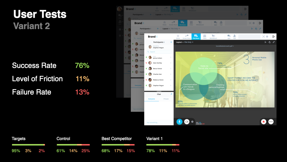
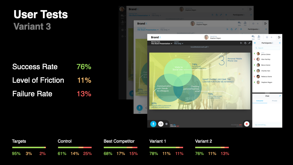
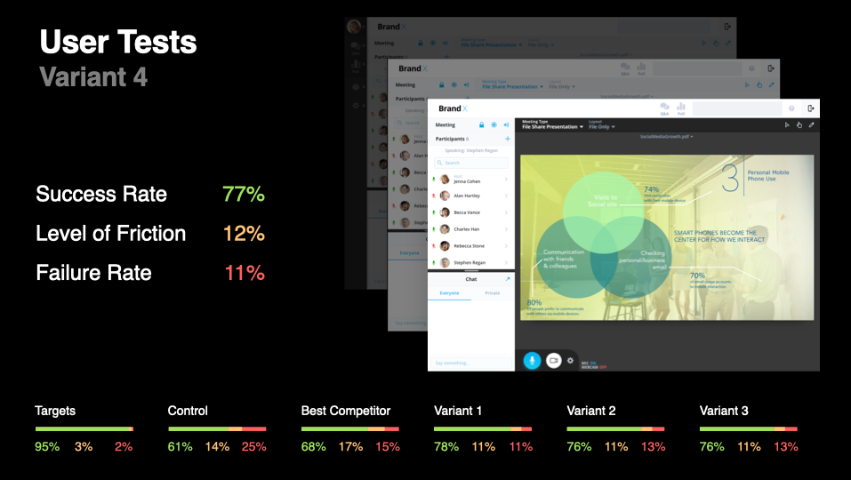
The most successful redesign concept achieved the following results:
success rate: 78%
level of friction: 11%
failure rate: 11%
level of friction: 11%
failure rate: 11%
While this was a significant improvement over our baseline usability (61% success rate) and outperformed all competitor platforms (best competitor: 68% success rate), it still fell short of the usability targets I set for success. This round of testing provided valuable insights that guided further refinements in the next iteration.
iterations: round 1
After analyzing the test results, I aggregated all user feedback to identify the key factors contributing to friction and failure. The data highlighted three major areas that needed improvement:
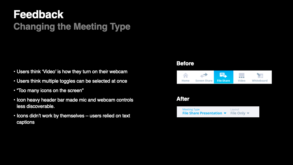
changing the meeting type
Users struggled to understand how to switch between different meeting formats.
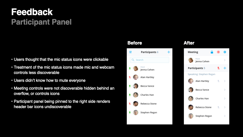
participant panel
Testers found it difficult to locate and manage participant controls efficiently.
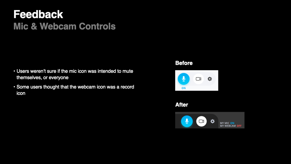
mic & webcam controls
Users hesitated when adjusting audio and video settings, indicating a lack of clarity in the UI.
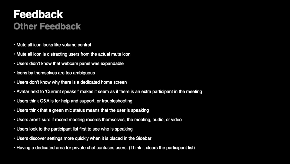
other feedback
In addition to these focus areas, I made several other refinements based on the test findings to further improve usability. These design iterations were then incorporated into a new prototype, which would be tested in the next round of user research.
user tests: round 2
Building on the insights from the first round of testing, I conducted a second round of user tests to evaluate six new redesign concepts. This round included 130 tests and produced 1,960 results, further refining the meeting room’s usability.
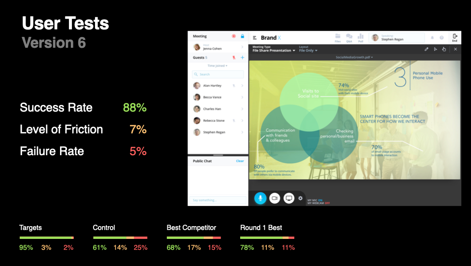
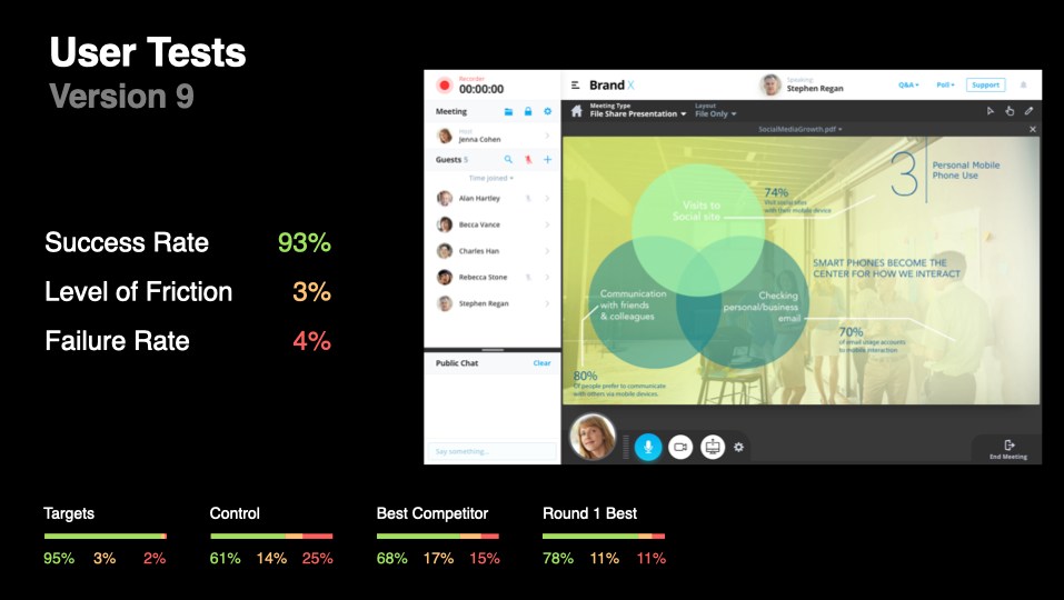
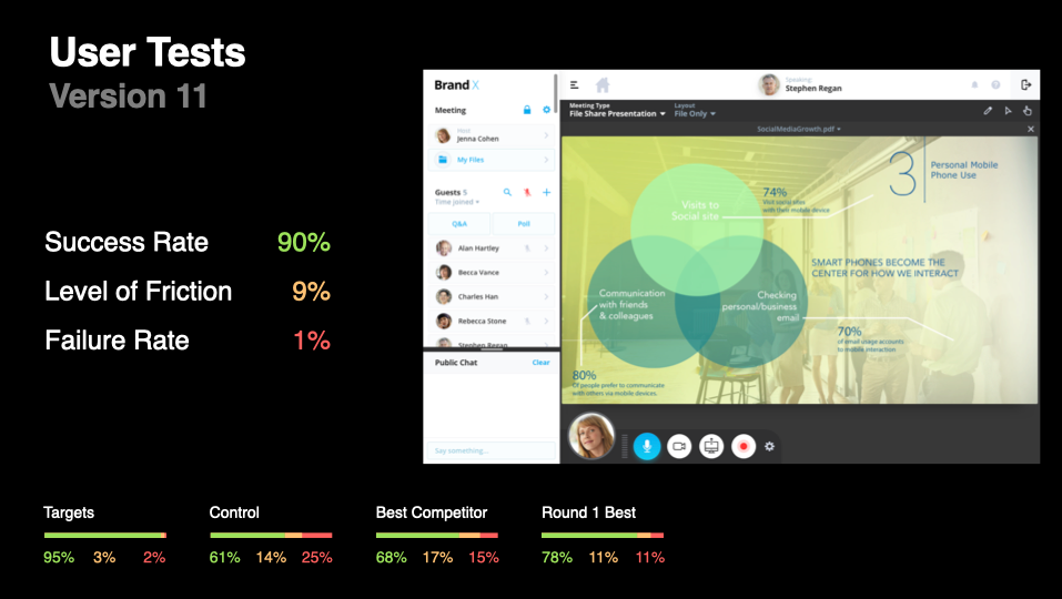
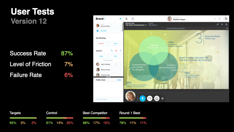
The most successful redesign concept achieved:
success rate: 93%
level of friction: 3%
failure rate: 4%
level of friction: 3%
failure rate: 4%
These results showed a significant improvement over both the original baseline and competitor benchmarks, bringing the design closer to the defined success targets. However, based on the feedback from this round, I saw additional opportunities for refinement, leading to another iteration cycle.
iterations: round 2
After analyzing the feedback from the second round of user tests, I identified the key areas that were still causing friction and failure for testers. The primary focus areas for improvement included:
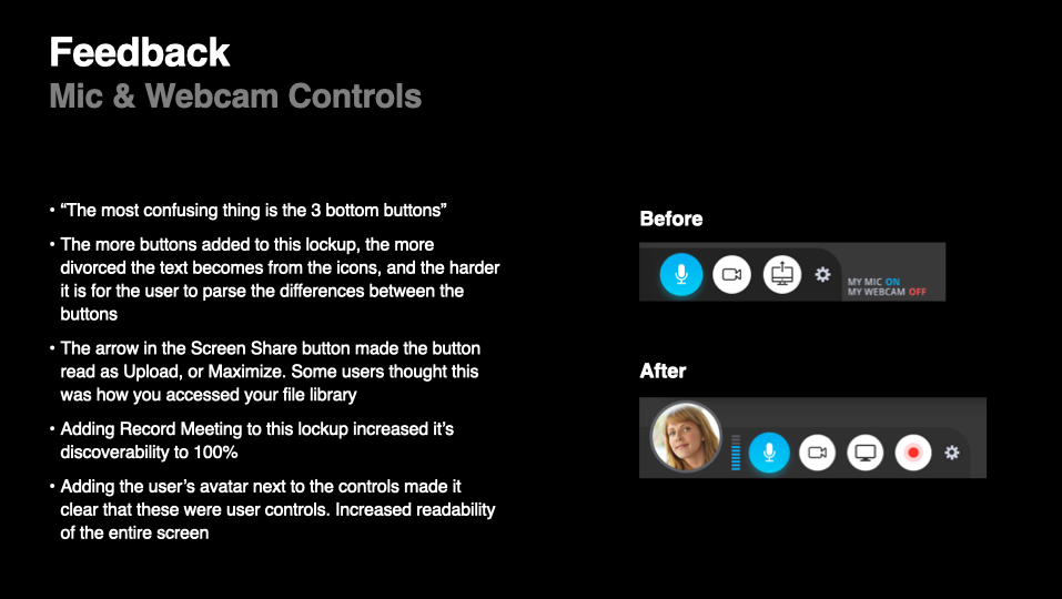
mic & webcam controls
Ensuring clearer visibility and easier access.
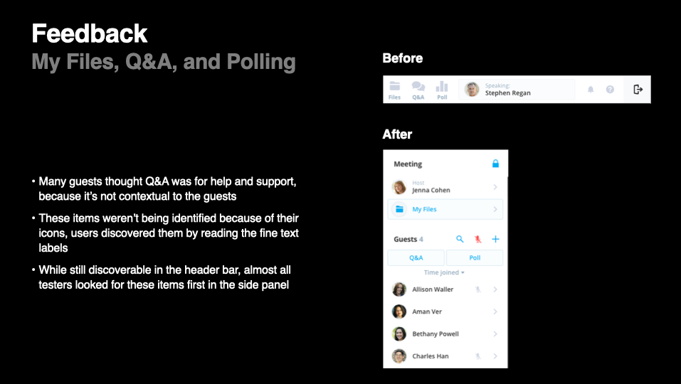
my files, Q&A, and polling
Improving organization and discoverability, enhancing the user flow for submitting and managing questions, and streamlining the process to make it more intuitive.
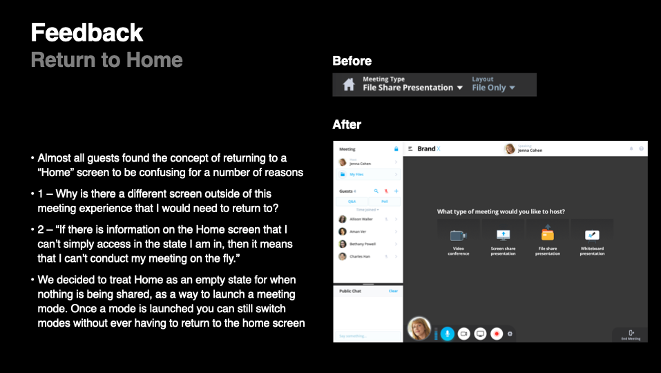
“return to home”
Making navigation back to the main dashboard more seamless.
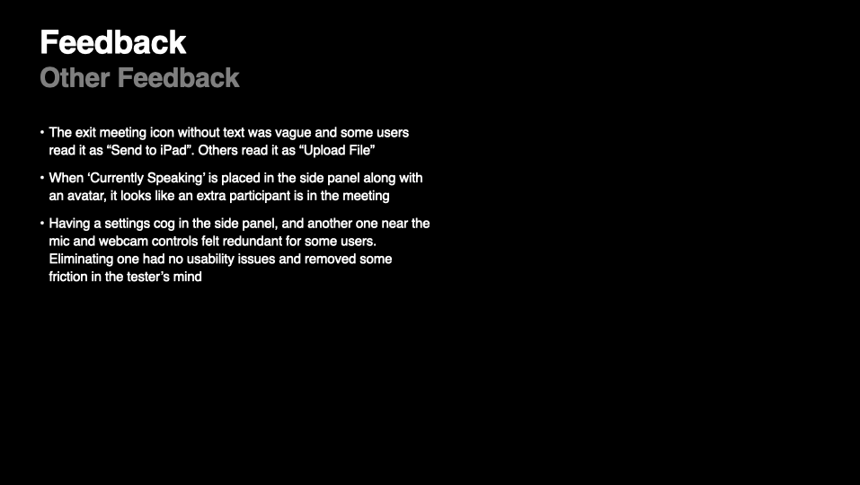
other feedback
In addition to these targeted refinements, I made several other design adjustments based on the test data. These iterations led to a final design proposal, which I prepared for the next and final round of user testing.
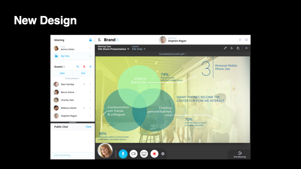
results
The final meeting room redesign delivered a significant improvement in usability, achieving:
success rate: 94%
level of friction: 5%
failure rate: 1%
level of friction: 5%
failure rate: 1%
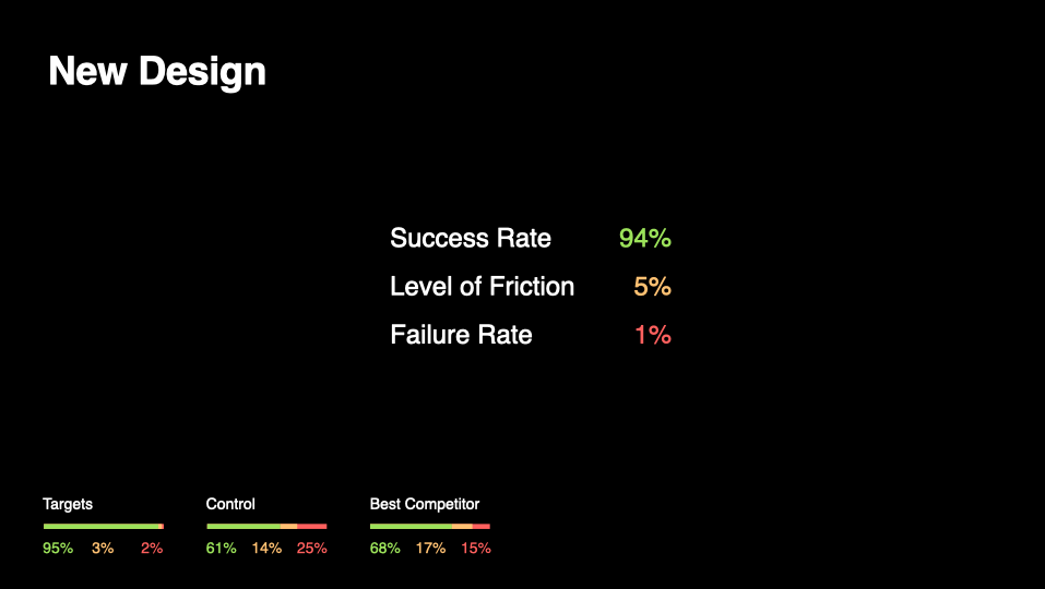
These results aligned closely with my definition of success, demonstrating that users could confidently complete tasks with minimal hesitation or confusion. With this data in hand, I had a strong, objective case to present to stakeholders, reinforcing the need to update the meeting room’s design to improve usability while ensuring a seamless transition for existing users.
impact
The success of the redesign not only met our usability targets but also won over key stakeholders, allowing GlobalMeet to move forward with the updated meeting room experience. The new design maintained familiar functionality while offering a modern, streamlined interface, easing concerns about alienating longtime users.
One seasoned GlobalMeet user perfectly captured the impact of the redesign, saying:
“I like that it is more simplified, clean, not as boxy as GlobalMeet. It looks newer even though it has the same feature sets. More simplified. Very Apple-like.”
This feedback validated the core design goals, ensuring a more intuitive experience without compromising the features users relied on.
tools used
Sketch, InVision, Usertesting.com