Accessible Components Do Not Make an Accessible Product
Every year since 2019, a small team at WebAIM in Utah has pointed an automated accessibility checker at the home pages of the top one million websites and published what it finds. The 2026 results came out this spring: 95.9% of those home pages had at least one failure the checker could catch on its own, up from 94.8% the year before, and the six most common problems have been the same six for seven years running.
The top two sit next to each other in the results table and look like the same kind of problem. The most common, on 83.9% of home pages, is low contrast text: words too pale against their background for a lot of people to read comfortably. The second, on 53.1%, is missing alternative text, meaning an image with no written description attached, so a person using a screen reader, the software that reads a page aloud, hears silence where the picture is, or hears a file name.
Now picture being handed each of those to fix across a company with two hundred products. For contrast, you decide once which colors may sit on which backgrounds, write it down, and the decision holds for every screen the company ships for the next decade. You never have to look at any of those screens. For alternative text, you have to look at one specific image, work out why it is on that page, and write a sentence about it. Then do it again for the next image. There is no version of that job you can finish in advance.
The two piles, and the question that sorts them
That difference is the whole argument. Some accessibility requirements can be settled without knowing anything about what will be on the screen; others cannot be settled until someone knows exactly what is on it. A design system, meaning the shared library of components, styles and rules a company's products all draw from, can guarantee the first kind completely and none of the second kind, ever.
The question that sorts a requirement into one pile or the other is easy to ask out loud: can the system answer this without knowing what the content is?
For a good number of requirements, it can. The contrast between any two surfaces the system defines. Whether an interactive target is big enough to hit reliably, which the current guidelines put at a minimum of 24 pixels. Whether the outline that appears when you tab to a control is visible against whatever sits behind it. Whether a component still works when someone zooms to 200%, or overrides the line spacing to suit their own eyes. Each of those has one correct answer for the entire organization, and one team can decide it once, before anyone opens a design file.
For the rest, the answer is no. What a button is called, in the words a screen reader will announce. Whether a heading is a second-level or a third-level one, which is how someone navigating by structure knows where they are. The order things should be read in. Whether an image carries information or only decorates the page. Whether an error message tells a person what to do next. Each of those has a different correct answer on every screen.
The dividing line is not difficulty, which is worth saying because people assume it is. Managing keyboard focus inside a complicated composite control is much harder engineering than writing three words of alternative text, and it still lands in the first pile, because the right answer does not change when the content does.
Why an "accessible theme" is a strange object
Start with what a high contrast theme actually is, since the term gets used loosely. Microsoft ships four of them in Windows, named Aquatic, Desert, Dusk and Night sky, at contrast ratios that are, in its own description, typically at or above 7:1. Someone turns one on in system settings, edits the colors if they want to, and from then on the operating system pushes those colors into applications and overrides what each application intended. The user is the one choosing, which makes the design system's obligation compatibility rather than authorship: do not fight the override, and do not hard-code colors that survive it and leave someone with white text on a white box. Martin Underhill, a UK developer who has written clearly on this, argues authors should stay out of the way, because people configure these themes for reasons an author cannot see, including some who deliberately pick a low contrast one.
An application-authored "accessible theme" is a different animal. It is a second complete set of color decisions, made by the same team that made the first set, maintained with a fraction of the attention, and reachable only by a person who knows it exists and goes hunting for the toggle. Shipping one does not add a guarantee to the product; it moves the guarantee out of the default and into an optional layer, and the default is now on record as the version that did not have to pass. The WebAIM trend suggests that is not a hypothetical worry: low contrast text rose from 79.1% of home pages to 83.9% in a single year, and the most solvable problem in the entire report is the one moving in the wrong direction.
The systems that solved it hid the guarantee inside the name
Two systems arrived at nearly the same move by different routes, and both are worth copying. The U.S. Web Design System, which the federal government publishes for its own agencies, puts every color on a lightness scale from 0 to 100, where 0 is white and 100 is black, and then publishes the arithmetic. Subtract one color's grade from the other and the difference tells you what you have: 40 or more clears the requirement for large text, 50 or more clears the normal-text requirement, 70 or more clears the strictest tier. They call it the magic number. A designer choosing colors needs no contrast checker and no formula, only subtraction, which makes the accessible choice and the convenient choice the same choice.
Adobe got there another way when it rebuilt Spectrum's colors, indexing every hue so that a color at index 700 meets or exceeds 3:1 against the default background and one at index 900 meets or exceeds 4.5:1, in every theme they ship. Neither system is a mode anyone switches into. Contrast becomes a consequence of picking a named thing correctly, and it holds by default, for everybody, whether or not they ever find a settings screen.
There is a portable idea underneath. Design systems talk about tokens, which are named design decisions, so a team writes "primary action color" instead of a particular shade of blue and the value underneath can change without anyone rewriting anything. What these two systems did is let a token name a relationship rather than a value. "Text on surface" carries an obligation a build process can verify every time, where a token that merely names a gray carries a number, and a number only gets checked by someone who remembers to check it.
The other pile is getting bigger, not smaller
The optimistic version of this story is that as component libraries improve, the second pile shrinks: more accessibility gets absorbed into the components, less left over for product teams. The evidence points the other way.
ARIA is a set of labels developers attach to page elements to tell assistive software what something is and what state it is in, needed when the underlying element does not say so on its own. Something styled to look like a checkbox has no way of announcing itself as a checkbox, so someone has to say it. WebAIM found ARIA use rose 27% in a single year, to an average of 133 of these labels per home page, and that pages using ARIA averaged 59.1 detected errors while pages using none averaged 42. WebAIM frames that as roughly 17 extra barriers on a page that uses it.
None of that means ARIA is bad; the W3C's own guidance opens by telling developers to reach for a native element instead whenever one exists, which suggests a fair number of those 133 labels are repairs to something that did not need breaking. What the numbers describe is the layer where product teams wire components into a real application, and that layer is busier every year and no better at it.
The alternative text figures make the same point from the other direction, because filling a slot is not the same as answering a question. WebAIM found that 10.8% of images that did have alternative text had text that was useless: a file name, the word "graphic," or a duplicate of the caption sitting right beside it. Counting everything, more than one in four images on these pages has alternative text that is missing, questionable or repetitive. No component can fix that, having never seen the picture, and no automated checker can either. Deque's audit data puts machine detection at 57% of accessibility issues, leaving the other 43% to a person.
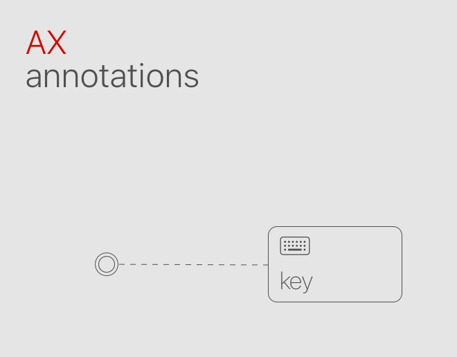
GitHub's design system team, writing about why they annotate their design files, described the mechanism exactly: arranging a series of accessible components on a page does not produce a correct heading structure, and their documentation cannot write the alternative text for you.
The strongest case against this
The best objection is that I am being unfair to the high contrast theme.
Plenty of people need considerably more contrast than 4.5:1, and the guidelines concede as much by defining a stricter 7:1 tier that almost no product meets by default. A team that ships a real high contrast option is serving those people now, rather than waiting on a token rebuild that may never get funded. On that reading an accessible theme is not an evasion, just the pragmatic thing available.
A weakness in my own evidence is worth volunteering too. WebAIM's figures come from an automated checker, which is excellent at catching pale text and hopeless at judging whether a sentence of alternative text is any good. The report therefore over-represents the pile I am calling easy and under-represents the pile I am calling hard, which makes my numbers tidier than the reality, and means the second pile is larger than the published figures show.
What survives both points is the difference between a preference and a guarantee. A high contrast option is a preference, like dark mode, and preferences are worth shipping. A guarantee is the thing that is true whether or not anyone touches a setting. When the only place a guarantee lives is inside a mode, most people never receive it.
Where each obligation should live
The practical failure is not that teams are unaware of their responsibilities. It is that one pile gets enforced by a build process and the other gets published on a guidelines site, and a build process wins that contest every time.
So the decision worth making, and it is a leadership decision rather than a technical one, is where each obligation lives. Anything the system can settle without seeing the content belongs in the defaults and the tokens, with no toggle and no parallel theme. Anything that depends on the content belongs at the moment of use: required rather than optional when a component gets placed, and written into the definition of done. A component that renders happily with no accessible name attached will ship without one across two hundred products, and nobody will file a bug, because nothing looks broken.
There is a cheap test for where you currently stand. Take the accessibility issues your teams logged last quarter and sort each one with the question. Anything landing in the first pile is a defaults problem, and no amount of training your product teams will fix it. Anything landing in the second is a handoff problem, and no amount of improving your components will fix that either. Most teams find they have been spending their effort on the opposite pile from the one their bugs are in.
Conclusion
Sort every accessibility requirement by one question: can the system decide this without knowing what the content is? Contrast, target size, focus visibility, zoom behavior, motion preferences and keyboard operation all can, which puts them in the defaults and in the tokens themselves rather than in an accessible theme that quietly concedes the default was optional. The systems that handle this best bury the guarantee inside the name of the thing, so a designer who picks correctly cannot produce an inaccessible result. Names, headings, reading order, alternative text and error messages cannot be decided in advance by anyone, so no amount of component quality will ever supply them. For that second pile, the system's job is not to answer the question but to refuse to let it go unanswered, at the moment of use, in front of the person who actually knows what the content is.