"Users spend most of their time on other sites. This means that users prefer your site to work the same way as all the other sites they already know." ~ Jakob Nielsen
A friend of Don Norman's once got trapped in the doorway of a post office in a European city. The entrance was a row of six glass swinging doors, followed immediately by a second, identical row. He pushed one of the outer doors, it swung inward, and he was in. Then something distracted him and he turned around for a moment.
When he turned back and pushed the next door, nothing happened. He pushed again. Nothing. He turned once more and tried the doors he had just walked through. Those would not move either. Concern, then mild panic. He was standing in a glass box he had entered voluntarily, and he could not work out how to leave it.
The doors were beautiful. The architect had wanted an uninterrupted plane of glass, so the supporting pillars were concealed, the hinges were concealed, and nothing on the face of any door indicated which edge was fixed and which edge swung. Norman's description of the effect in The Design of Everyday Things: "No distracting lines, no visible pillars, no visible hinges." Then his verdict: "Attractive doors. Stylish. Probably won a design prize."
The part of the story nobody repeats
The lesson usually taken from this is that the architect chose beauty over usability, which is true and which stops one step early.
Count the doors. Six, and then six more. Whatever was decided about that door was decided once and manufactured twelve times, in a row, on the busiest wall in the building. It was not a bad door. It was a bad door specification, applied uniformly, at the only scale that building had.
That is the thing a design system is, which makes the comforting version of this story backwards. A design system does not prevent Norman doors. It reproduces whichever doors you put in it, and the measures it reports on will not tell you which kind you have.
The door failed at communication, not at consistency
Norman drew a distinction in the revised edition of his book that matters here, and he drew it because designers kept collapsing the two ideas. An affordance is what an object makes possible. A signifier is what tells you where and how to act. In his words: "Affordances determine what actions are possible. Signifiers communicate where the action should take place. We need both."
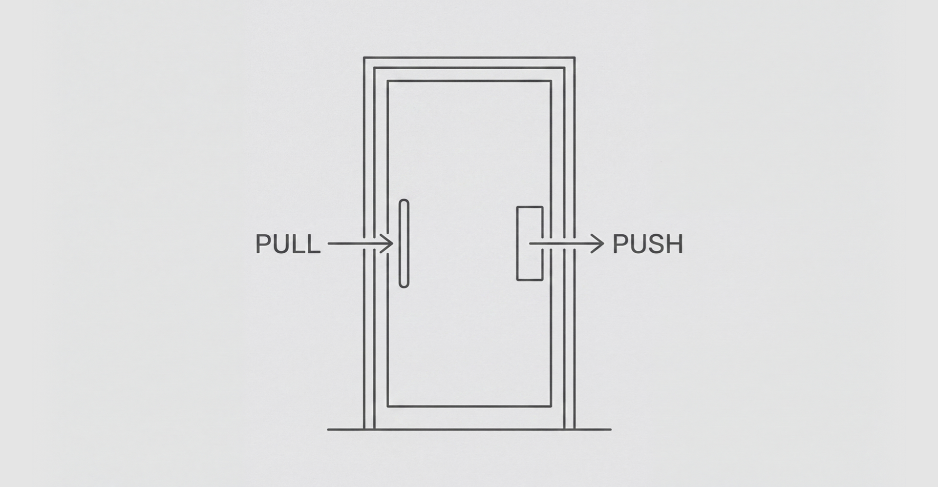
The everyday version: a flat metal plate at shoulder height tells you to push, and a vertical bar you can wrap a hand around tells you to pull. Nobody teaches you this, and you do not have to have visited the building before. The hardware says what it wants, on first sight, to a stranger. Norman puts discoverability and understanding at the top of his list of what good design has, and both are properties of a single first encounter.
The post office doors had the affordance, since a glass panel on hinges obviously swings. What they had no trace of was a signifier.
Now notice what they did have. Twelve identical doors, indistinguishable from one another, built to a single specification and installed with perfect fidelity. Consistency was not missing from that entrance. Consistency is what made it inescapable. When the friend's first guess failed, his second guess failed the same way, because there was no second design to try.
A building where every door is different is exhausting, and that is a real problem
Walk through an ordinary office building and pay attention. The first door has a handle, you pull it, you are through. The next one has no handle, so you push. The one after that opens by itself and you brake awkwardly in front of it. Then a keypad, then a badge reader, then a door that swings back at you. Each of those doors is individually fine. Meeting forty of them in a day is what wears people down.
That is the strongest everyday case for a system, and the version of this argument I have been making for years stops right here: standardize the doors and the visitor stops spending attention on doors. It is correct as far as it goes. But be exact about what the standard bought. It removed the cost of re-learning. It did not supply what the post office was missing, which was a door that told a stranger what to do before they touched it.
A building where every door is identical and none of them announces which way it swings is not a solved building. It is one mistake made everywhere at once, and it goes unfixed because it stops feeling like a mistake.
Grudin's knives
The most useful thing ever written about this is nearly forty years old. In 1989, Jonathan Grudin published an argument in Communications of the ACM called "The Case Against User Interface Consistency," and he opened it with a kitchen.
Where do you keep the knives? Consistency has an obvious answer, and Grudin states it fairly: "All may be kept in the same drawer. Consistent, easy to learn, easy to remember: there is one place to go for knives." Real kitchens do not do this. The paring knife lives near where vegetables get cut, the bread knife near the board, the steak knives with the table settings. Grudin is direct about the cost: "By distributing the knives, we have introduced inconsistency and increased the time needed to learn where to find them." And about why it wins anyway: "We have made the knives easier to use by placing them according to how they are used, according to the tasks in which they are involved."
He then separates consistency into three kinds. There is a design's consistency with itself. There is its consistency with other interfaces the person already knows. And there is its correspondence to things in the world outside the computer.
Only the second and third do what a push plate does, because both borrow from knowledge the person already arrived with. Internal consistency borrows nothing. It is also the only one of the three a design system can enforce automatically, audit on a schedule, and put on a slide, which is precisely how it ends up being the one that gets managed. Grudin's warning is about that substitution: "when user interface consistency becomes our primary concern, our attention is directed away from its proper focus: users and their work."
The failure does not report itself
Here is why none of this self-corrects.
When people cannot work something out, they mostly do not file a complaint. They conclude they are the problem. Norman quotes a woman apologizing to a machine that had defeated her: "I'm sorry. I am so bad at mechanical things." He points out that the apology is pointed in the wrong direction, and that it is the ordinary direction.
When people do not blame themselves, they route around the obstacle quietly. Ross Koppel and colleagues studied barcode medication systems across five hospitals and published the results in the Journal of the American Medical Informatics Association in 2008. These systems exist to confirm that the right drug reaches the right patient, by requiring a scan of the medication and a scan of the patient's wristband. The researchers documented 15 distinct types of workaround and 31 causes for them. Nurses affixed patient identification barcodes to computer carts, to doorjambs, and to their own belt rings. They carried several patients' pre-scanned medications together on one cart. Nurses overrode the system's alerts for 4.2% of patients charted and 10.3% of medications charted.
Those override rates are small, and they are not the finding that matters. The belt rings are. A barcode on a nurse's belt scans exactly like a barcode on a patient's wrist. The safety check produces the same record either way, so the compliance report reads clean while the check itself has been bypassed. This is a failure that files itself as a success, in a setting with more oversight than any design system will ever have.
Design system teams have the milder version of the same blindness, and it is measurable. Sparkbox's 2022 survey collected 219 responses from people building and using design systems. Only 16% tracked any metrics at all, a figure unchanged from the previous year. The survey also found that respondents' top five challenges were identical to their top five priorities: expansion, adoption, design-code parity, technical debt, and education.
Every item on that list is a question about the system's relationship with the teams that consume it. Not one of them is a question about whether a person got through the door. The review that would have caught the post office entrance did not exist. The review that did exist asked whether the doors matched the facade, and they matched it perfectly.
The best argument on the other side
Jakob Nielsen's formulation of this is hard to beat: "Users spend most of their time on other sites. This means that users prefer your site to work the same way as all the other sites they already know."
Taken seriously, that dissolves my distinction. A flat glass panel with no hardware is a signifier now, for a great many people, because they have met a thousand of them and learned what to do. Learned conventions work, and they cost nothing to reuse. Most patterns in most design systems were never invented in the first place; they were inherited from conventions someone else had already validated on a far larger population than one company can assemble. Design systems have also raised the floor on contrast, focus visibility, target size and keyboard operation across whole organizations, and that floor holds whether or not anybody measured it.
I should say plainly where my own evidence runs out. I cannot point you to a study showing that design systems make products harder to use. What I can show is what teams measure, which is a claim about attention rather than about outcomes.
But notice the scope of Nielsen's law. It is a statement about conventions that exist outside your product, in the population you are designing for. It transfers no benefit whatsoever to a pattern your own system invented eighteen months ago and then applied to two hundred screens. Internal consistency with a novel invention is not Jakob's Law. It is the post office entrance with better documentation.
A test you can run on your own library
Take any pattern in your system and put it in one of three groups.
It communicates on first encounter, to a person who has never used your product. It does not communicate, but the convention exists widely outside your product, so most people arrive already knowing it. Or it does not communicate, and the convention exists only inside your product.
The third group is legitimate and sometimes unavoidable. It arrives with a bill: somebody has to teach every new user, and you should be able to name who does that and what it costs. Most systems have third-group patterns filed as first-group patterns, because the pattern has been in the library long enough that everyone on the design system team reads it instantly. Your own fluency with your own doors is not a usability finding.
So add one standing question to component review. Not whether the component is consistent with the system, because that gets asked and answered every time. Ask instead: what does a person who has never seen this do first, and what on the component itself tells them? If the honest answer is the documentation, you have a flat glass panel, and the documentation is not on the door.
Conclusion
The Norman door is usually taught as a story about an architect who cared more about the facade than about the people walking through it. The sharper lesson for anyone running a design system is that the door was a standard. One decision, made once, manufactured twelve times, installed in a row, and reviewed by people who were checking it against the building rather than against a stranger carrying groceries. Design systems inherit that exact shape. They are extremely good at removing the cost of re-learning, which is a genuine and underrated win, and they are silent on whether any given pattern communicates anything to someone experiencing it for the first time. Consistency is not the same thing as communication, and only one of the two is easy to audit. Watch which one your review process actually measures, because that is the one you are building.