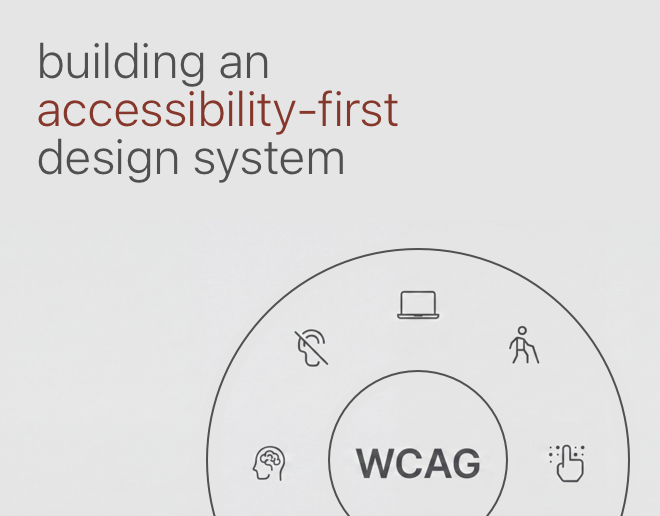
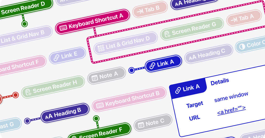
Accessibility annotations (AX Annotations) are a powerful tool for bridging the gap between design and development, ensuring that digital products are built with inclusivity in mind from the start.
These annotations provide clear, structured guidance on how UI elements should interact with assistive technologies, making it easier for developers to implement accessible experiences.
By embedding accessibility details directly into your designs, you not only improve usability for people with disabilities but also create more intuitive, user-friendly interfaces for everyone.
Let’s explore how AX Annotations can become a seamless and essential part of your design workflow.
Annotation Types
AX Annotations include a variety of types to cover all key aspects of accessibility.
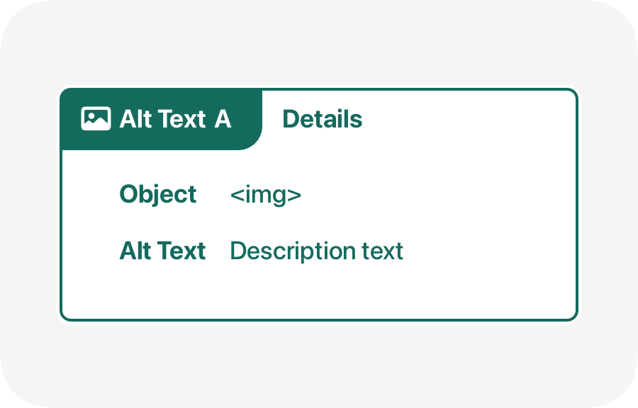
Alt Text
Used to describe images for screen readers, providing a textual alternative for visual content. Alt text ensures that users who are blind or have low vision can understand the content and function of images. It is crucial for conveying the purpose of icons, photos, illustrations, and any other graphical elements that convey information or have a functional role.
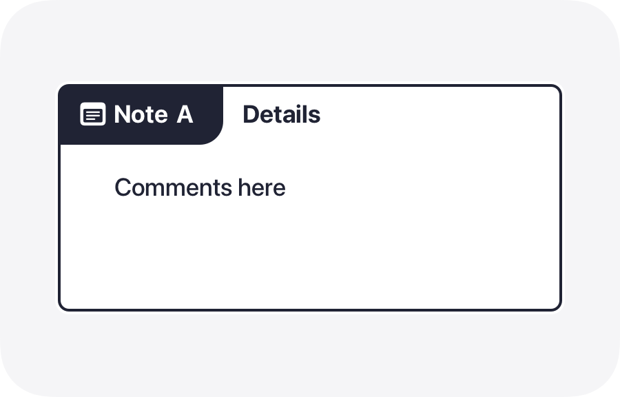
AX Comments
Used to add general accessibility notes. These comments can include any additional information or instructions necessary to enhance the accessibility of a design, such as reminders to check for device compatibility or suggestions for improving user interaction.
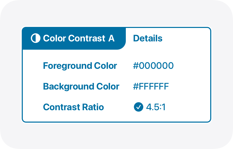
Color Contrast
Used to highlight areas needing sufficient contrast. Ensuring proper color contrast between text and background is vital for readability, especially for users with visual impairments or color blindness. These annotations help designers identify and rectify contrast issues to meet accessibility standards.
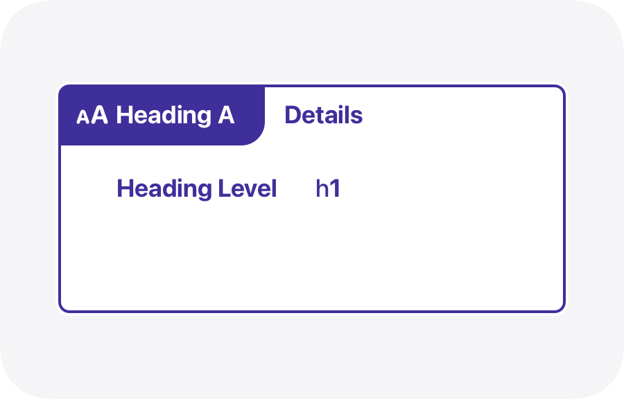
Heading Levels
Used to indicate heading hierarchies. Proper heading structure is essential for screen readers to navigate content efficiently. These annotations help designers assign correct heading levels (H1, H2, H3, etc.) to maintain a logical and accessible content structure.
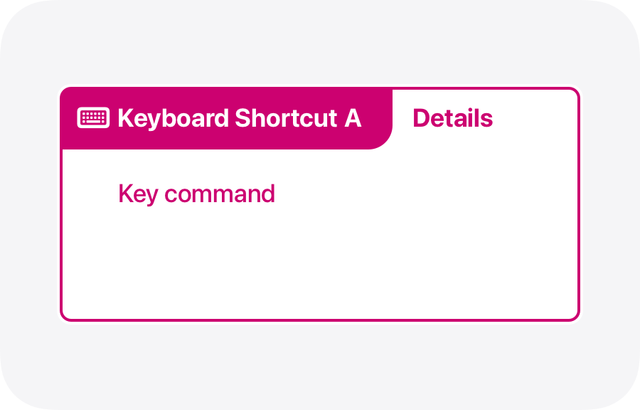
Keyboard Shortcuts
Used to specify keyboard navigation options. Keyboard accessibility is crucial for users who rely on keyboard navigation instead of a mouse. These annotations identify and document the keyboard shortcuts and tab orders needed to navigate the UI efficiently.
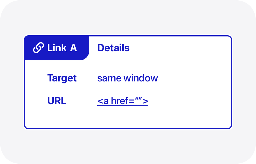
Links
Used to identify and describe link behaviors. Clear and descriptive links are essential for accessibility. These annotations help designers specify the purpose of each link, ensuring that users understand where each link will take them.
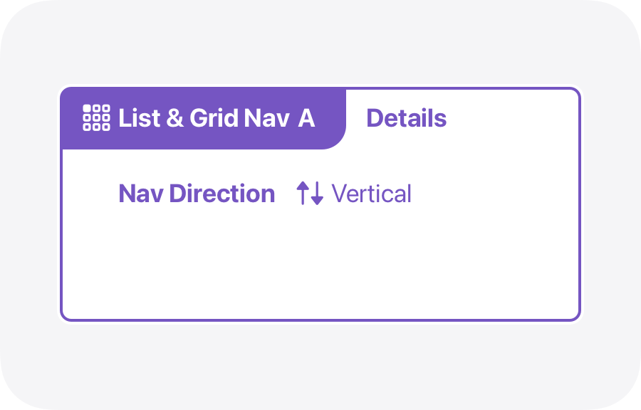
List & Grid Nav
Used to define navigation patterns in lists and grids. Properly annotated lists and grids improve navigation for screen readers and keyboard users. These annotations ensure that the order and structure of list and grid items are logical and accessible.
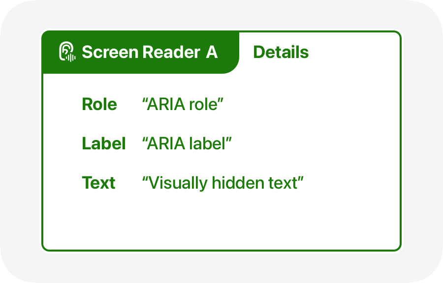
Screen Readers
Mark sections to be read by screen readers. These annotations indicate which parts of the UI should be accessible to screen readers, ensuring that important information is not overlooked and that interactive elements are properly described.
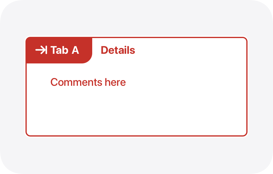
Tab Order
Used to outline the logical tabbing order. Defining a clear tab order is crucial for users who navigate using the keyboard. These annotations help designers arrange interactive elements in a logical sequence, ensuring smooth and intuitive navigation for all users.
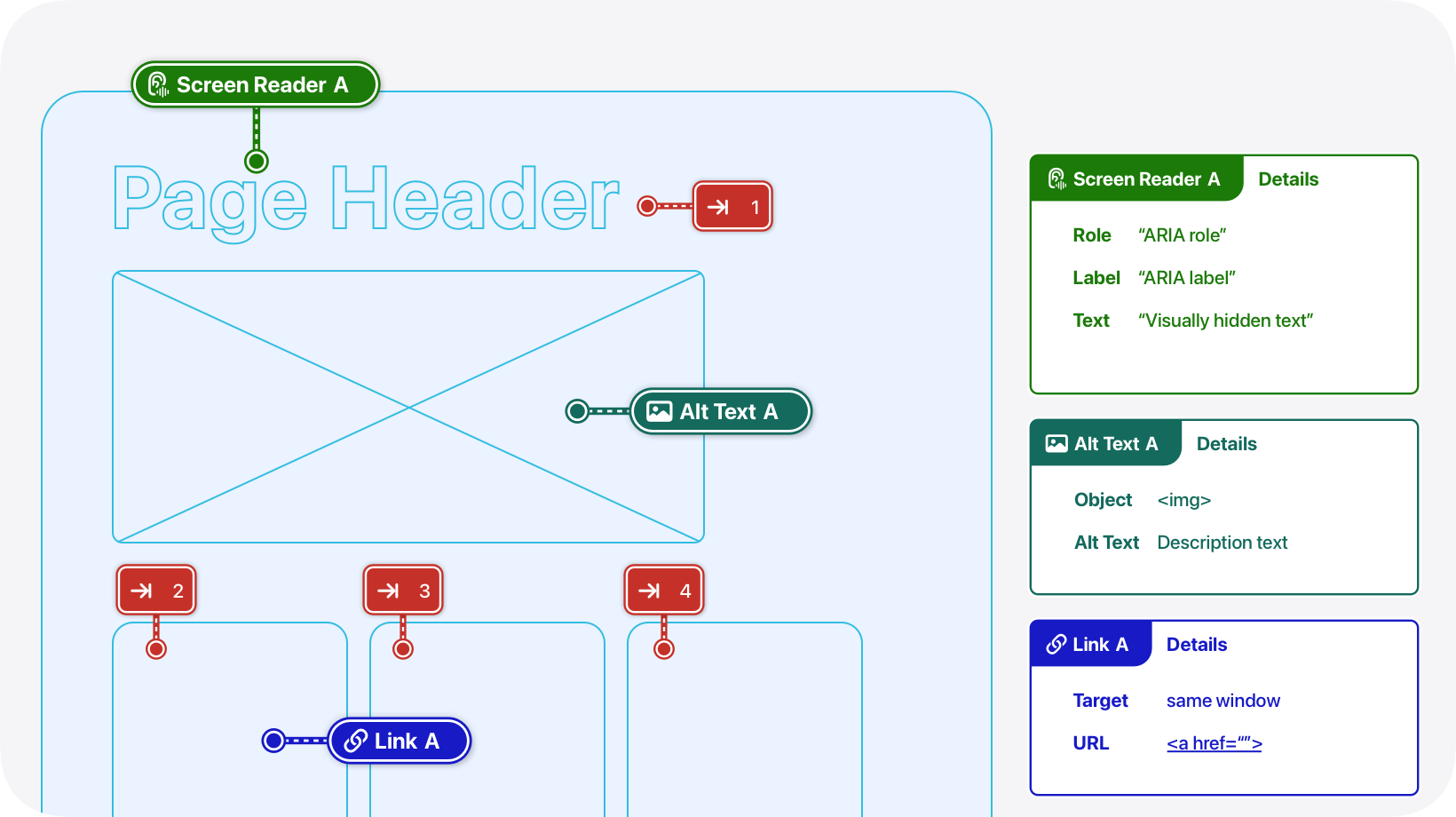
How to use annotations
Using AX Annotations in your designs is simple:
1) Add a stamp
Begin by placing a "stamp" on the relevant part of the UI. This could be a pin stamp for pinpoint accuracy or a lasso stamp for larger areas.
2) Write details
You can either write the details directly on the stamp or use it to reference an associated "details box" positioned off to the side of your design.
Stamps
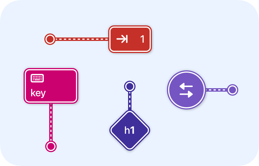
Stamps are visual markers that help designers communicate specific accessibility details within a UI design.
A stamp marks the type of annotation being referenced. Each annotation type, such as Alt Text, Color Contrast, or Tab Order, has its own unique stamp. These stamps serve as quick visual indicators, making it easy to identify the type of accessibility information being communicated.
Stamps should be placed directly on the interface element or area they refer to, providing exact guidance on what needs attention.
Pins and Lassos
When adding AX Annotations to your designs, it's important to choose the appropriate stamp to effectively highlight accessibility details. Our system offers two main types of stamps: pins and lassos. Understanding when to use each will ensure that your annotations are clear and precise.
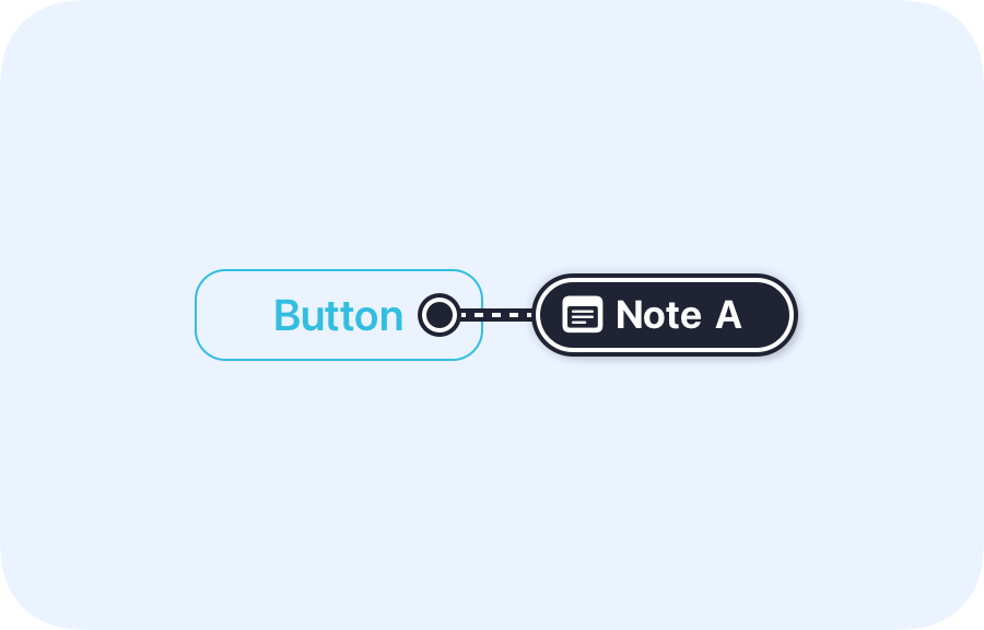
Pins
Pins are used to mark a specific, precise part of the interface. This tool is ideal when you need to annotate a single element or a very small area.
when to use pins:
• When the annotation applies to a specific element.
• When you need to provide detailed information about a particular point.
• When precise placement is crucial for clarity.
• When the annotation applies to a specific element.
• When you need to provide detailed information about a particular point.
• When precise placement is crucial for clarity.
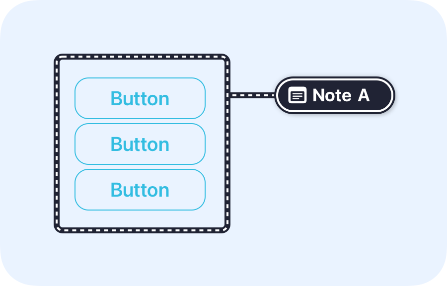
Lassos
Lassos are used to mark larger areas or regions within the interface. This tool is perfect for situations where the annotation applies to a group of elements or an entire section.
when to use lassos:
• When the annotation applies to a broader area rather than a single point.
• When you need to highlight the interaction or relationship between multiple elements.
• When annotating regions that encompass several components, ensuring that all relevant details are captured.
• When the annotation applies to a broader area rather than a single point.
• When you need to highlight the interaction or relationship between multiple elements.
• When annotating regions that encompass several components, ensuring that all relevant details are captured.
Write Details
Details contain the accessibility information you want to convey about the interface. They provide the specific guidance and context needed to ensure that a design is accessible and inclusive. They can include descriptions, instructions, or specifications that aid in making the design more accessible.
Details can be located within a stamp, or in a box positioned off to the side of the interface.
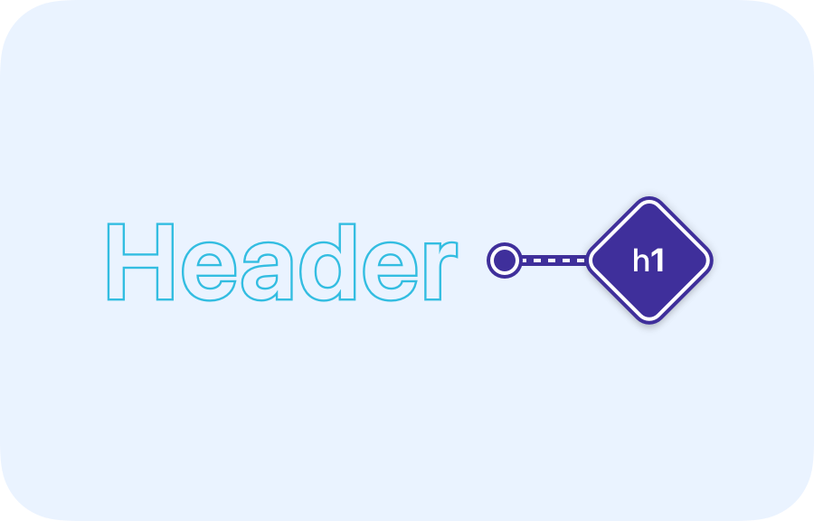
In-Stamp Details
For concise and immediate context, details can be placed directly within a stamp. This method is ideal for straightforward annotations where the information is brief and directly related to a specific element.
when to use in-stamp details:
• When the annotation requires a short, direct explanation (e.g. a heading level for a title, or a tab stop for a button)
• When the detail needs to be quickly associated with a specific element without additional reference
• When the annotation requires a short, direct explanation (e.g. a heading level for a title, or a tab stop for a button)
• When the detail needs to be quickly associated with a specific element without additional reference
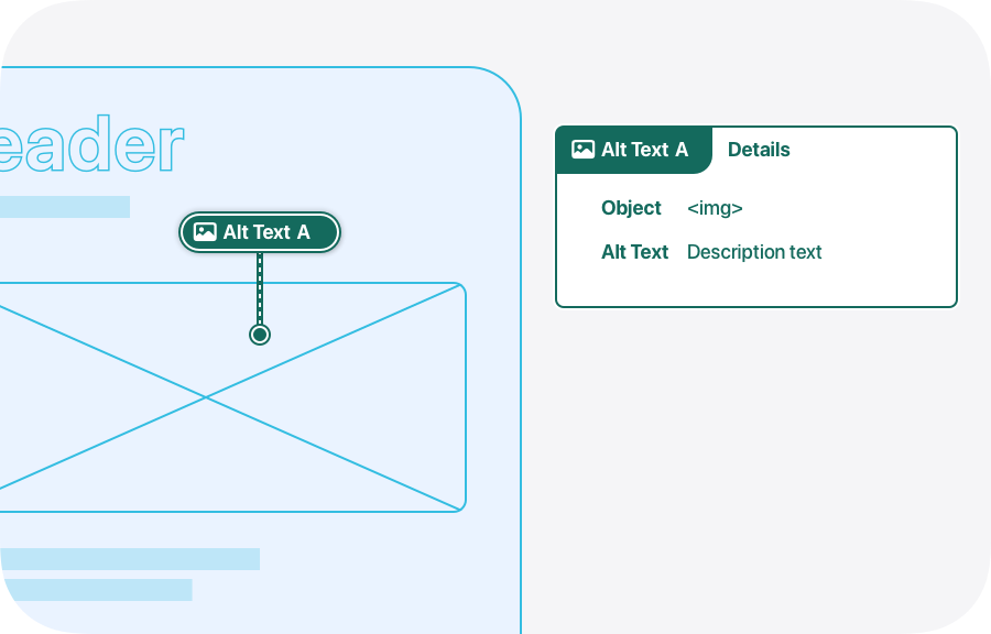
Details Box
For more comprehensive information, details can be placed in a details box positioned off to the side of your design. This allows for more extensive explanations or instructions without cluttering the main interface.
when to use a details box:
• When the annotation needs a more detailed explanation that won't fit comfortably within a stamp (e.g. explaining a complex interaction pattern or providing a list of keyboard shortcuts).
• When you want to keep the main design interface uncluttered, placing more extensive details in a box off to the side
• When the annotation needs a more detailed explanation that won't fit comfortably within a stamp (e.g. explaining a complex interaction pattern or providing a list of keyboard shortcuts).
• When you want to keep the main design interface uncluttered, placing more extensive details in a box off to the side
By incorporating accessibility annotations into your design workflow, you bridge the gap between design and development, ensuring that accessibility isn’t an afterthought but a core part of the user experience. These annotations provide clear, actionable guidance on how components should behave for assistive technologies, reducing ambiguity and streamlining implementation. More importantly, they champion inclusivity, helping to create digital experiences that are usable by everyone, regardless of ability. When accessibility is built into the foundation of a product, it leads to better, more thoughtful design for all users.