In September 2025, a research lab called Thinking Machines published a small experiment. They asked a language model the same question a thousand times. Not similar questions: the identical question, over and over, with the model's randomness setting turned all the way down to the position that is meant to make it answer the same way every time.
They got eighty different answers back.
Eight percent variation does not sound catastrophic until you remember what had been asked for. That setting is the one that promises repeatability. The correct number was one.
The cause had nothing to do with the model making choices. Requests arriving at a server get handled in batches, the size of the batch shifts the arithmetic underneath by a rounding error or two, and that is enough to send two answers down different paths. Which means the answer you get depends, in a small but real way, on how many strangers happened to be typing at the same moment you were.
Nobody designed that, and nobody can tune it either, because there was no decision behind it to tune. For two years that noise has only reached the words inside an answer. What happens when it reaches the layout is a design system's problem.
An interface is two things, and only one of them has changed so far
Split an interface into two parts that can vary independently. The scaffolding is the structure: where the answer appears, what container holds it, what order things come in, what actions sit beneath. The content is what fills that structure, meaning the words and numbers and images.
For most of software's history a person settled both before any user arrived. Conversational products broke the content half, and design system teams absorbed that with a familiar kind of engineering: components that survive text of any length, overflow rules, states for content still arriving and content that never arrives. OpenAI's public design guidelines for the apps that run inside ChatGPT are a rulebook in exactly that shape. Use our type rather than your own. No more than two primary actions on a card. Never put a scrolling area inside another scrolling area.
Every one of those rules governs what goes inside a box, and every one assumes the box is already there, in a known place, at a known size. That assumption is what made the last two years manageable.
The next change takes the container away
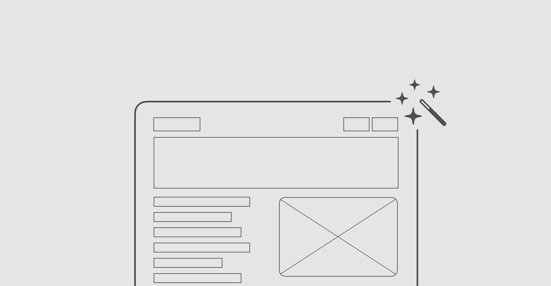
In November 2025, Google shipped the first serious version of the other thing. Its generative interfaces, which appear in the Gemini app and in Search, do not choose a layout from a set of prepared ones. For each response the model writes the interface itself: structure, styling and interaction, coded fresh for that one answer.
Two different things now make that layout unstable, and they are worth separating, because only one of them is anybody's decision.
The first is deliberate. The model is trying to fit the interface to the question, so a comparison gets a table and a route gets a map. Reasonable people can argue about whether that beats a fixed template, and later in this piece I will give the argument its best shot.
The second is the noise from the opening. Interface code comes out of the same machinery, on the same servers, in the same shifting batches as everything else, so two people asking the same question in the same second can get differently arranged screens for no reason at all. Google's writeup does not measure this, and as far as I can find, nobody has published a figure for how much a generated layout varies when nothing about the request has changed. The field is shipping generated structure without a published number for its own variance.
Either way a design system loses the same thing, because almost every promise it makes depends on knowing in advance where things will be.
Why a screen that stays put is worth money
Designers usually defend consistency on grounds of craft or brand coherence. There is a stronger argument available, and it has arithmetic behind it: consistency makes people faster.
Open a menu you have never seen and you read from the top until you find what you want, so your time grows with the length of the list. Use that same menu a hundred times and you stop reading and start reaching, because you know your item is fourth down, and the length of the list stops mattering much. Cockburn, Gutwin and Greenberg modeled both states in a 2007 paper at CHI, the main academic conference for interface research. A straight line for the first state, a curve that flattens for the second.
Picture that as a fraction of a second saved on one click and you will underrate it. The real difference is the shape of the two lines. One cost keeps growing as a screen gets denser and the other stops growing. On a five-item menu nobody notices. On an enterprise screen with fifty places a person might look, it separates a tool people eventually get fast in from one they never do.
Whether someone ever crosses from the first line to the second depends on a term in that model the authors call learnability. It is scored from zero to one and it measures how reliably the interface stays where you left it. A layout that never moves scores a one. Feed their equations an interface whose items land somewhere new on every visit and it scores zero, and at zero nobody ever crosses.
In plain terms, a product that reassembles itself every session has no experienced users. It has first-time users who happen to have been coming back for a year, each of them paying the beginner's cost on every visit.
The best argument against everything I just said
The case for generating the layout anyway is straightforward, and I do not think it is silly. If the arrangement is genuinely right for this person and this task, then consistency was only ever a rough substitute for getting it right, and there is no reason to keep paying for a substitute once you have the real thing.
Krzysztof Gajos and colleagues tested a version of that in 2008 using adaptive toolbars. They separated two properties that normally travel together: how accurate the adaptation is, meaning how often it puts the button you actually wanted within easy reach, and how predictable it is. Accuracy did nearly all the work. Improving the hit rate from 50% to 70% made people measurably faster, while making the algorithm easier to anticipate, on its own, did not. Google's raters point the same way, preferring its generated interfaces to ordinary chatbot answers.
That finding holds, and it does not carry as far as it first appears. What it measures is adaptation that a person designed and can keep improving: push accuracy from 70% toward 90% and by their own result people get faster again. It says nothing about variation that comes out of server load, which has no accuracy to raise, because nobody chose it in the first place. Google's writeup complicates the picture from the other direction as well, since interfaces built by human experts still rated highest, ahead of the generated ones, though the team does not publish by how much.
The honest position is not that generated layout is worse than a fixed one. It is that a generated layout blends a decision you can improve with noise you cannot, and nothing on the screen tells anyone which is which, including the team that shipped it.
Better instructions have never fixed this, in any field
A few years ago developers had a persistent complaint about language models. Ask for an answer in a particular format and you would usually get it, occasionally you would not, and the failures were expensive. OpenAI's first response was the obvious one, and it worked: the new model returned the correct format 93% of the time, up from under 40% a year earlier. And 93% was still not good enough, because a format that breaks once in every fourteen calls is a format nobody can build on.
So they shipped something else beside it. Not clearer documentation and not a better-worded request, but a mechanism that checks each word as the answer is produced and refuses any word that would break the required shape. The wrong answer stops being unlikely and becomes unavailable. That took the same model to 100%.
The same distinction is sitting in our own field, unnoticed. A design system team made their entire system machine-readable and connected it to coding agents, so that anyone could ask for a component and get the real one back. Thousands of prototypes came out of it. An audit of a sample found the components correct and the foundations wrong, meaning the underlying decisions everything else is built from: type sizes that were not on the approved scale, spacing that matched nothing, colors nobody had signed off.
Those foundation rules were in the system. They were machine-readable, accurate, and sitting right there. But the request was for a card, so a card came back, and nothing in that exchange obliged anyone to go and read the typography rules. Nobody did, and the gap filled with a guess.
The rules were available, and available turned out not to mean binding.
A test, and what to do about what it finds
Go through the rules your system holds and, for each one, name who enforces it in a world where no person arranges the screen. Wherever the honest answer is "a designer, at the moment they lay it out," your system is not enforcing that rule. Someone has been supplying it by hand, unrecorded, and that arrangement works right up until they leave the loop.
The repair is not to make generated layouts identical, because that is not on offer. Of the two things making them vary, you can argue with one and not the other. So the move is to decide which properties people actually navigate by, hold those fixed across every generated variation, and let the rest float.
That gives you a list, and it should be uncomfortably short. Results always read in the same order. A destructive action always occupies the same region. Type always comes from the approved scale. If people build muscle memory against it, it belongs on the list; if they do not, it probably does not.
Then the list needs teeth, which means checking each generated interface against it before anyone sees it and, when the check fails, falling back to a prepared layout rather than shipping the violation. That is a real cost and worth naming plainly. It means owning a fallback for every surface you allow generation on, and accepting a slower response on the occasions the check fires. Teams that skip that step will publish the list as guidance and land exactly where the audit above landed.
The list also has a ceiling. Researchers at CHI this year examined 300 interfaces generated by commercial models and found 541 places, close to two per interface, where the result passed every automated accessibility check and still told a screen reader user nothing: alternative text reading "image," links announcing themselves as "click here." A check can force structure. It cannot force meaning, and meaning stays with whoever knows what the content actually says.
Conclusion
Design systems came through the first wave of AI intact because a person was still deciding where everything went on the screen. All the system had to do was make the contents of each box flexible enough to hold whatever the model wrote. Generated layout removes that person, and what goes missing is not polish. People get fast at software by learning where things are, and nobody learns a screen that is rebuilt on every visit. Better guidelines will not fix that, because an agent that can look a rule up is under no obligation to follow it. The fix is to name the few things people navigate by, such as the order a result reads in and the place a destructive action sits. Hold those steady across every version the model produces, and check each screen against that short list before anyone sees it. Producing three absolutely consistent things is worth more than generating three hundred variations.