Details
Year: 2016
Platform: iOS
Role: UX/UI Designer
Tools Used
Sketch
Zeplin
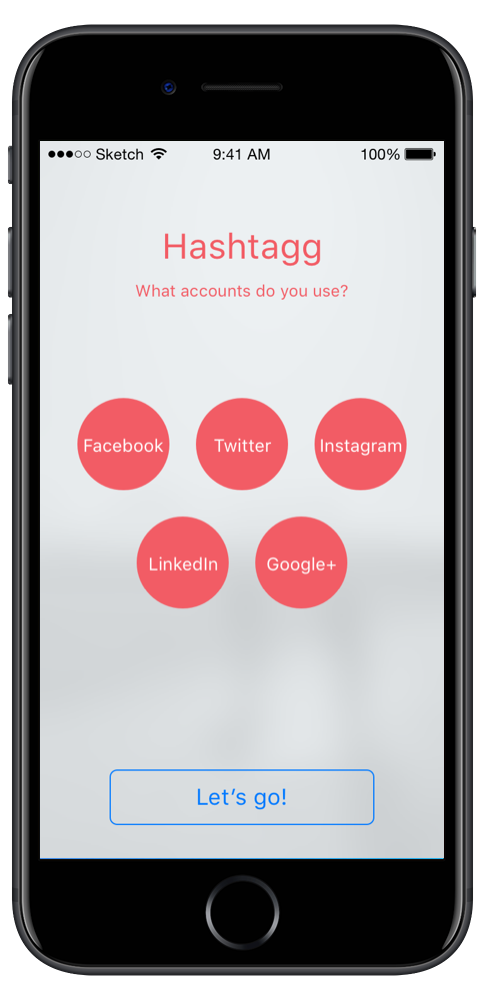
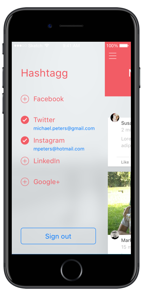
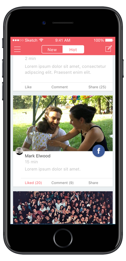
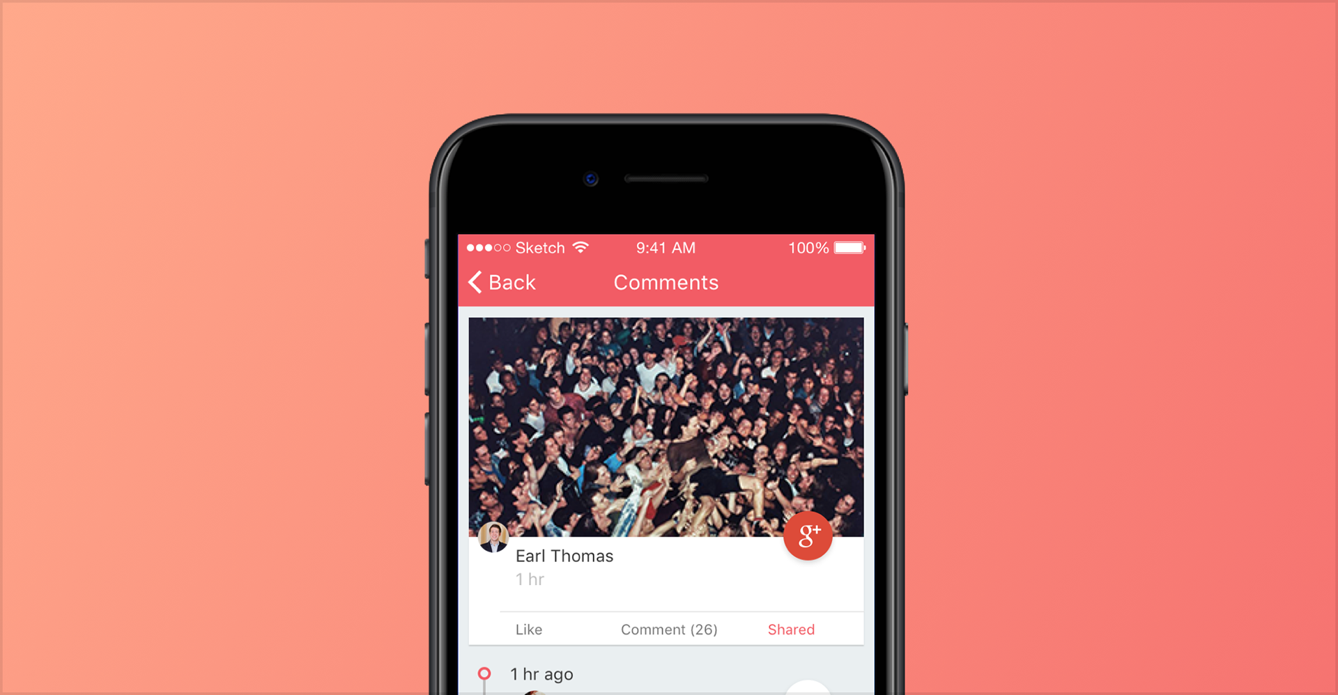
Hashtagg was a social media aggregator. It connected a person's Facebook, Instagram, Twitter, LinkedIn, and Google+ accounts into a single feed, and let them publish one post to several of those accounts at once. It was never a shipping product. It was built to prove to investors that the idea held up when someone used it.
Objective
Someone with five accounts checks five apps. Each one orders its feed differently, names the same actions differently, and means something different by a reply. The cost isn't any single app. It's the switching, paid several times a day, in attention that never produced anything.
An aggregator only pays that back if the merged feed reads as one thing. Five feeds stacked in one scroll view is five apps with a shared status bar, and a person can already do that with a home screen folder.
So the goal was to design and prototype an iOS app from the ground up that a potential investor could hold and use. Not a deck. A prototype, because a slide can claim a combined feed works and a prototype has to demonstrate it.
Approach & Methodology
Treated the five platforms as five different products
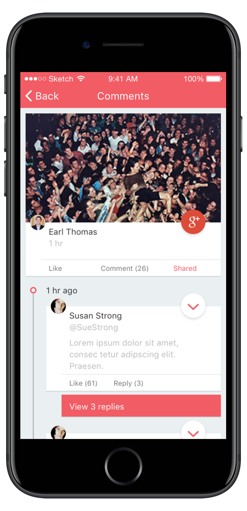
I ran a competitive analysis of Facebook, Twitter, Instagram, LinkedIn, and Google+, and documented how each one handles posting, engagement, and feed structure. The differences are the whole problem. A like isn't a favorite, a share isn't a retweet, and a comment thread on one platform nests where another one runs flat.
That analysis produced two lists: what the platforms agree on, and where they don't. The agreements became the shared interface. The disagreements became decisions I had to make on purpose, because a merged feed that invents its own vocabulary teaches the user a third language on top of the two they already know.
Studied the aggregators that already worked
I looked at existing aggregated feeds, Reddit among them, to see how other products sort content from unrelated sources without making the reader do the sorting. Designing this from a blank canvas would have meant relearning what those products already settled.
Tested with people who had the accounts
I ran usability sessions with friends and family who actually maintained multiple social accounts, and used what they found to refine the key interactions. Testing with people who only use one network would have validated the wrong thing, since the value of the product is only visible to someone paying the switching cost.
That sample was convenience-recruited and small. It caught interaction problems, which is what it's good for. It can't say anything about whether people would adopt the product.
Wrote the spec for one developer
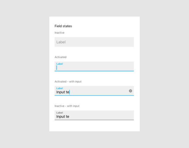
A solo iOS developer built the prototype, so I delivered design specs and interaction documentation rather than static screens. One developer has no one to ask. Every state I left undocumented was a decision he'd have to make mid-build, and a decision made under a deadline usually becomes whatever's fastest to code.
Impact & Results
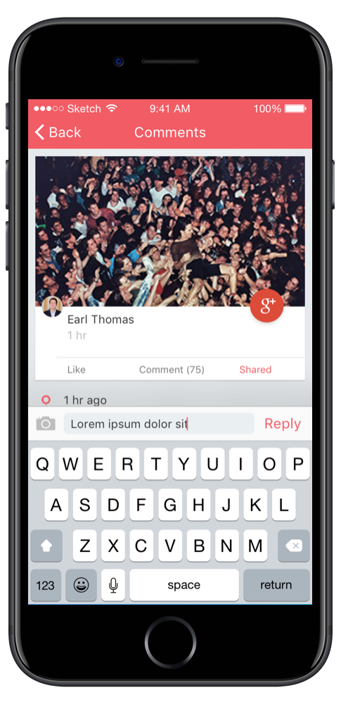
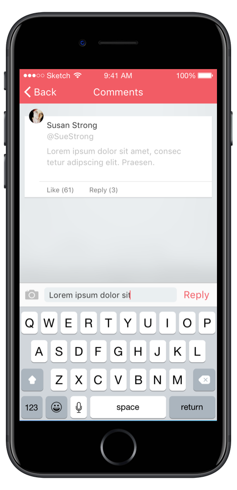
The prototype worked. It demonstrated the core functionality and the merged feed on a real device, which is the form the idea had to take to be evaluated at all.
It was submitted to the Rollins Center for Entrepreneurship & Technology competition and took second place, and it gave the team something concrete to put in front of potential investors.
Images