Details
Year: 2019
Platform: Android
Role: Design System Manager, Lead Designer
Tools Used
Sketch
Zeplin
Notion
By 2019 PGi had design systems for web, desktop, and iOS. Android was the one still missing. I'd built the first three, which made this one look like a repeat. It wasn't. Android isn't a platform you can specify once and leave alone.
Objective
PGi shipped Android apps, and every screen in them got decided by whoever happened to be building it. So the same questions got answered again from scratch: what a button looks like, how a sheet behaves, where navigation lives. A customer who used PGi on a phone and on a laptop got two unrelated answers from one company.
The system had to close that gap without erasing the platform. PGi's Android apps needed to read as one company's work. They also needed to behave the way an Android user already expects their phone to behave.
Approach & Methodology
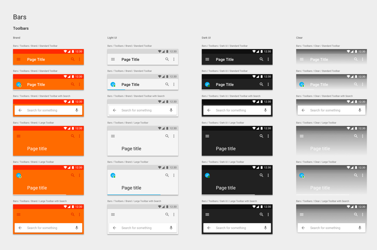
Built on Material, not on the iOS library
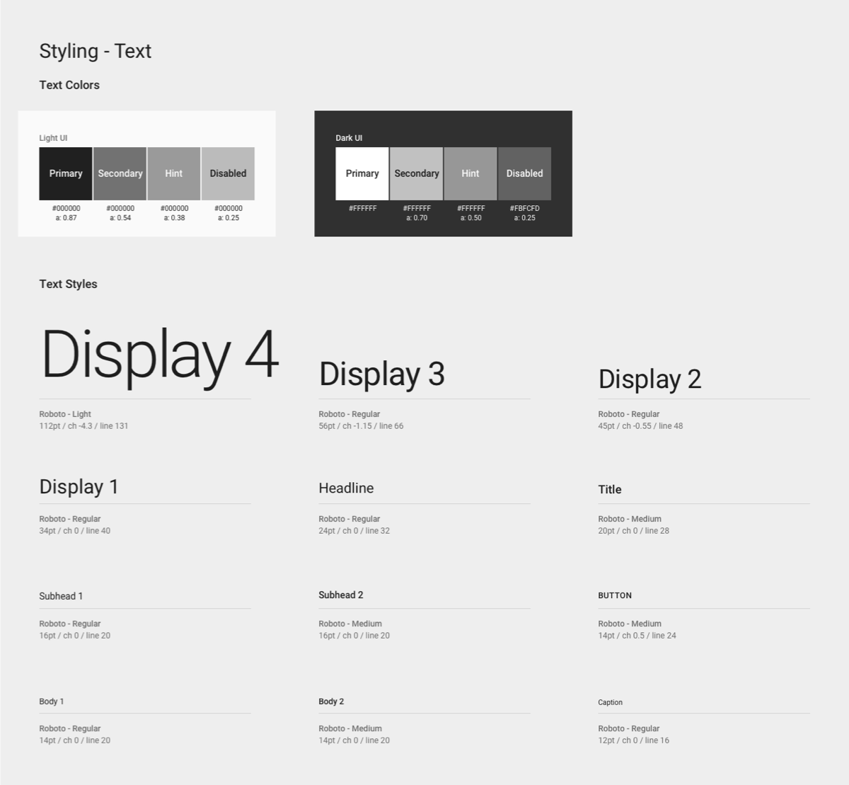
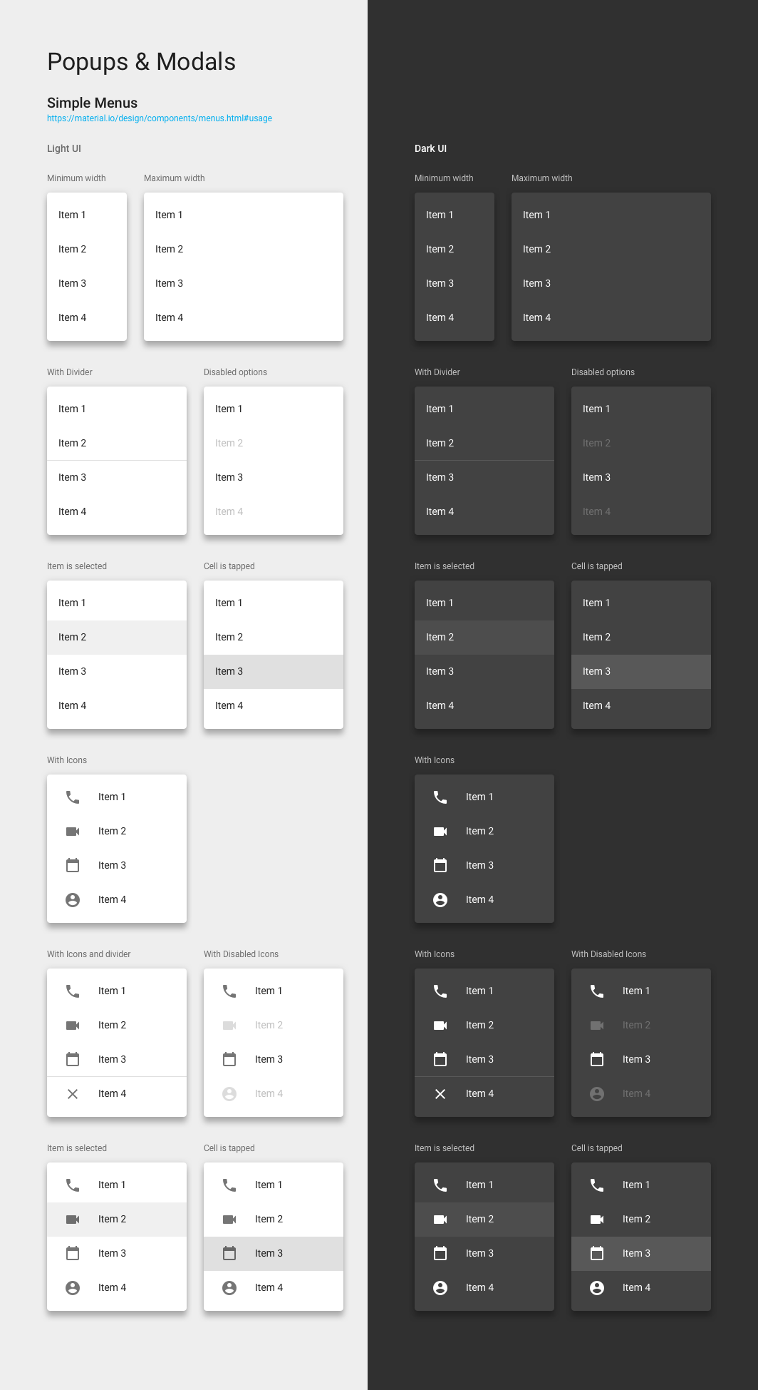
The cheap way to build a fourth system is to restyle the third one. Take the iOS components, change the type and the shapes, call it Android. I didn't do that. People learn conventions from the device in their hand, not from the company that made the app. Someone on Android expects navigation, sheets, and controls to behave the way the rest of their phone does.
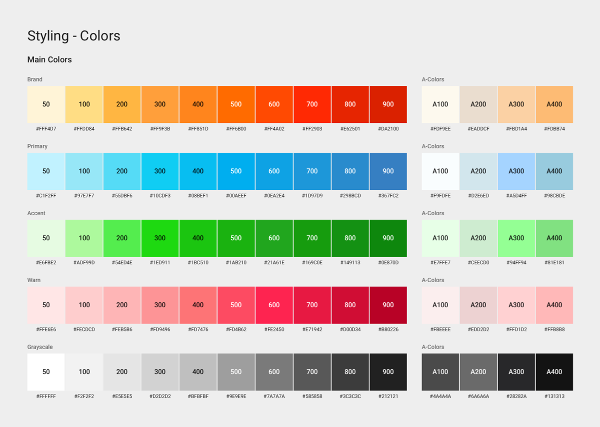
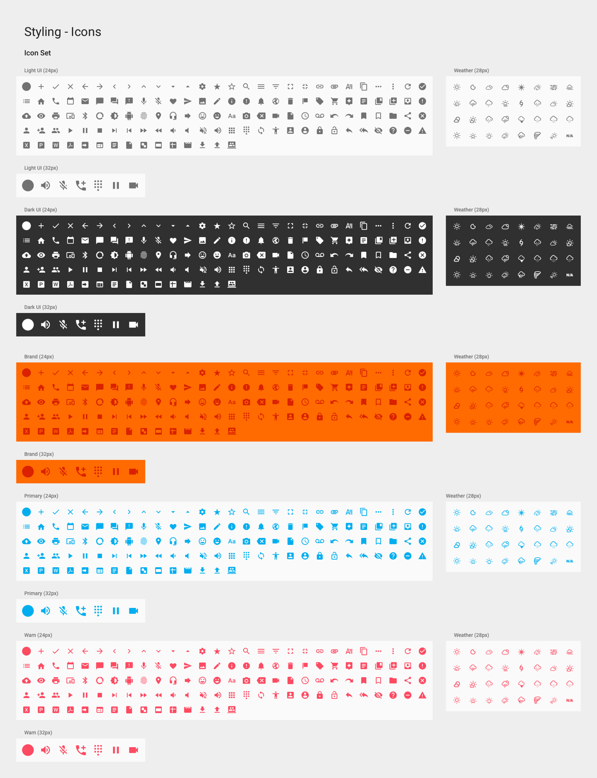
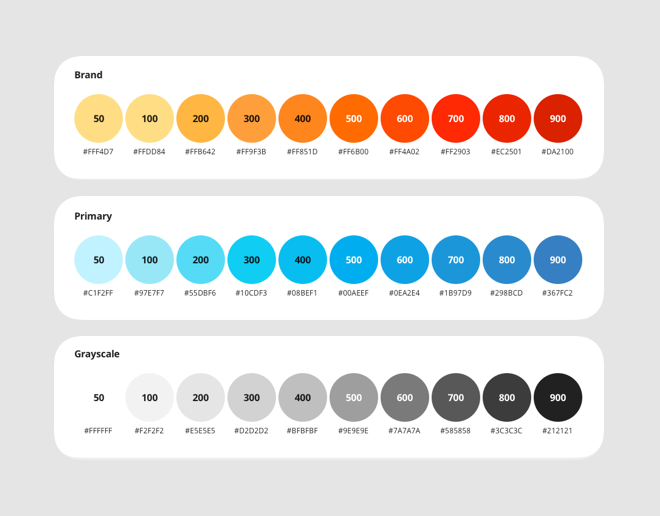
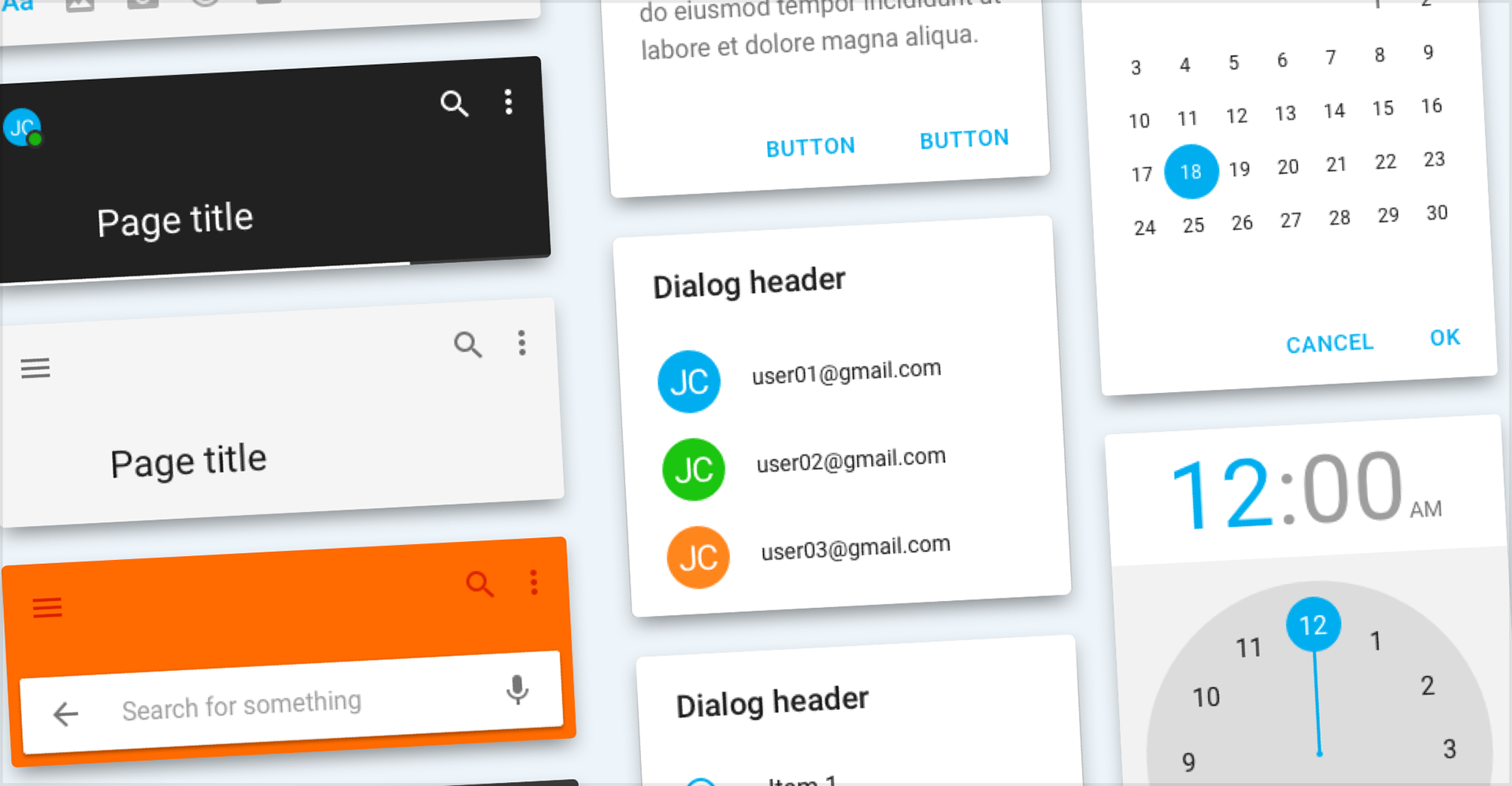
So the system took Material Design as its foundation and carried PGi's brand on top: color, type, iconography, tone. Brand travels across platforms. Convention doesn't. Where the two disagreed I kept the convention, because a user relearning a control they already know is paying for a decision they didn't make.
Designed for the hardware
iOS was the easier system to write, because Apple controls the devices and the update schedule. Android doesn't work that way. PGi's apps had to hold up across a wide range of screen sizes, resolutions, OS versions, and manufacturer customizations. I couldn't test against all of them, and neither could the teams building on the system.
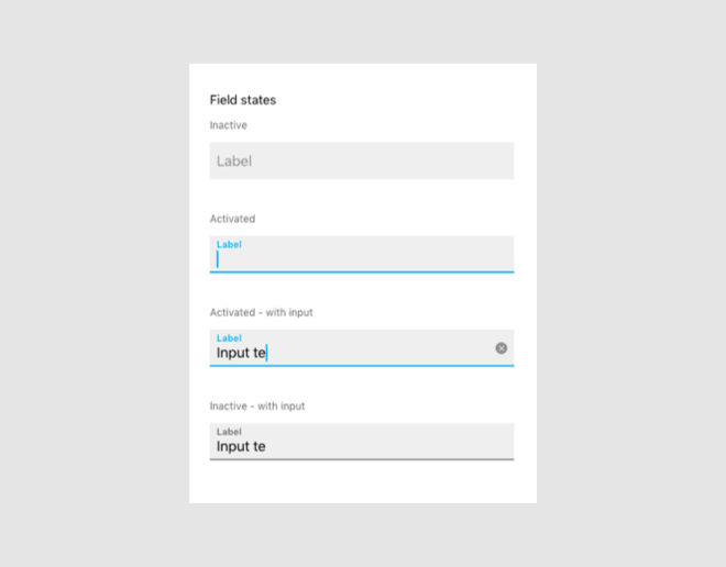
So I specified components by behavior instead of by appearance at one size. Each one said what it does when the space around it changes, how it holds at the edges of the range, and when it's the wrong choice. A component defined only by how it looks on the designer's device breaks on somebody else's.
Let the product teams set the order
I worked through the design leads and product teams to find out what their apps needed and what they were already working around. Those constraints set the build order, because a component nobody is waiting on gets adopted last. Building against real screens also kept the library small, since a request from one product isn't yet a case for a shared component.
Wrote the rules and how to change them
Material Design keeps moving. A system that treats every platform update as an emergency stops getting used, because teams route around anything they can't rely on. So I wrote usage guidance for each component and set up governance to handle updates as routine work. The rules covered what a component is for, when it's wrong, and how something new gets in. An update to Material became a review, not a rebuild.
Impact & Results
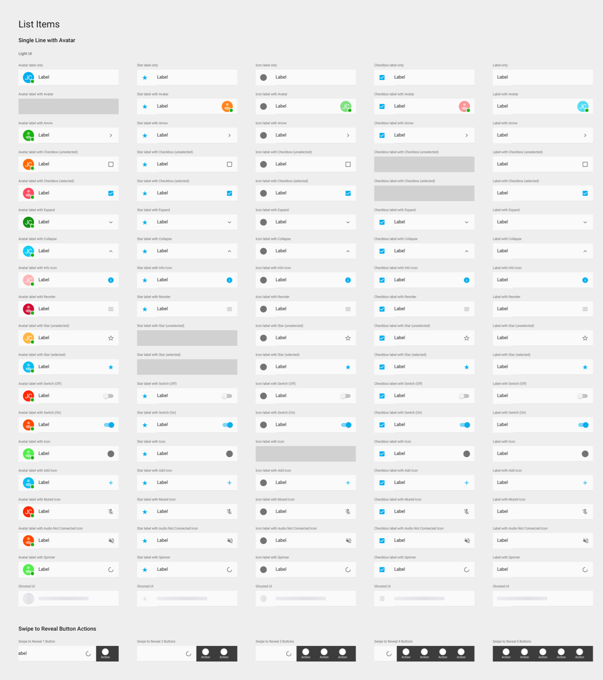
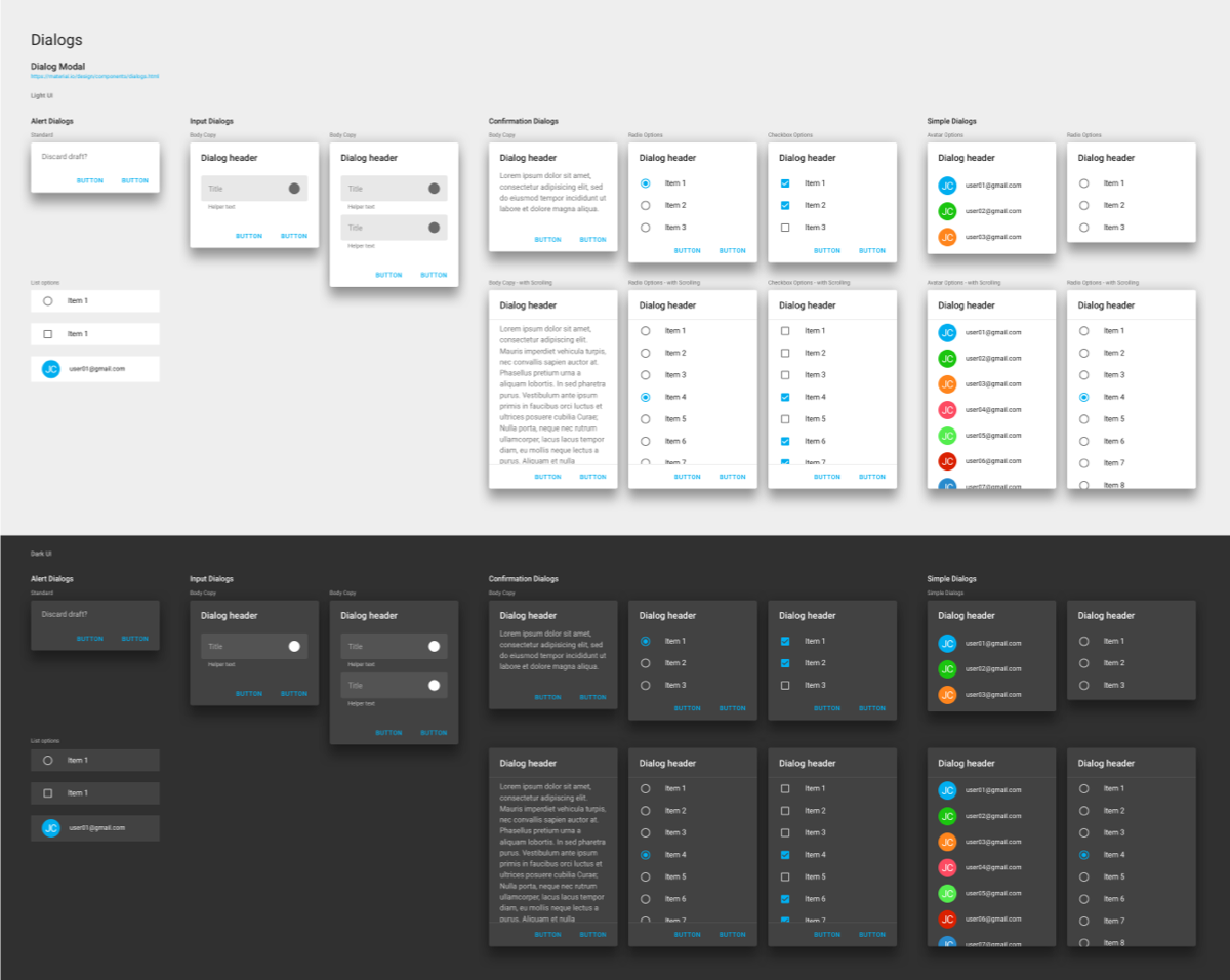
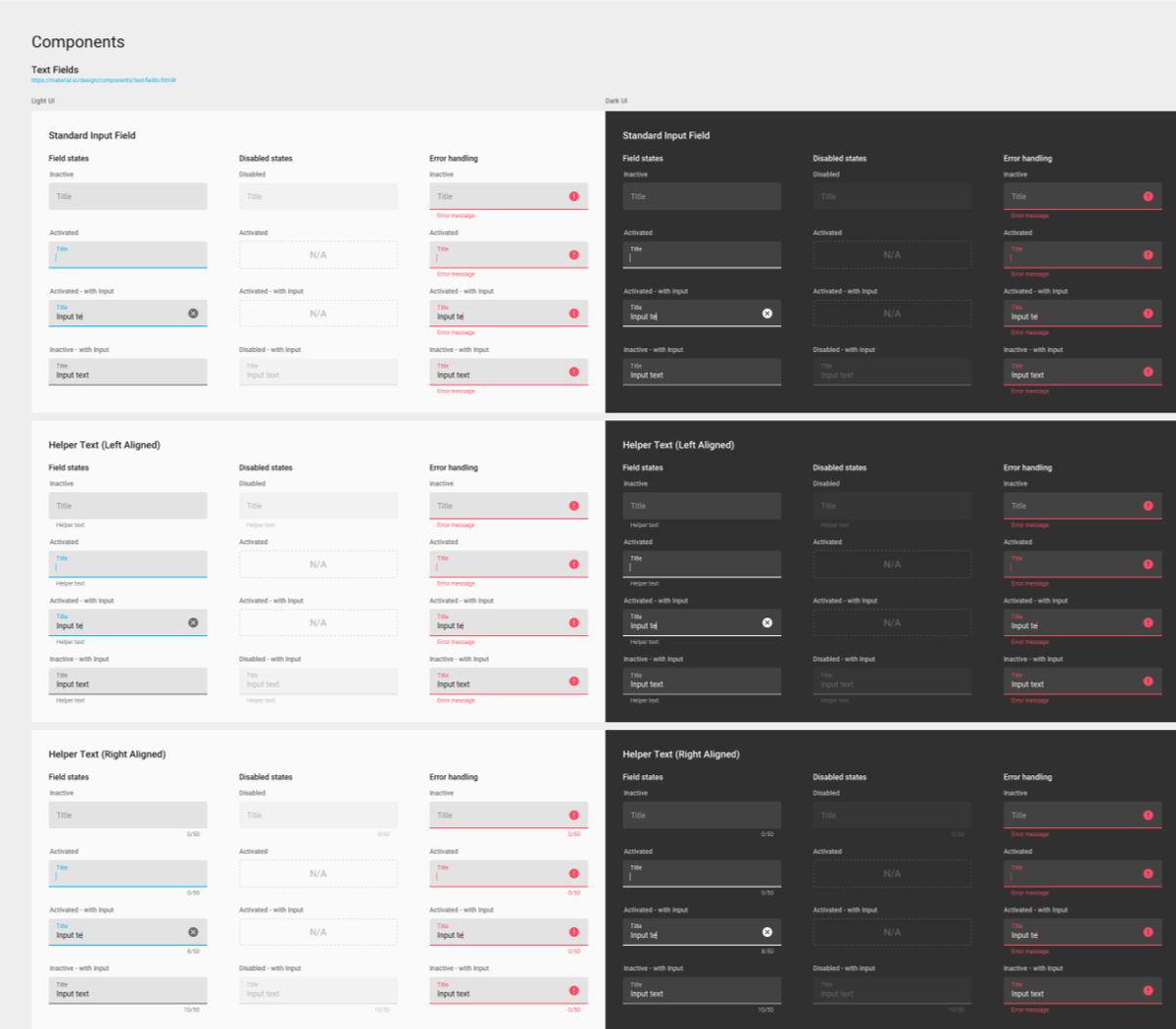
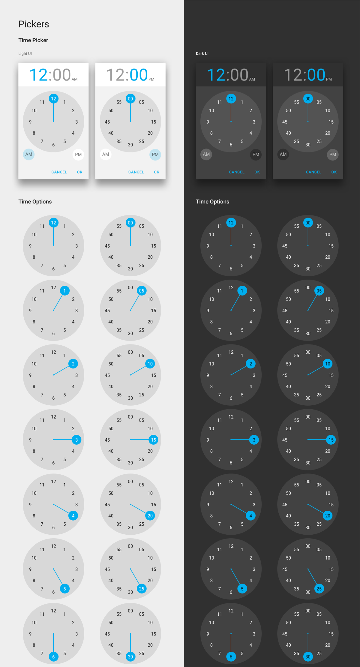
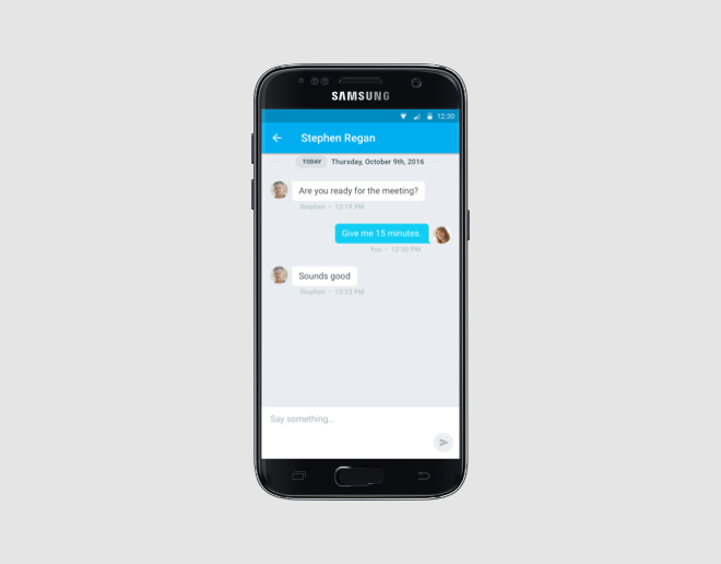
PGi got its first Android design system. Android stopped being the platform where each team started over. A designer opening a new screen found the components, states, and behavior already decided. A developer building it found the rule written down next to the spec.
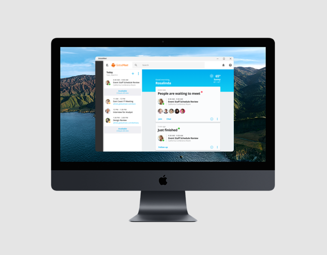
It also made the suite legible across platforms without making it identical. A PGi app read as a PGi app on Android, and as an Android app on Android. That's the harder version of consistency, and it's the one users get something out of.
Images