Details
Year: 2016
Platform: iOS, Android
Role: Lead Designer
Tools Used
Sketch
Zeplin
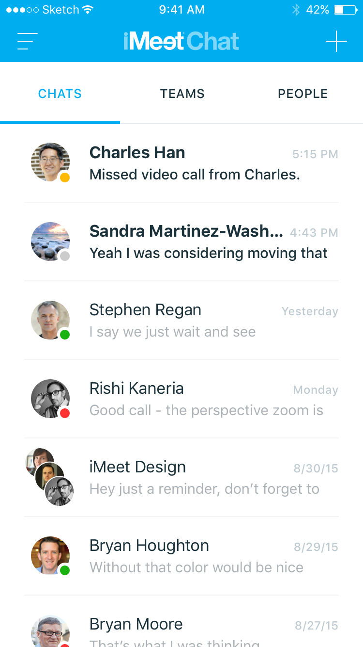
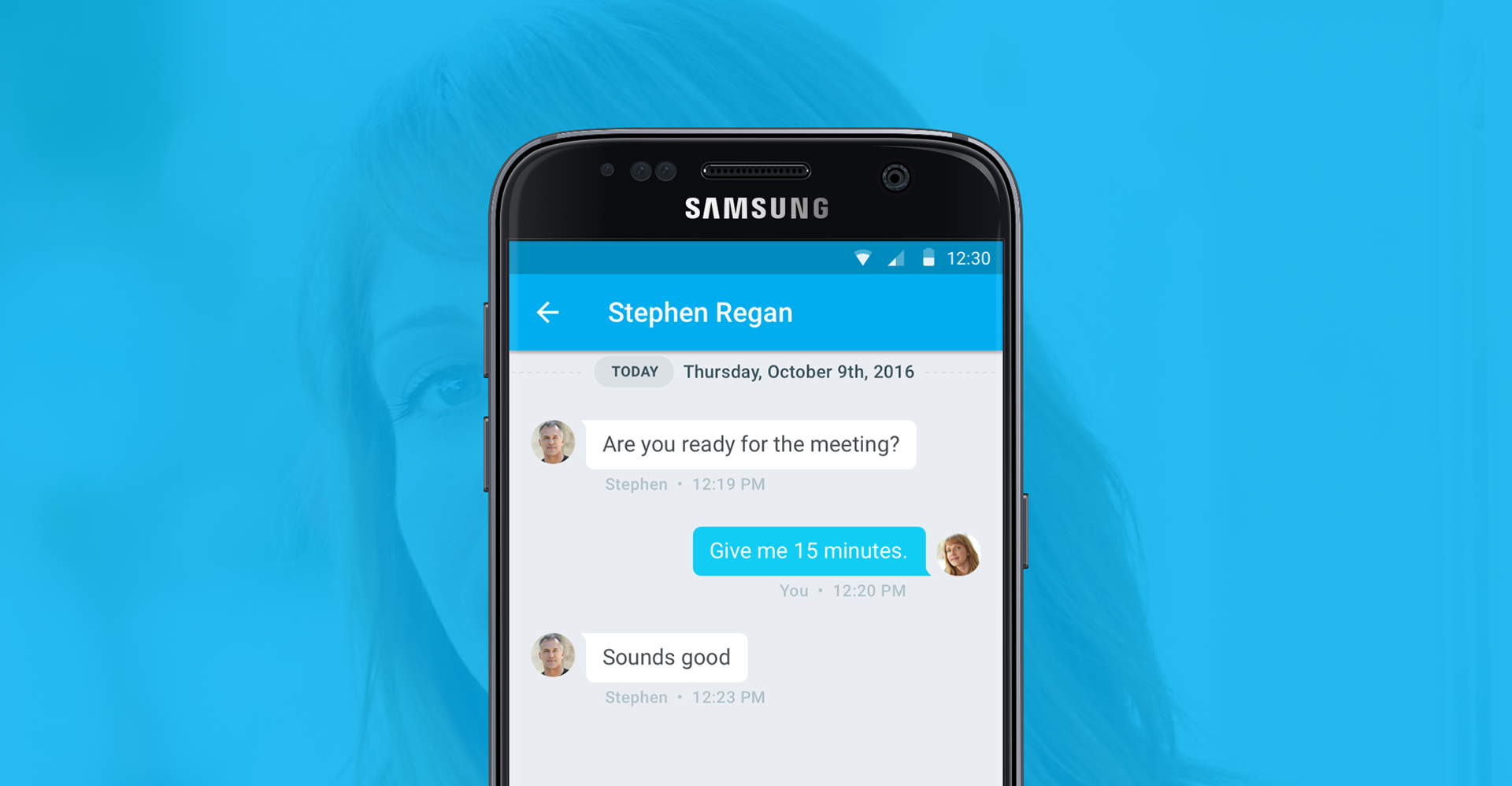
iMeet Chat was PGi's business messaging app, built to compete with Slack and Microsoft Teams. It carried text, voice, and video in one product, on iOS and Android. PGi already sold conferencing to enterprises, so chat was the piece of the workday it didn't own yet. I was named lead designer on it after my work on Agenday.
Objective
Work chat is the app a person leaves open all day. That makes it unlike most software, because the cost of a bad decision doesn't land once during onboarding. It lands on every message, in a window somebody keeps in view for eight hours.
It also makes the category unforgiving. A team evaluating chat already uses Slack, and they compare from muscle memory. Anything named differently or placed differently gets read as the new app being wrong, not as the new app being new.
The target was an MVP on both platforms by year-end. A deadline that fixed leaves one variable, which is scope, so the design job was to decide what a first version had to do to be usable rather than to be complete. An MVP that ships without voice and video isn't a competitor. An MVP that tries to match Slack feature for feature doesn't ship.
Approach & Methodology
Learned the category before designing a screen
I researched the messaging technologies available and ran a competitive analysis across the products people were already using, to find where the category agreed and where it left something unsolved.
The agreements aren't optional. Threads, presence, mentions, read state, and the difference between a channel and a direct message are conventions people learned somewhere else and brought with them. So the shared vocabulary got adopted rather than reinvented, because a product that renames a familiar thing charges every new user for a lesson they didn't ask for.
The disagreements were where the product had room. That's what the analysis was for: a list of places where the incumbents made someone work, which is a much better source of differentiators than a brainstorm.
Let each platform behave like itself
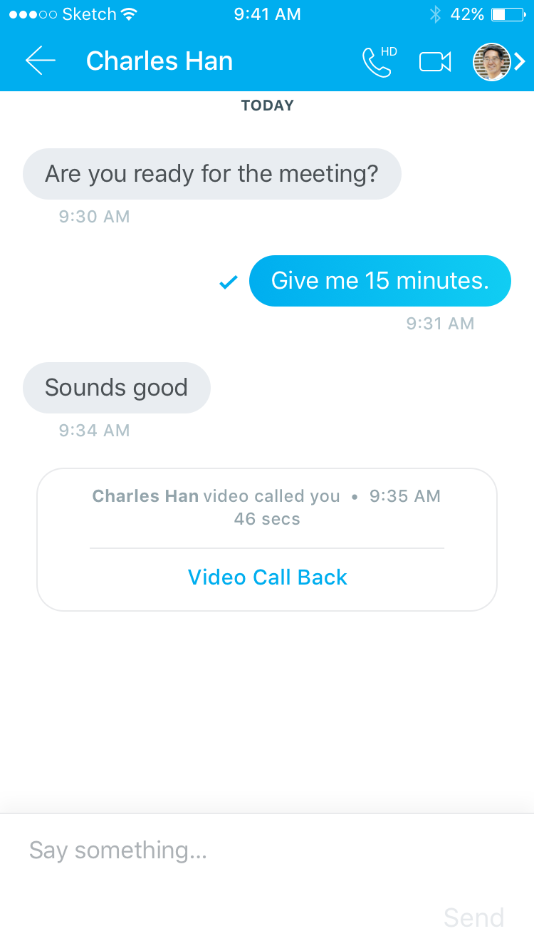
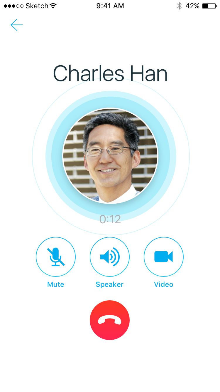
Text, voice, and video are usually three products stitched together, and the stitching is what users feel. Starting a call shouldn't feel like leaving the conversation, because the conversation is the reason the call is happening.
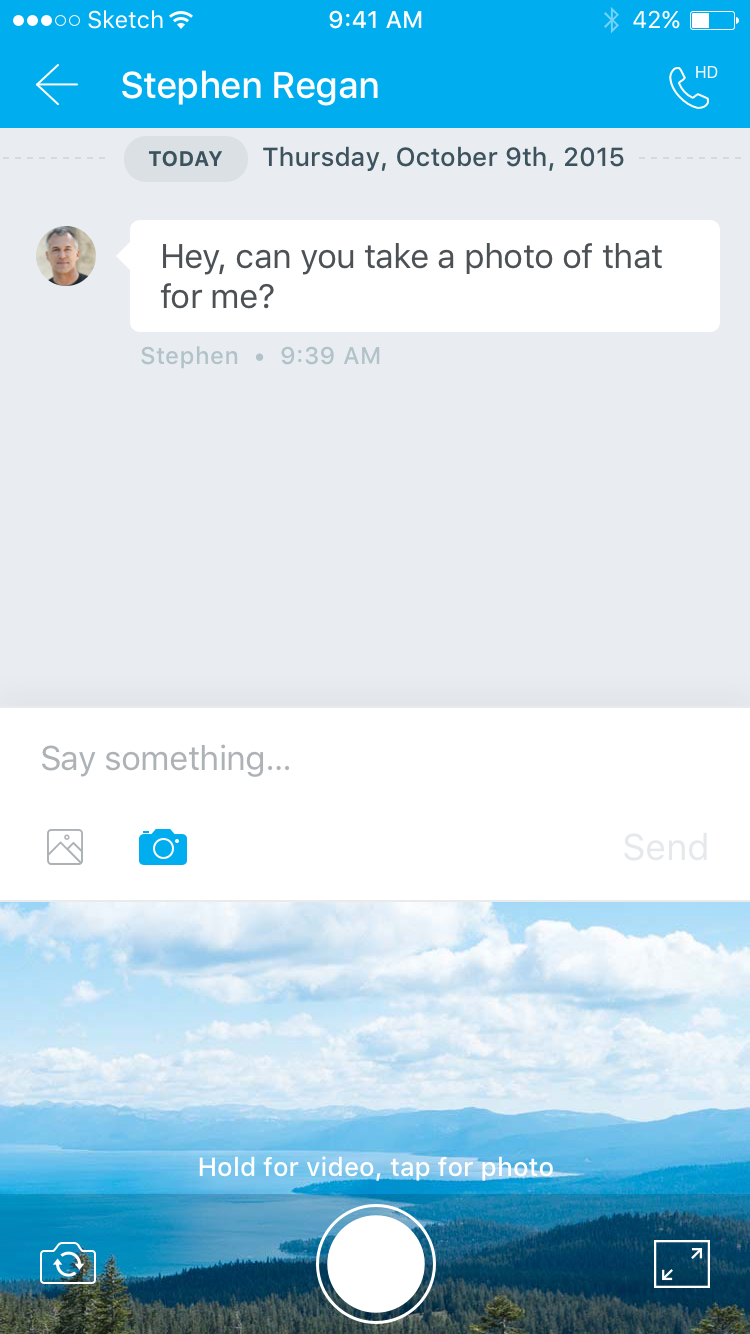
So I designed the messaging experience as the container and treated calls as something a conversation escalates into. That kept the model small enough for one team to hold and build twice, and it kept the structure able to take features the MVP had to cut. iOS and Android then followed their own platform conventions on top of it, since users learn controls from the device in their hand.
Moved the design team off Photoshop while the project was running
PGi's UX team designed in Photoshop and handed developers flat comps with redlines. That's expensive at any time. On this project it was the schedule risk, because two platforms and a year-end date meant every specification would be read by developers who couldn't wait for a designer to answer a question.
So I led the move to Sketch and brought in Zeplin for handoff. Developers pulled specs, measurements, and assets themselves, and a change to a screen updated what they were reading instead of producing a new PDF that competed with the old one. The tradeoff was real: the team gave up fluency in a tool it knew well, in the middle of a deadline, and that costs a few weeks of speed before it returns any.
Impact & Results
iMeet Chat shipped on iOS and Android by the deadline, with text messaging, voice, and video in the first release. The full MVP made it out, which is the outcome that was actually in question when a fixed date meets two platforms.
The tooling change outlasted the project. Sketch and Zeplin became how the UX team worked after it, so the next project started with handoff already solved instead of paying for it again. Design operations rarely gets its own budget or its own timeline, and the practical way to fund it is to attach it to something shipping.
What it taught me is where the leverage sits on a deadline project. The design decisions were bounded by a category people already knew. The handoff wasn't, and that's the part I could still make cheaper.
Images