Details
Year: 2019
Platform: iOS
Role: Design System Manager, Lead Designer
Tools Used
Sketch
Zeplin
Notion
By 2019 PGi's web and desktop products were running on design systems I'd built. iOS was next, and it came with a constraint the other two didn't have. Apple ships a new version of iOS every year, and some of those years it moves the design language underneath everyone. A mobile system that ignores that schedule is out of date on a date you can look up in advance.
Objective
PGi shipped several iOS apps, and each one settled its own interface questions. What a button looks like, how a sheet behaves, where navigation lives. A customer who used PGi on a phone and on a laptop got two unrelated answers from one company.
The system had to close that gap without overwriting the platform. PGi's iOS apps needed to read as one company's work and still behave the way an iPhone already behaves. It also had to survive Apple's release calendar. A library that gets redrawn every fall isn't a system, it's an annual project.
Approach & Methodology
Let the platform hold the conventions and the brand sit on top
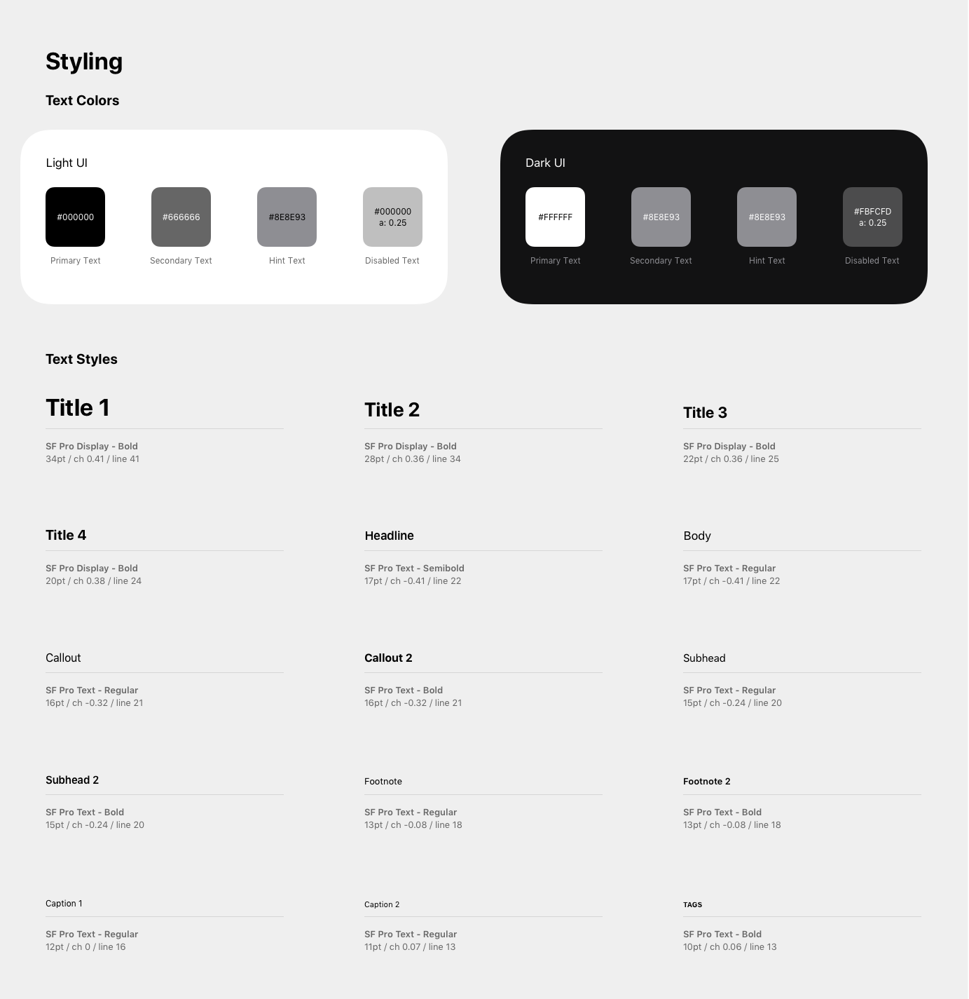
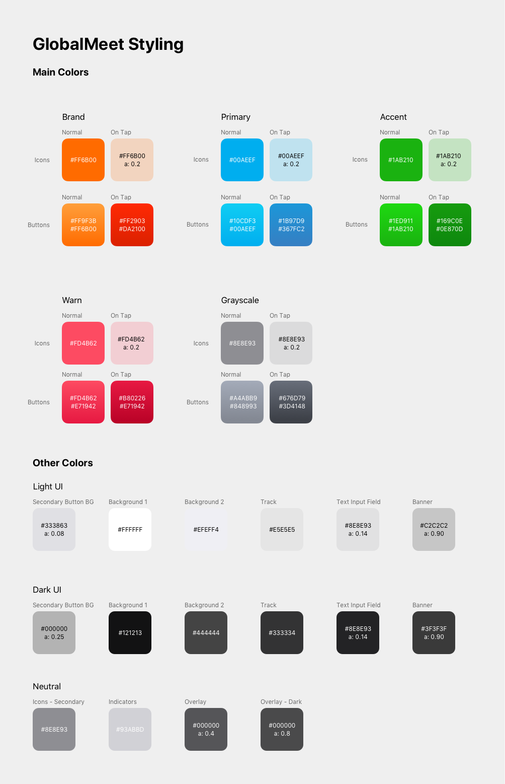
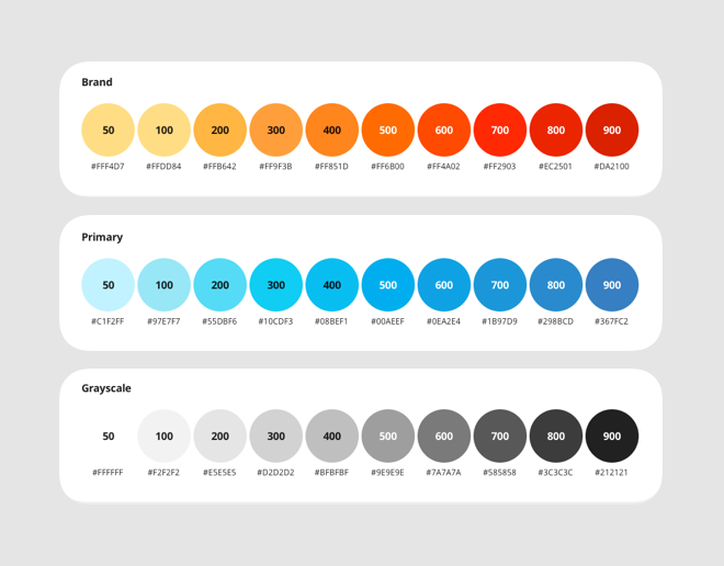
I took Apple's Human Interface Guidelines as the foundation and carried PGi's identity in color, type, iconography, and tone. Brand travels across platforms. Convention doesn't. People learn how controls work from the phone in their hand, not from the company that made the app. So a control that looks like PGi and behaves like nothing else on the device charges the user for a decision they didn't make.
Where the two disagreed, the platform won. That kept the brand doing what it's good at, which is telling someone whose product they're in. It kept the brand out of what it's bad at: teaching someone a control they already know.
Designed against native behavior
The obvious way to get an on-brand mobile library is to rebuild Apple's controls as custom components and style them. That looks correct in the file and costs money every year. A custom control inherits nothing when Apple changes the platform, so someone has to redraw it.
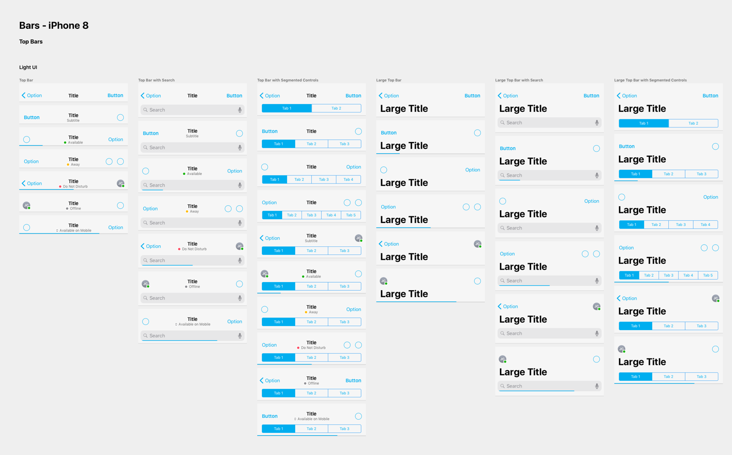
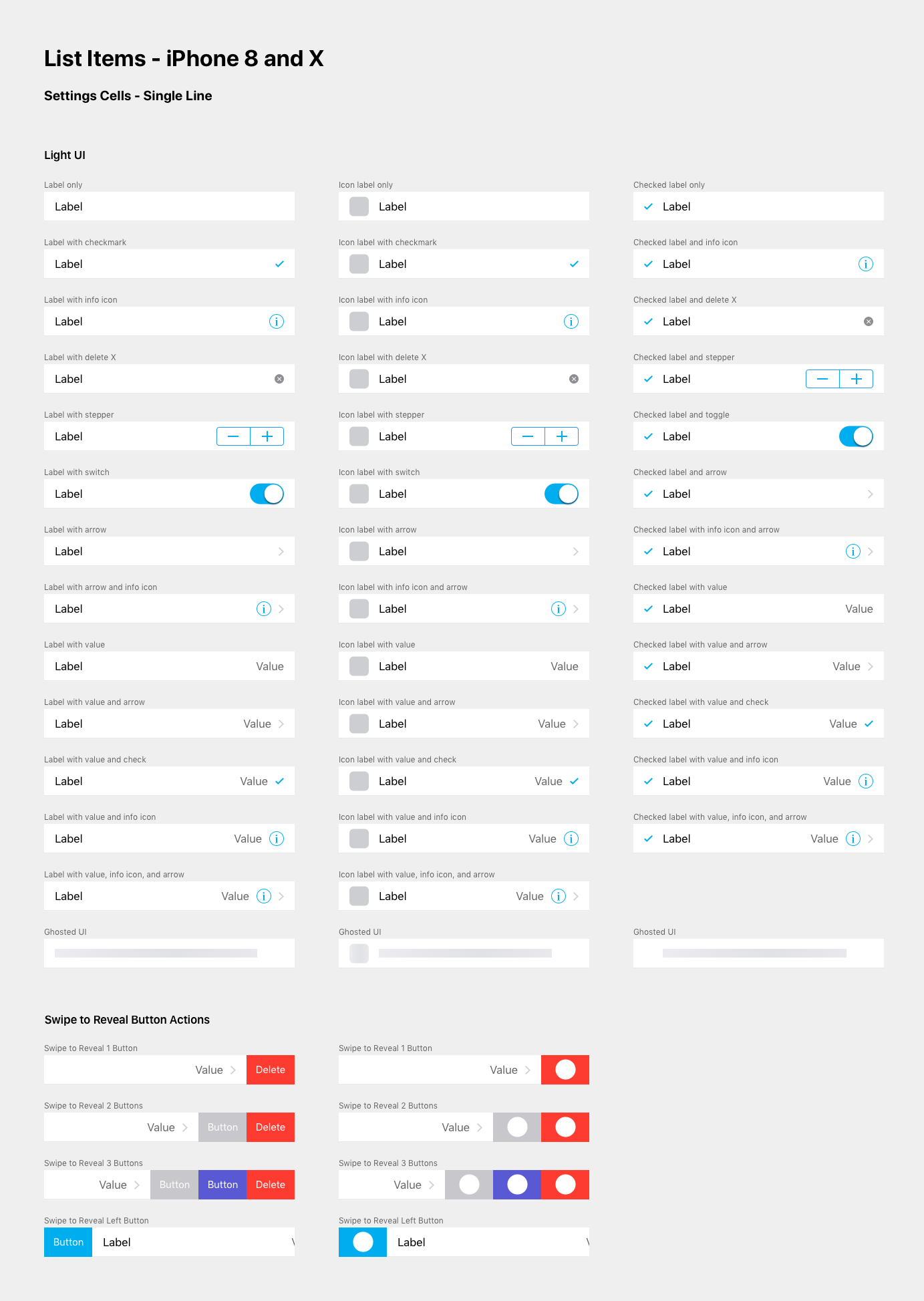
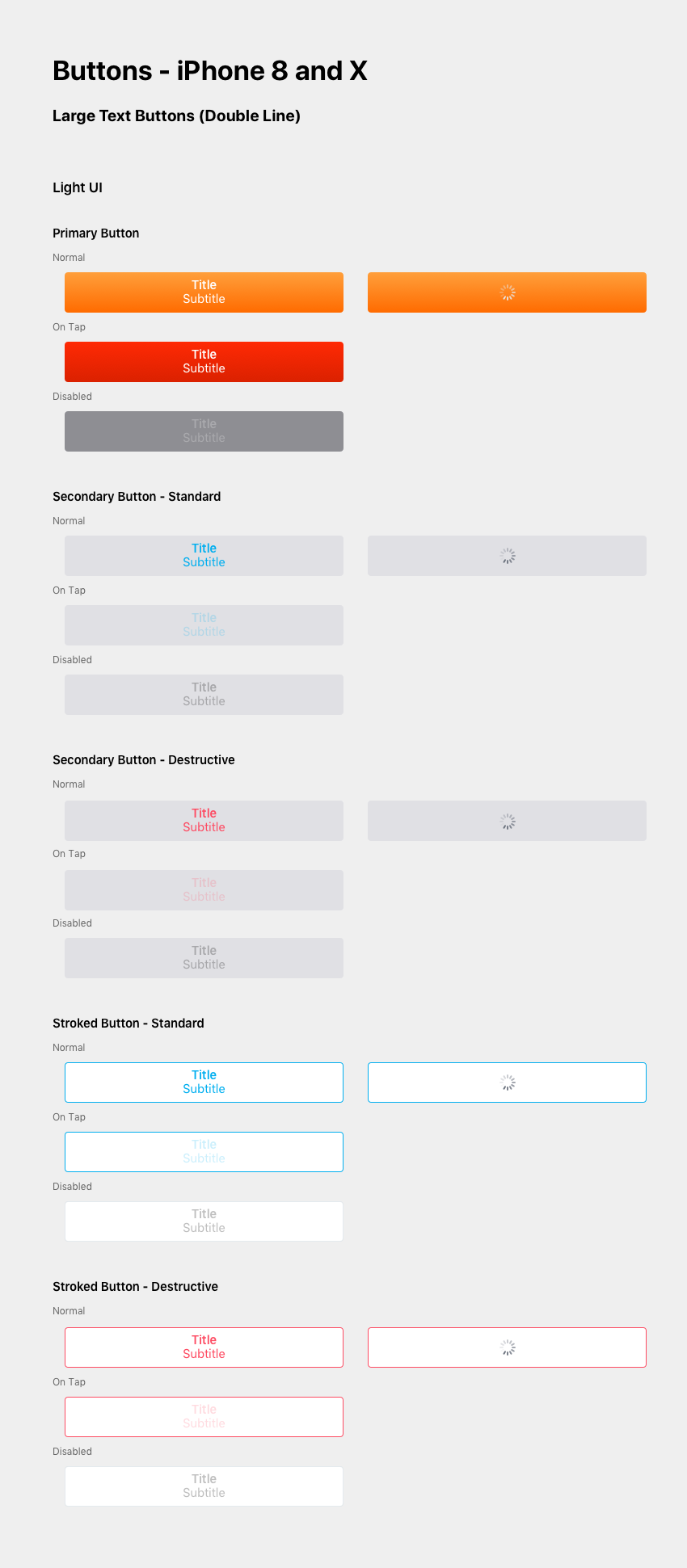
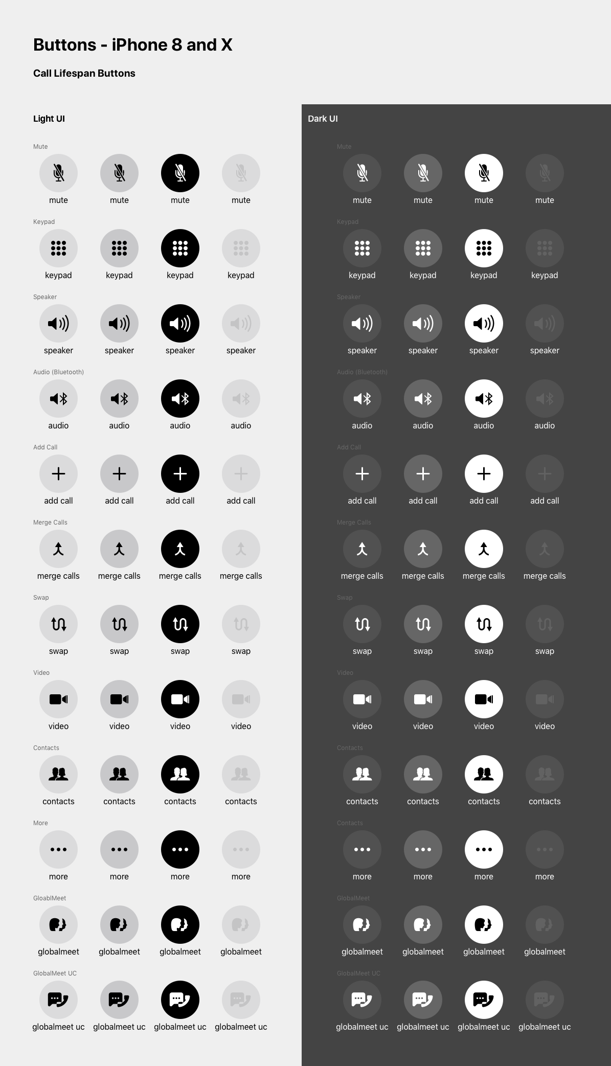
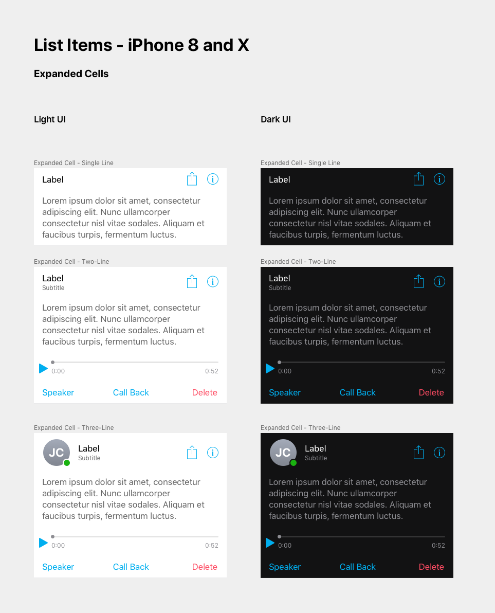
So the components were specified as native controls with PGi's decisions applied to them. Each one documented what it's for, how it behaves in the states a user can reach, and when it's the wrong choice. An iOS refresh then landed as a review of a short list rather than a rebuild of the library, and the designers got their fall back.
Built the order from what teams were already working around
I worked through the design leads across the organization to collect real use cases: the screens they were building, the components they were faking, the questions that kept coming back. Those constraints set the build order, because a component nobody is waiting on gets adopted last. Working from real screens also kept the library small, since one product's request isn't yet a case for a shared component.
Impact & Results
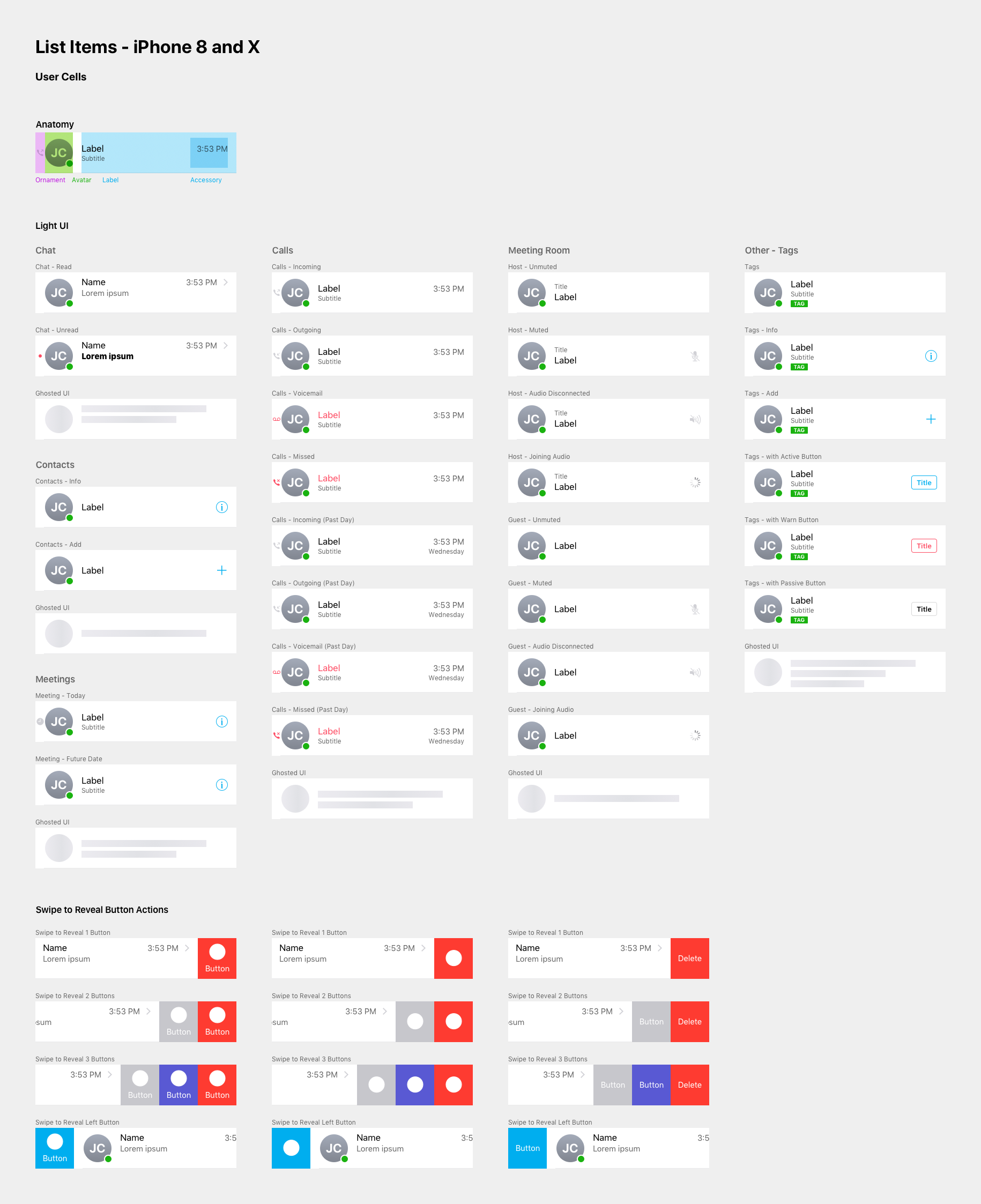
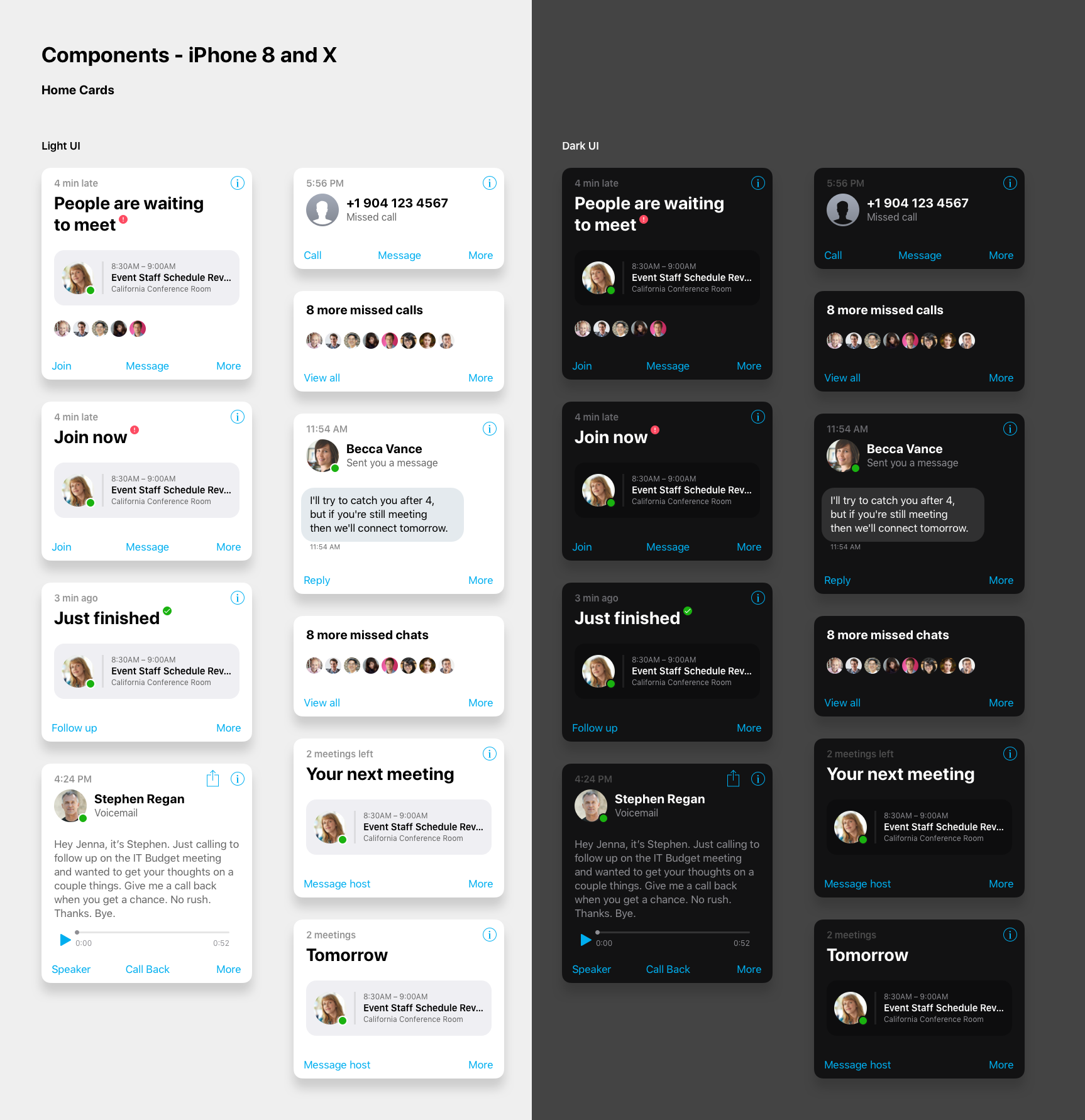
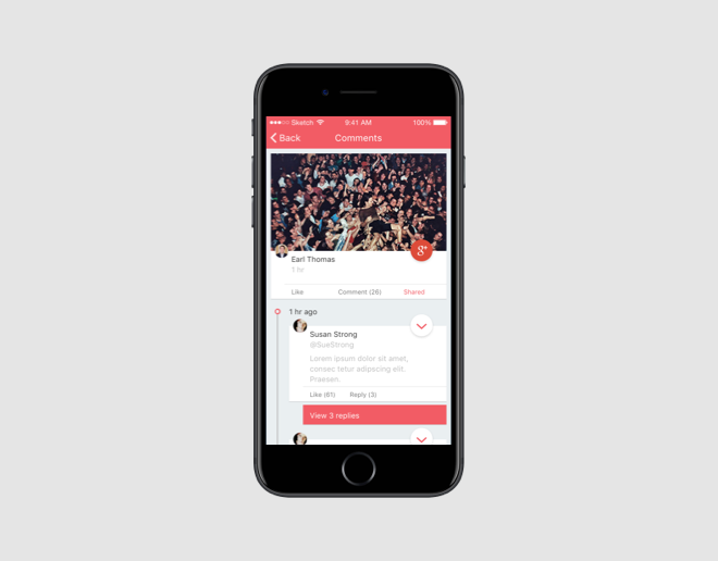
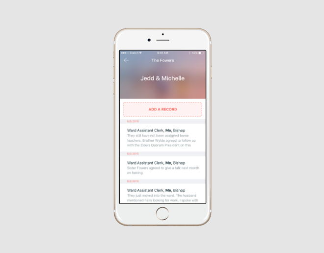
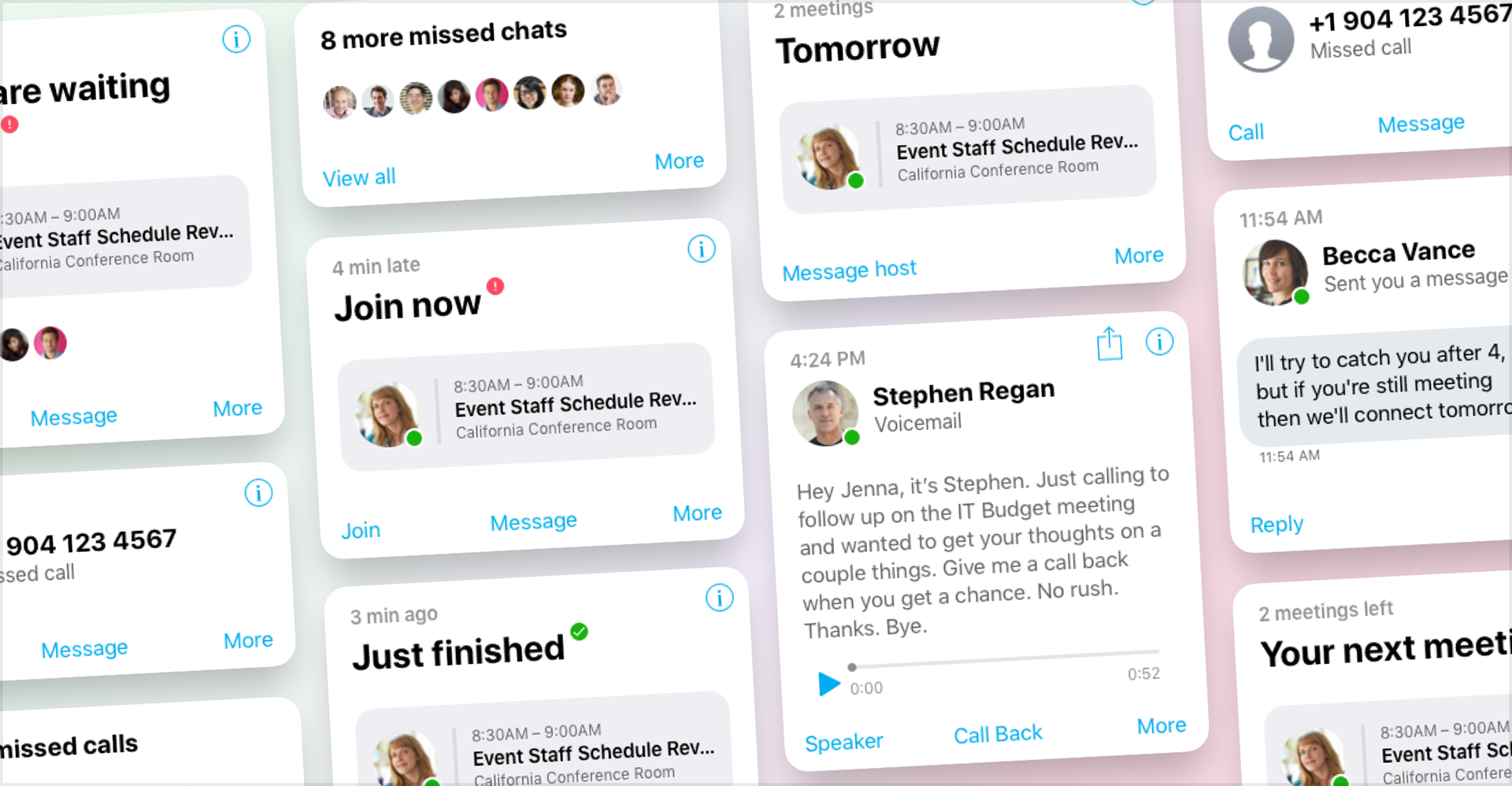
PGi's iOS suite got its largest UX and UI update in one pass, and the apps came out aligned with Apple's current standards instead of three different interpretations of them. A designer opening a new screen found the components, states, and behavior already decided. A developer building it found the reason written next to the spec.
The system also settled the annual question. When Apple moved, the work was to check the list, not to rebuild it, and that's the difference between a system teams keep using and one they route around.
Images