Details
Year: 2015
Platform: iOS
Role: UX/UI Designer
Tools Used
Sketch
Zeplin
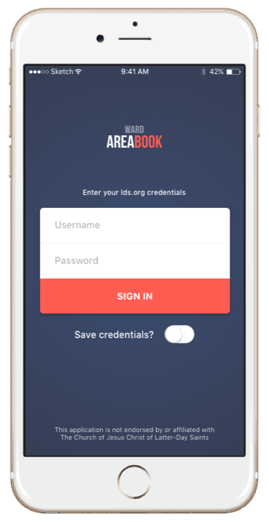
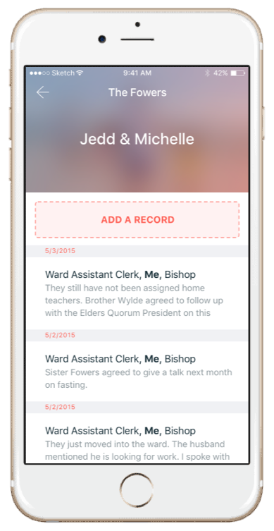
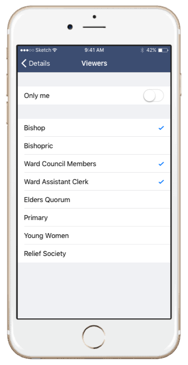
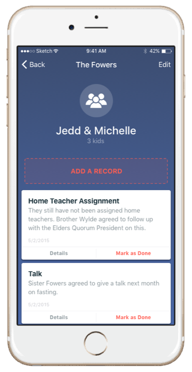
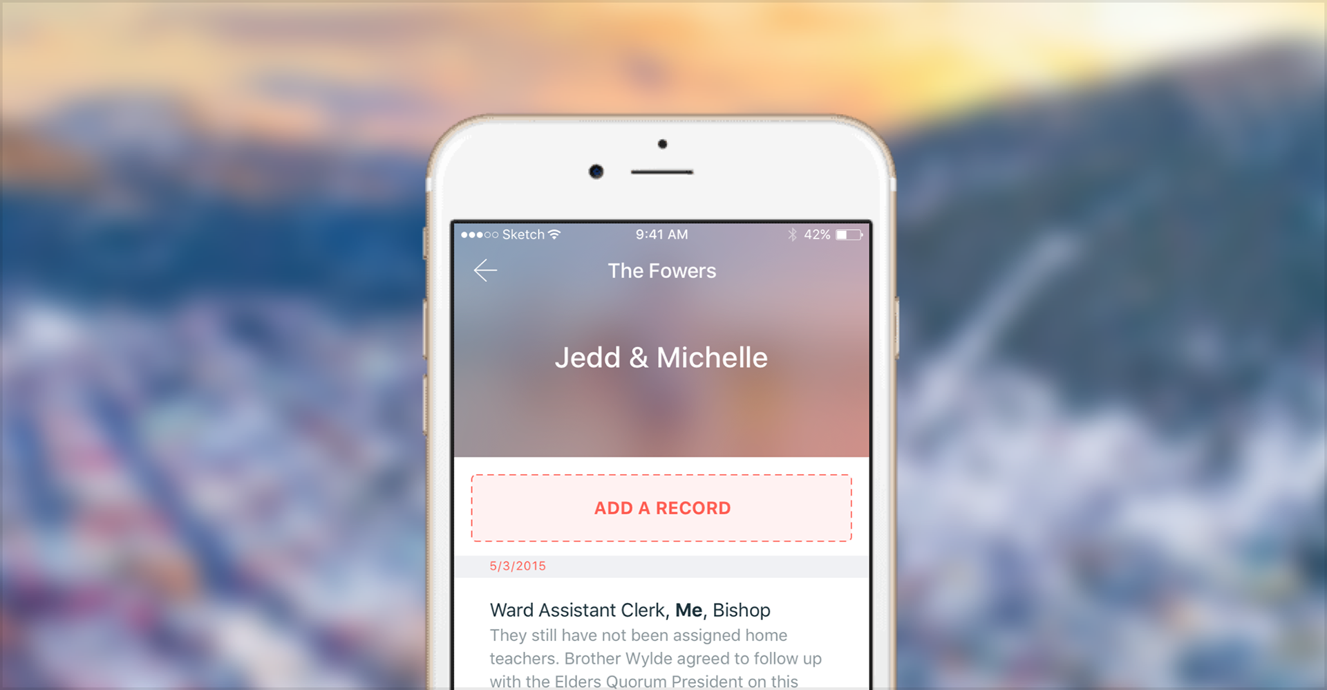
Ward Area Book is an iOS app for bishops and other leaders of a ward, which is a local congregation in The Church of Jesus Christ of Latter-day Saints. It holds the records a leader is expected to keep in their head: home teaching assignments, new families, address changes, upcoming talks, members looking for work, and the ordinary life events that decide who gets a visit this week.
Objective
A ward leader isn't an administrator. It's an unpaid role held by someone with a job and a family, and the record keeping happens in the margins of a week: between meetings, in a car, standing in a hallway after a service.
That's where the records fail. The information isn't hard to store, it's hard to capture at the moment somebody tells you. A note written on the back of a program doesn't make it back to the list, so the next leader inherits a record that's stale in exactly the places that matter, which is who moved, who's new, and who needs something.
The goal was to design and launch an iOS app from the ground up that let a leader find or update a congregation record in the time they actually have, standing up, between two other obligations.
Approach & Methodology
Borrowed the flows from Contacts instead of inventing them
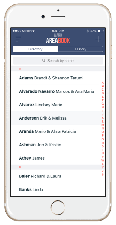
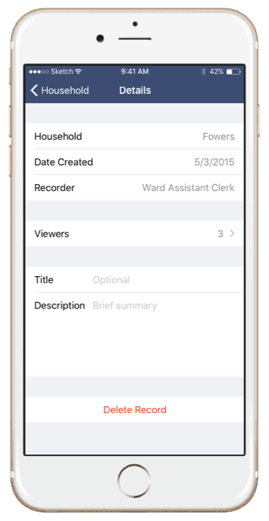
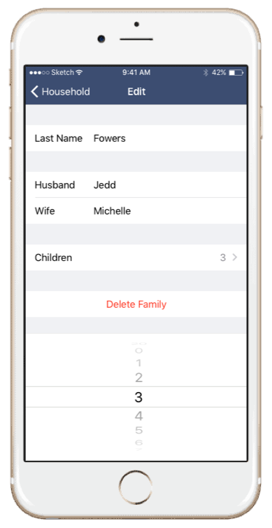
I used Apple's Contacts app as the reference for navigation, list structure, and record editing, because the underlying job is nearly identical: a long list of people, a detail view for each one, and edits made in a hurry. The audience is niche. The task isn't.
A leader who owns an iPhone has already learned Contacts. Adopting its patterns means the app charges them nothing before it becomes useful, and any hour I spent inventing a better list would have been billed back to them as unfamiliarity. The app only departs from Contacts where the record itself is different, since a home teaching assignment and an upcoming talk have no equivalent there.
Judged every screen on speed, not on appearance
Each screen was measured by how fast it let a leader finish one task. So the interface stays minimal: few controls, a flat hierarchy, and nothing decorative competing with the record.
That tradeoff is real and worth stating. The app doesn't have a memorable look and won't win anyone over on a screenshot, which costs it something in a store listing. For software opened for a moment at a time, in a hallway, that's the right side of the trade.
Worked with a developer who could test inside the audience
A solo iOS developer built it, and he served in a ward himself, so he ran flows past members of his own congregation and brought back what confused them. That's a small convenience sample. It can't say anything about adoption, but it's good at catching interaction problems, and that's what it caught.
One developer also has nobody to ask. So I handed over documented states and interactions rather than flat screens, because every state I left undefined was a decision he'd have to make mid-build, and a decision made mid-build usually becomes whatever's fastest to code.
Impact & Results
Ward Area Book launched on the iOS App Store, which put it in reach of any ward leader instead of only the congregation it started in.
It replaced paper notes and personal memory with a structured record. Assignments, life events, and administrative details got one place to live, so a leader could see who's scheduled to speak, who recently had a baby, and who's looking for work without reconstructing it from three sources before a Sunday meeting.
I don't have download, retention, or task-time figures for it. It was a small independent app in 2015, and nothing measured it in a form I had access to.
What it taught me is that a niche audience rarely needs a niche interface. The domain was unfamiliar to me and to most designers. It was not unfamiliar to the people using the app, and their interaction habits came from the phone in their hand, not from the subject matter.
Images