Details
Year: 2018
Platform: Web
Role: Design System Manager, Lead Designer
Tools Used
Sketch
Zeplin
Notion
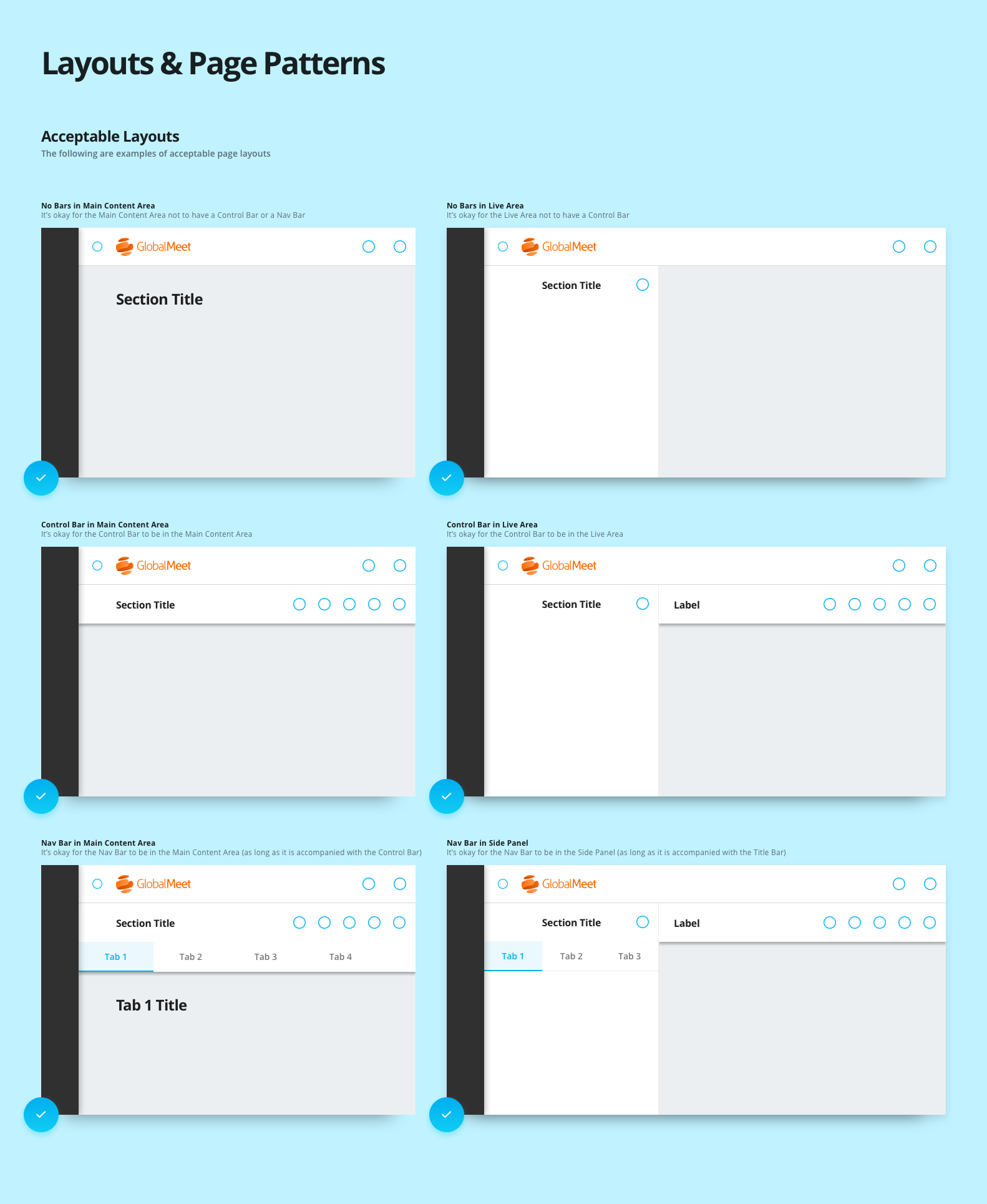
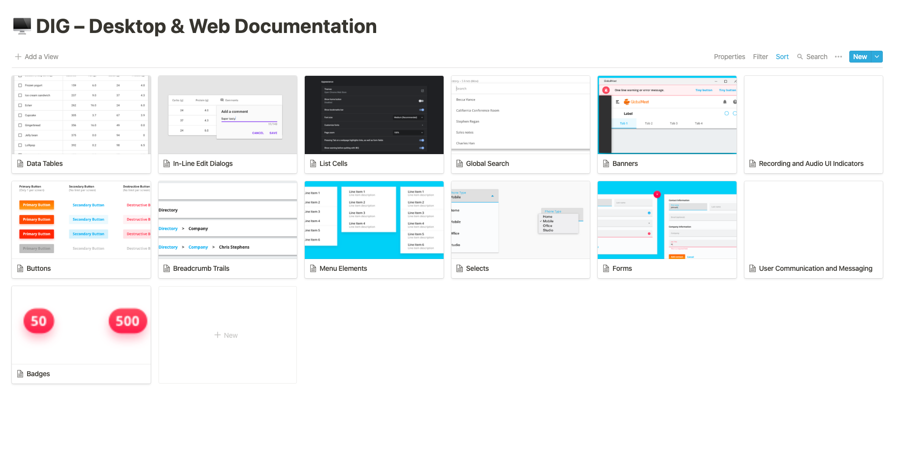
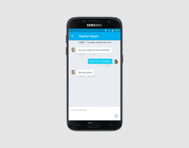
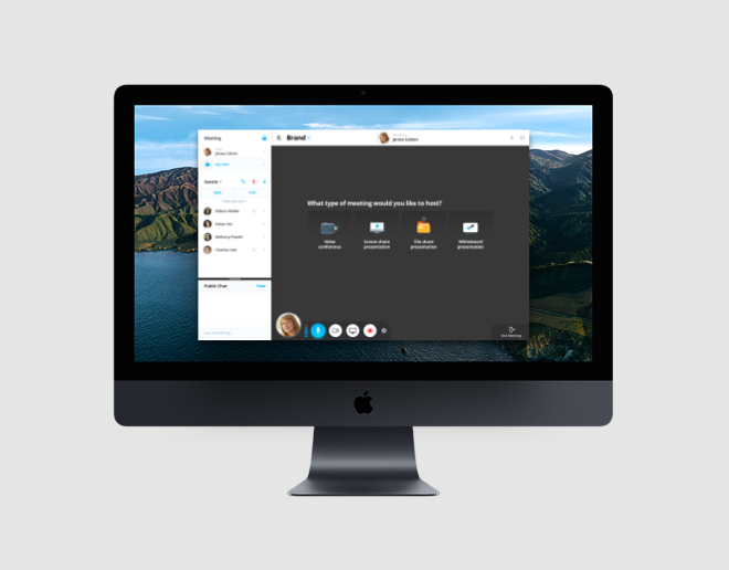
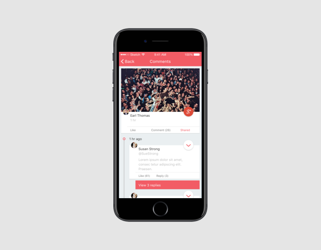
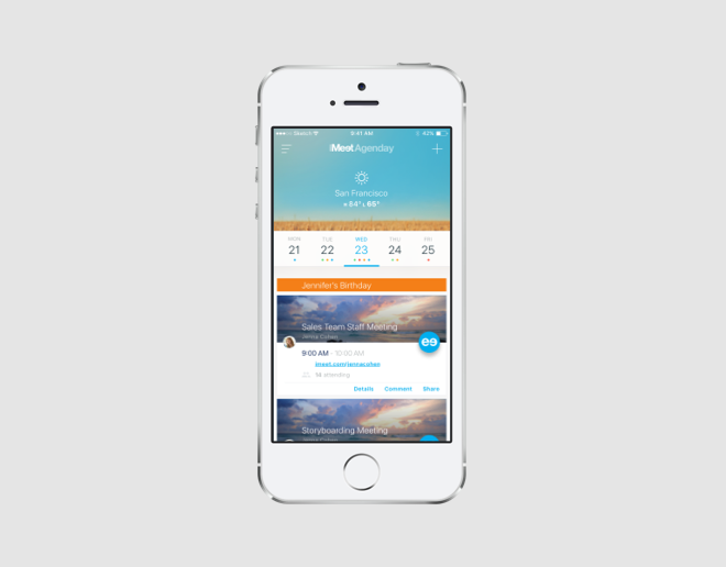
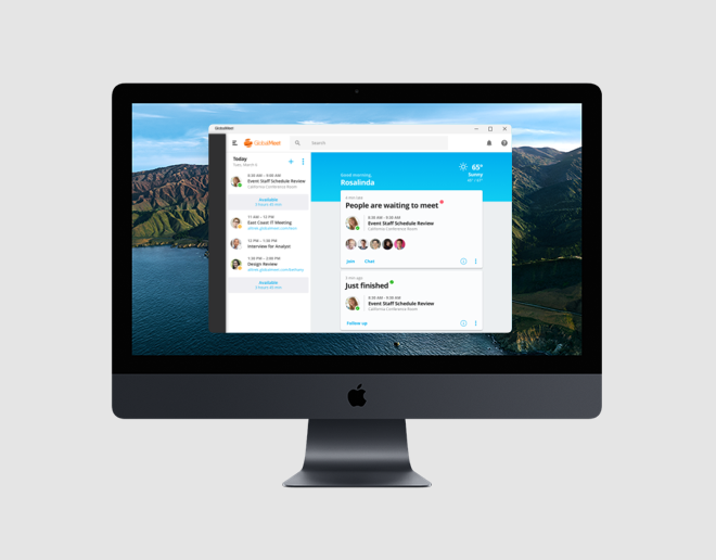
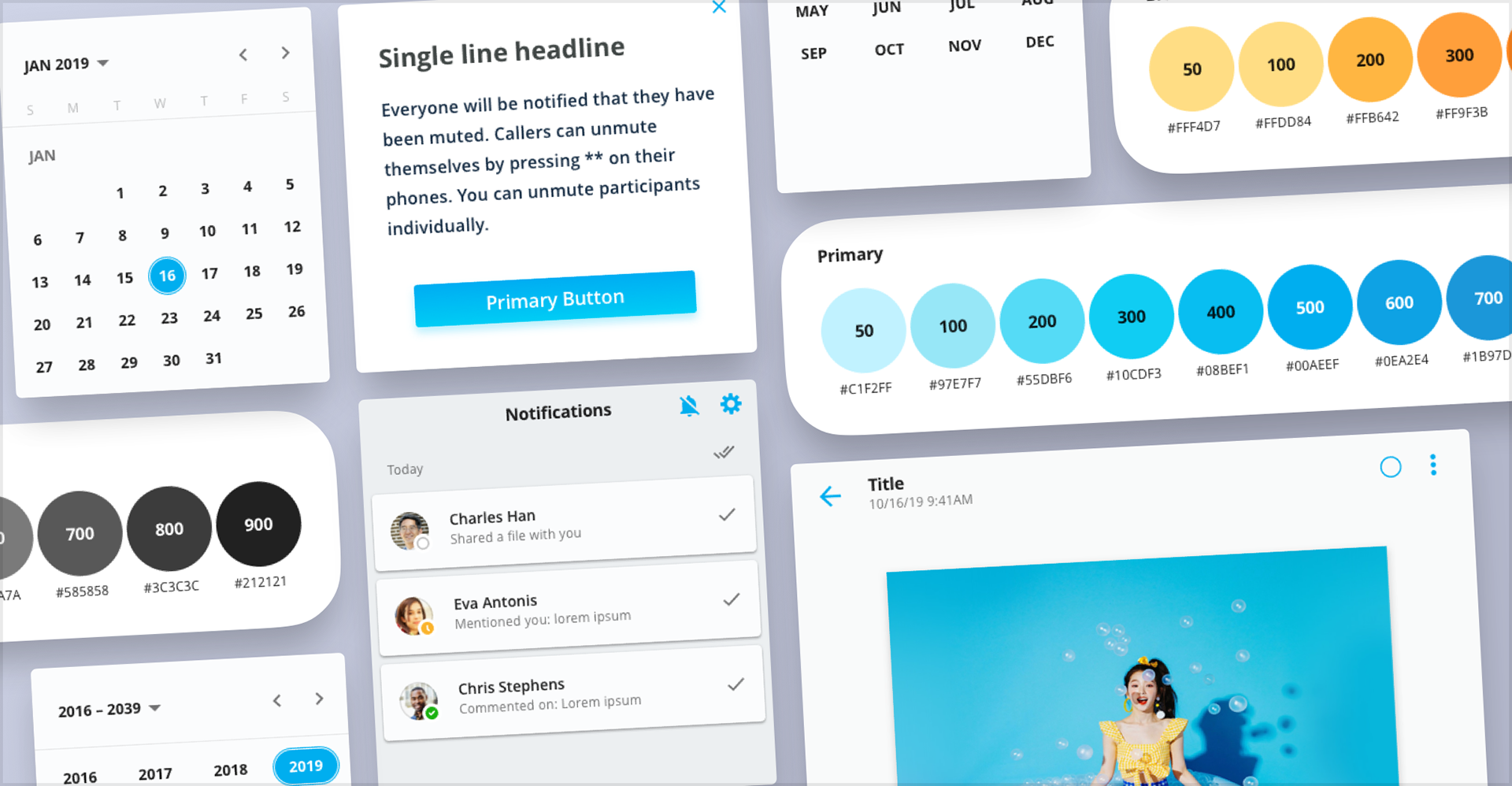
The Design Interface Guidelines, or DIG, was PGi's first design system. It covered the web and desktop suite: GlobalMeet, iMeet Chat, Agenday, and the products around them. I'd just finished modernizing GlobalMeet, which is what made the real problem visible. One product was current, the others weren't, and nothing in place kept them from drifting apart again a year later.
Objective
PGi sold a suite, but each product settled its own interface questions. What a button looks like, what a form does when it's wrong, where navigation lives. A customer who used two PGi products learned two sets of answers from one company, and the second one cost them attention they'd already spent.
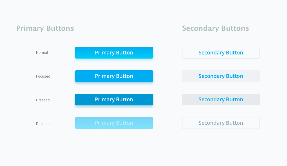
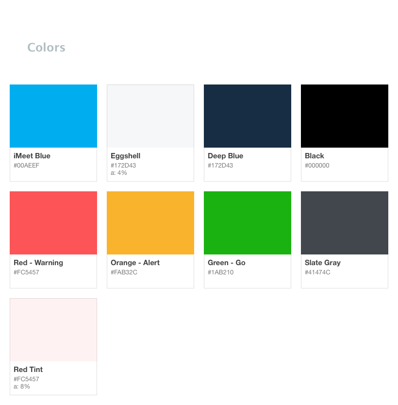
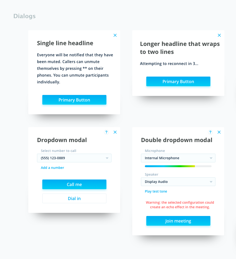
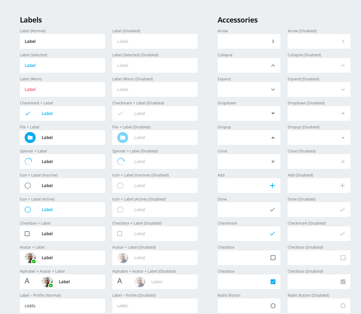
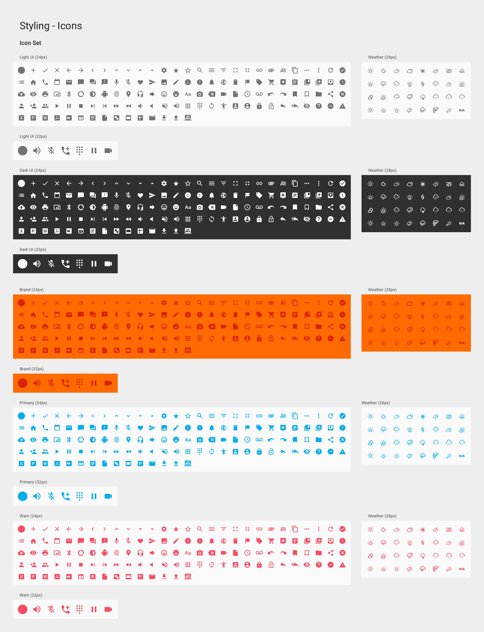
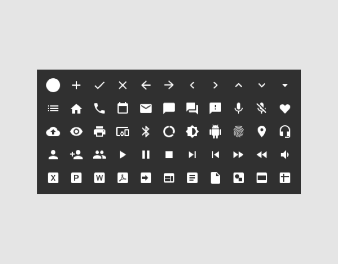
So the system had three jobs. Codify the design and development decisions once, across web and desktop. Give teams reusable components so building a screen didn't start from nothing. Hold the suite together as it kept changing, because a modernization that only lands on one product expires.
Approach & Methodology
In 2018 design systems were still being figured out in public. I went to the design system meetups in Atlanta and New York to hear what teams were actually running into, and I read the published systems closely: Material, Polaris, and Lightning. Each one had already made structural decisions I'd otherwise make blind, like how to separate a foundation from a component and how much guidance a component needs before a developer can use it alone.
I took the structure and left the styling. A borrowed structure has been tested against real teams. Borrowed visuals just make your product look like someone else's.
Designed for Angular
I partnered with the developers to build DIG on Angular, which was already the foundation of PGi's web platform. That mattered more than the component inventory did. Building the library in the framework teams were already shipping in meant adopting DIG was cheaper than not adopting it. That's the whole mechanism: make the good decision the cheap one.
Built the order from what teams were already working around
I worked with the design leads across PGi to find out what their products needed and what they were faking in the meantime. Those constraints set the build order, because a component nobody is waiting on gets adopted last. Working from real screens also kept the library small, since one product's request isn't yet a case for a shared component.
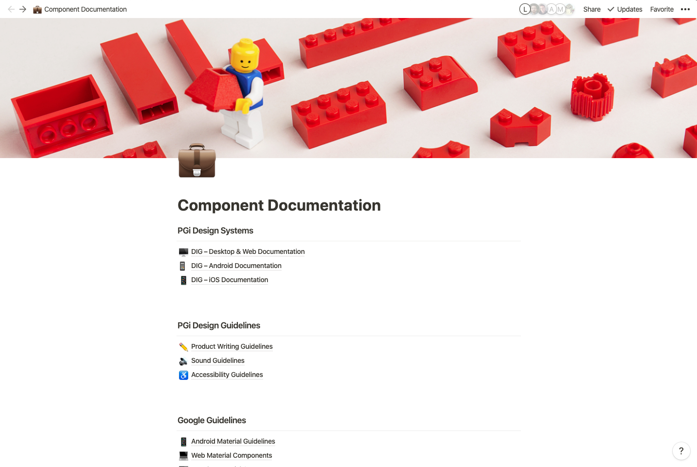
Wrote the guidance and documentation
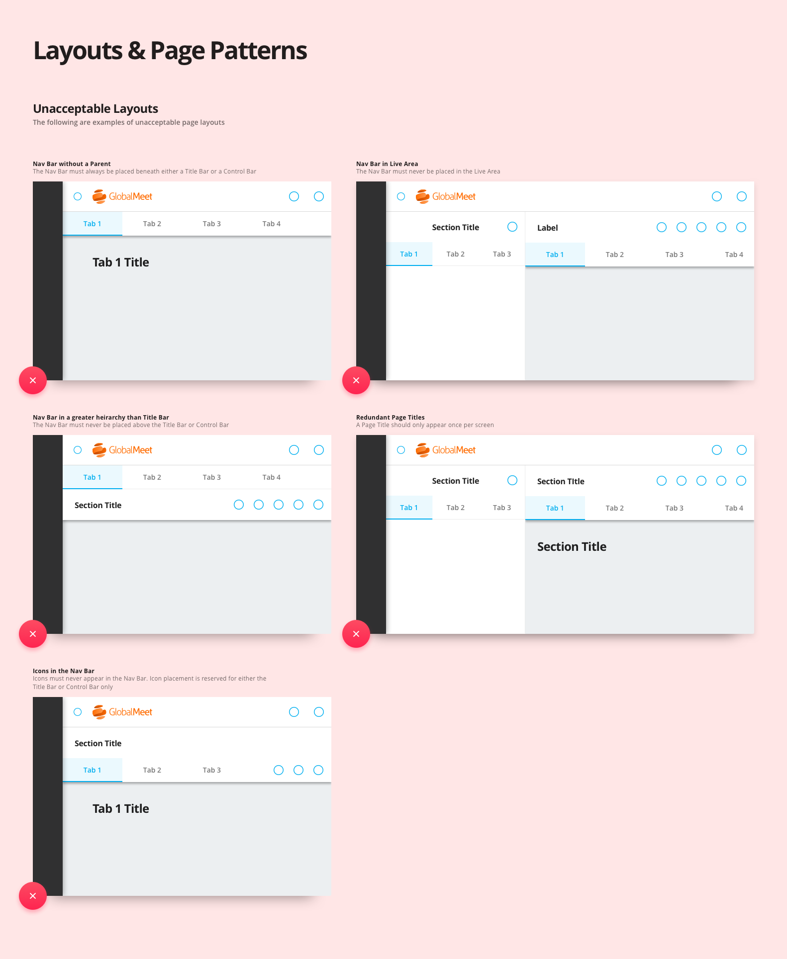
Guidance shipped with each component: what it's for, how it behaves in the states a user can reach, and when it's the wrong choice. Governance covered the rest. Who owns a component, what gets it changed, and how something new gets in.
Impact & Results
PGi got a single reference for its web and desktop products. A designer opening a new screen found the components, states, and behavior already decided. A developer building it found an Angular component and the reason written next to it, so the work was assembly instead of interpretation.
The suite also started to read as one company's work. That's what the customer gets out of a system: a second product that behaves like the first one they learned.
Images