Details
Year: 2012
Platform: iPad
Role: UX/UI Designer & Illustrator
Tools Used
Photoshop
Illustrator
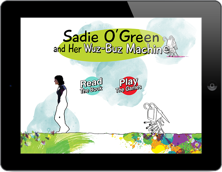
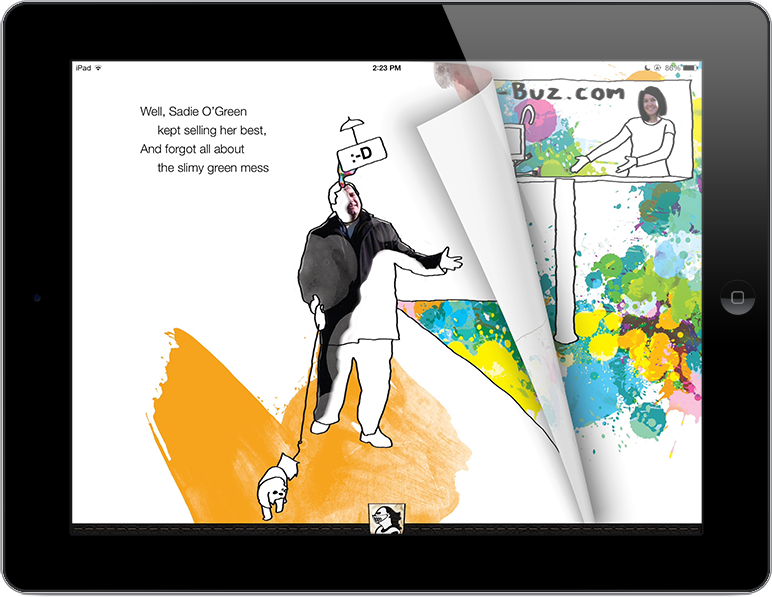
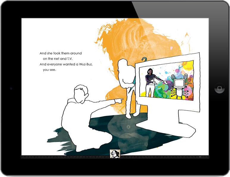
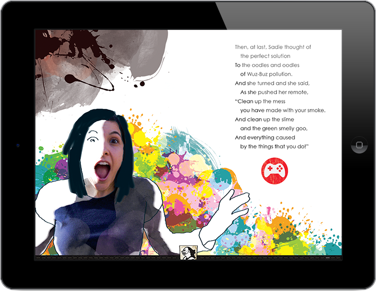
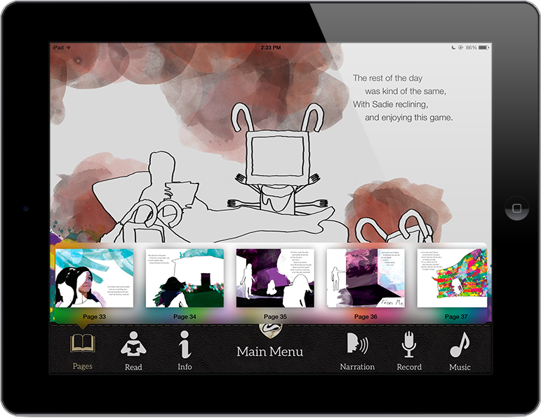
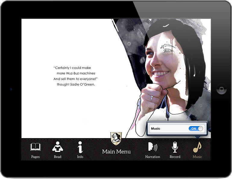
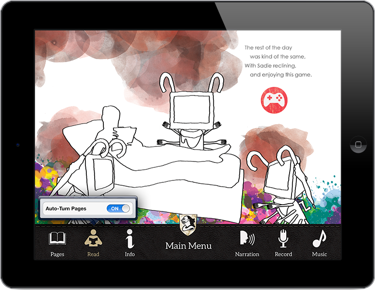
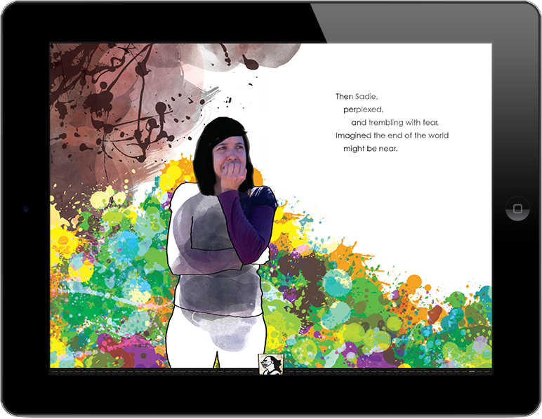
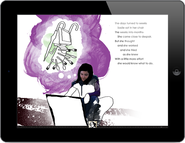
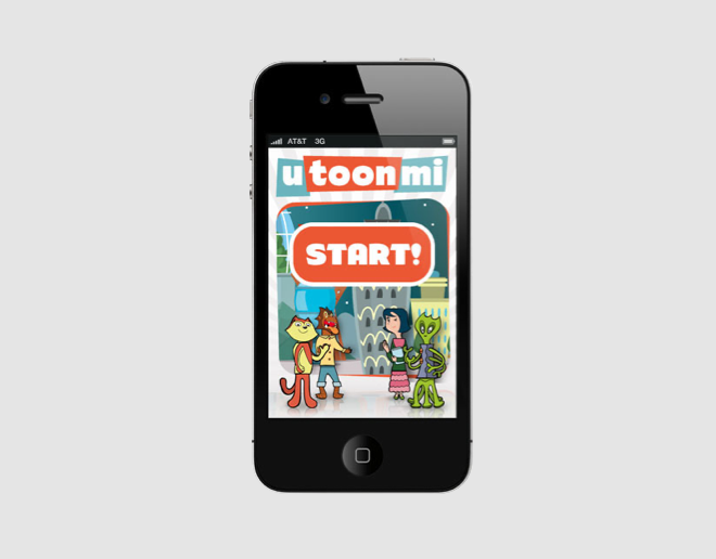
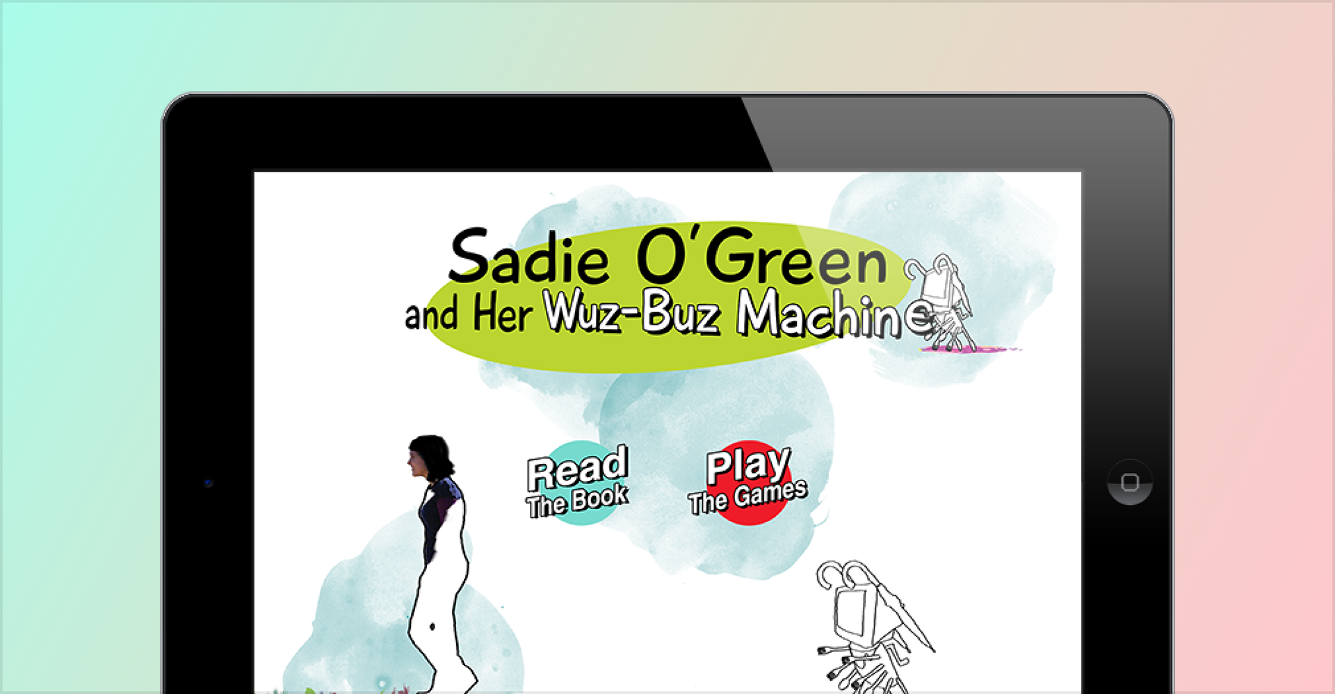
Sadie O'Green and Her Wuz-Buz Machine was a printed children's book about a girl who builds a machine. It was rebuilt as an interactive iPad app with music, sound effects, motion, narration, and games, and released on the App Store in 2012. I designed the experience and illustrated it.
Objective
A printed picture book already works. That's the hard part of adapting one, because every capability the tablet adds has to earn its place against a version of the story that reads fine without it. Sound, motion, and touch can pull a child further into a story, or they can become the thing the child is doing instead of reading it.
So the goal was to use what an iPad can do that paper can't, and spend none of the book to get it. The story stays the spine. Everything added is a way into it.
Approach & Methodology
Learned what the category had already settled
I ran a competitor analysis across the interactive children's books available at the time, to separate the conventions the category had settled from the places it had left something unsolved.
The settled conventions get adopted. A page turn, a read-to-me toggle, and a tappable word are things a child and a parent have already learned somewhere else, and renaming or relocating one charges them for a lesson they didn't ask for. The unsolved places are where the app had room, which is a better source of ideas than a brainstorm.
Tested with readers in the actual age range
I watched my young nephews use digital books and adjusted the design around what tripped them up. Young children are useful testers for one specific reason: they don't narrate their confusion. They just stop, or they tap something else. So the method has to be observation, because asking a six-year-old whether a control was clear returns an answer about wanting to be helpful.
That sample finds places where an interface doesn't behave the way a child expects. It says nothing about whether anyone wanted the app, and I don't claim it did.
Placed interactions at moments in the story, not on every page
I designed the games and touch interactions around the points where the story could absorb them, rather than distributing them evenly through the book.
Interaction on every page teaches a child to hunt for the tap. Once that habit sets in, the words become the thing standing between them and the next toy, and the reading is what gets skipped. Restraint is what keeps an interaction meaningful, because a child who expects one everywhere stops noticing any of them.
Built the sensory layer to serve reading, not to decorate it
I illustrated the app and worked through the background music, sound effects, and motion as part of the same pass, so the atmosphere belonged to the scene it sat under.
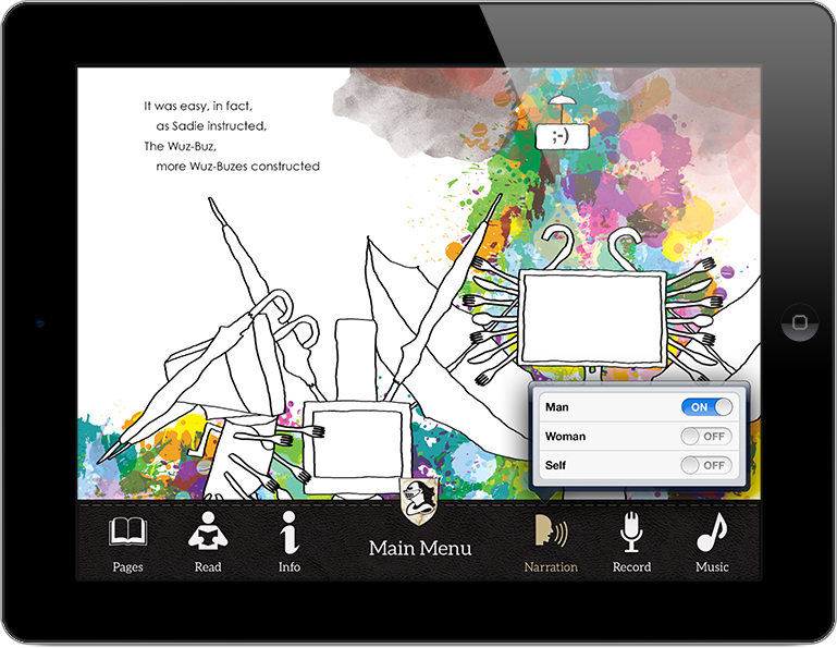
Narration was optional, with a male or female voice. Optional matters more than the choice does: a pre-reader needs the book read aloud, an early reader needs to be left alone to try it, and the same child moves between those two states over a year. A book that decides for them is wrong for one of them.
Worked alongside the developer through the build
One iPad developer built the app, and I stayed in the build with him rather than handing over comps.
A comp shows one state. An interactive book is mostly the states a comp can't hold, which is timing, transitions, sound cues, and what happens when a child taps in the wrong place at the wrong moment. Every one of those I left unspecified would have become a decision the developer made alone, so working through them together kept the intent in the code instead of in a redline.
Impact & Results
The app launched on the App Store for iPad with the full experience intact: illustration, background music, sound effects, motion, the interactive games, and optional narration in either voice.
I don't have download, retention, or session data for it. Nobody was measuring the app in a form I had access to, and consumer analytics on a 2012 project this size mostly meant a download count.
What it gave me is a rule I've used on every product since. A capability doesn't justify itself. It has to serve the thing it was added to, and when it competes with that thing instead, the right move is to take it out. On this project the thing was a story, and the test was whether a child got to the end of it.
Images