Details
Year: 2013
Platform: iOS
Role: UX/UI Designer
Tools Used
Photoshop
Illustrator
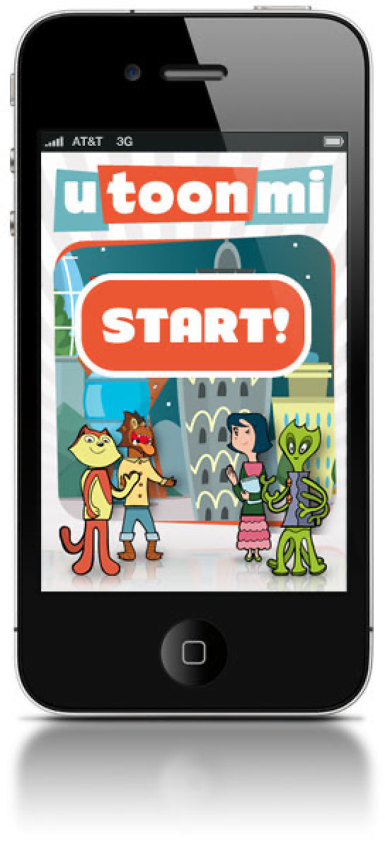
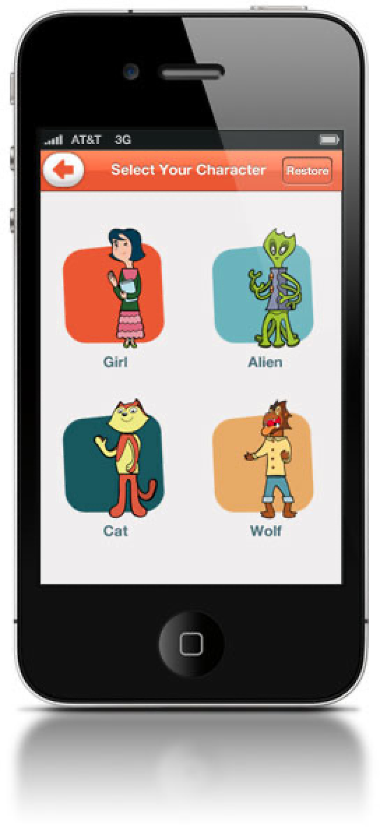
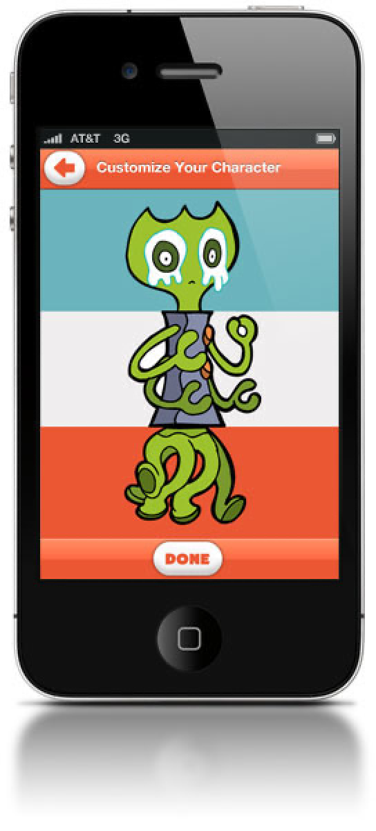
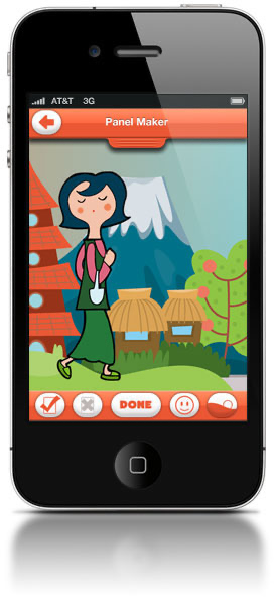
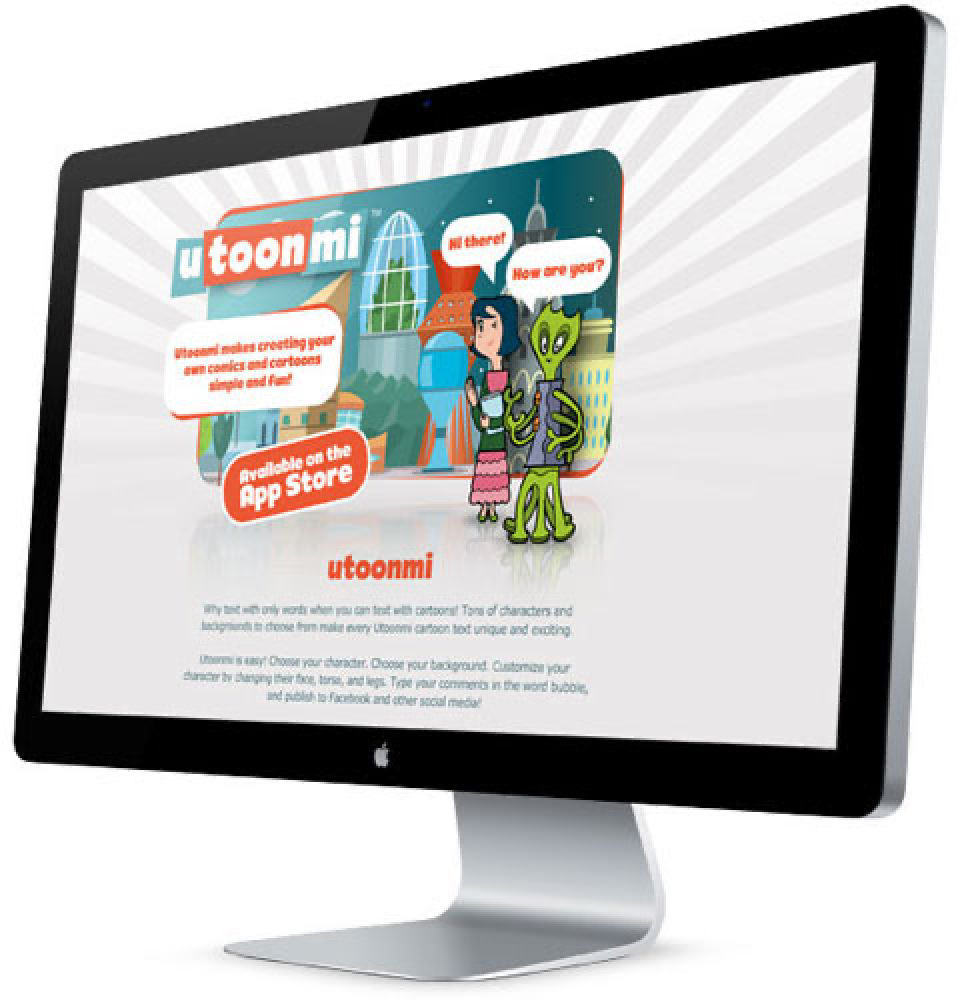
Utoonmi was a consumer iOS app for making comic strips. A person picked a layout, filled the panels, wrote the dialogue, and shared the finished strip to social media. It was built for an audience of all ages and shipped on the App Store in 2013. I was the only designer on it.
Objective
A creation tool has to decide who it disappoints. Make it simple enough that a first-time user finishes something, and it runs out of room by the third strip. Give it real control, and it asks a person to learn a canvas, a text tool, and a layer model before they've made anything. Both failures cost the same thing, which is that the strip never gets made.
So the goal was to design a brand-new app from the ground up that put a finished, shareable comic at the end of a first session, and still had somewhere to go for the person on their tenth.
The build had about a month in it. A schedule that short fixes scope before the design starts, so the question wasn't what the app could include. It was which decisions a person had to make to get one comic out the door, and what could wait.
Approach & Methodology
Owned UX and UI as the only designer
I was responsible for the flows and the interface, which on a team of one means they move together. That's an advantage on a month-long cycle, because there's no handoff between the two and no version drift between a flow diagram and a screen.
It also removes the check. There was no one to run a critique with, so the flows had to get their correction somewhere else.
Validated the flows with the people I could get
There was no budget or schedule for formal usability research, so I tested the interactions with friends and family and reworked what tripped them up. That kind of sample is good for one thing: it finds the places where an interface doesn't behave the way a person expects. It says nothing about whether anyone wants the product, and I don't claim it did.
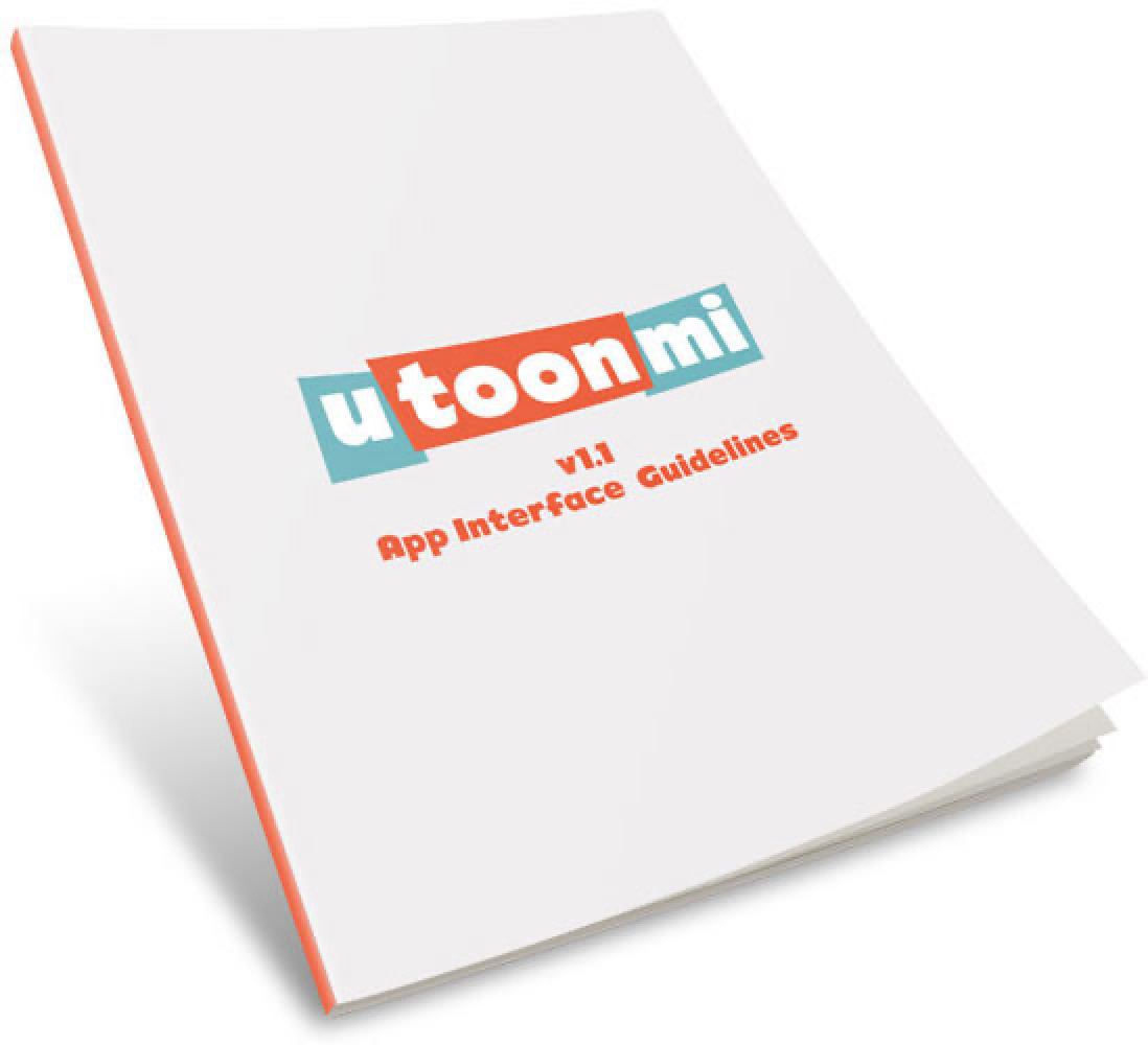
Wrote an App Interface Guidelines manual
One iOS developer built the app, so I documented every expected interaction and behavior in a written manual rather than delivering flat comps. A comp shows one state. An app is mostly the other states, and each one I left unwritten became a decision the developer had to make alone, under the same deadline I was working against.
Documenting the behaviors made those decisions mine and made them cheap to look up. That manual is the first design system I ever wrote, several years before I had the word for it.
Kept the scope inside the development cycle
The app was designed to be completed and released within a month, which meant treating the schedule as a design constraint instead of an engineering problem. Anything that couldn't be specified clearly enough to build in that window didn't go in, because a half-specified feature spends the developer's time twice.
Impact & Results
Utoonmi launched on the App Store inside the one-month cycle, with comic creation and social sharing in the first release.
I don't have adoption, retention, or task data for it. Nobody was measuring the app in a form I had access to, and 2013 consumer analytics on a project this size mostly meant download counts.
What it gave me was a working habit I still use. The manual, not the mockups, is what made a solo developer able to build a product that behaved consistently, and writing the behavior down turned out to be the part that scaled.
Images